

Glasses for William
The following texts and images are the results of a training exercise to go from the pictures or the description of an artefact to the creation of a 3D digital double, sometimes restored version of it. If you wish to know more about the process, explanations are in A journey into learning a (3D!) restoration process workflow article.
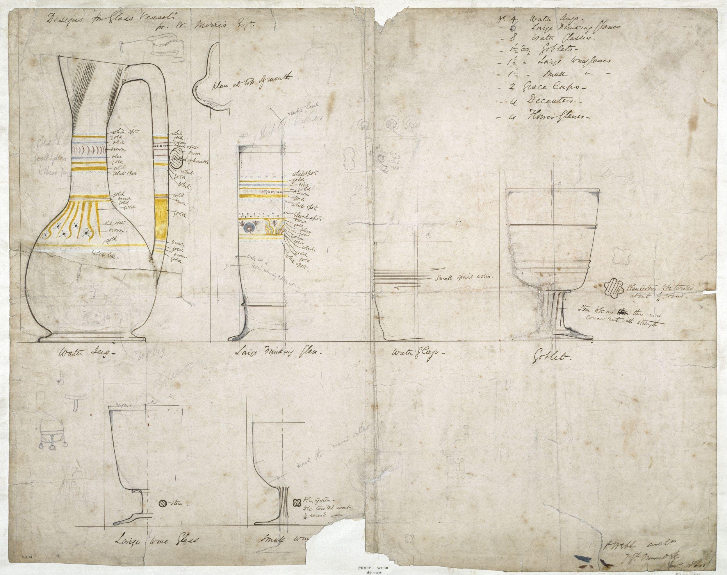
Title: Glassware Design
Author: Philip Speakman Webb (1831-1915)
Datation: ca 1860
Provenance: England
Dimensions: H 54.5 x W 67.2cm
Media: paper
Source image: INV n°E.340-1944, Victoria and Albert Museum
Deciphering things
Historical context
This drawing was made as part of the Red House project in Bexleyheath, by architect Philip Speakman Webb. He co-designed the house with William Morris as the latter family rural home. Loosely intended as a “revival template of a medieval-style work-based community”, it was designed and furnished in cooperation with various artists and embodies the principles of the Arts and Crafts movement.
Glassware were among the numerous elements created for the house. Furniture, tapestries, ceramics were also imagined: basically all vernacular elements needed on an everyday life were concerned.
I was not able to find many remaining items assuredly used at the Red House, and particularly not of all the glassware created exactly as the drawing dictates. There are versions of the “simplest” shapes on various collections, as this tumbler or this wine glass, but not the ornate ones like the jug or the large drinking glass. If any of you, dear, reader, knows about them, please get in touch !
As a nice breather exercise, I thought modelling them as best I could from the drawing would be interesting.
Shape, decors and colours
Now, for once, we have very clear and precise instructions as to what to is expected, provided I could read Webb’s handwriting correctly.
Or so I thought.
You think I should know better, at that point !
There is a cryptic list in the top right corner of the drawing. According to the other elements on the page, here’s what I was able to read:
“N°4 Water jugs
- 2 (6?) large drinking glasses
- 8 water glasses;
- 1 1/2 doz(?) goblets
- 1 1/2 doz(?) large wine glasses
- 1 1/2 doz(?) small wine glasses
- 2 grace cups
- 4 decanters
- 4 [undecipherable begins with “H”?] glasses”
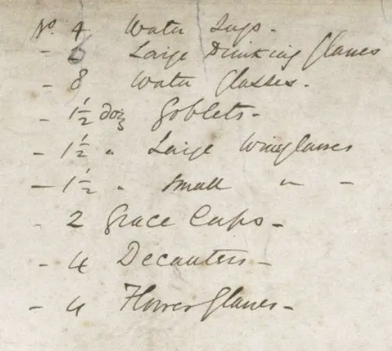
NOTE: Grace cups are a type of vessel. A tankard, sometimes with handles on each side passed round after a grace prayer at banquets.
I was a bit puzzled by the “doz” until a quick internet search pointed to the answer. It was not an intended volume, but the abbreviation of “a dozen”: 1 and half dozen make 12+6=18 pieces. Ask a linguist why people used and are still using this way of counting things, it has always puzzled me.
There are three elements we know nothing about. The grace cups, the decanters and the last line whose first word I cannot decipher. If any of you, dear reader, has an idea on the subject, please, do let yourself be known. Pretty please with sugar on top?
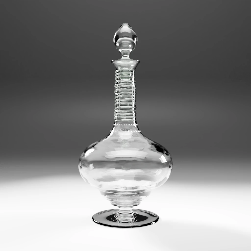
We can only assume the decanters may have been variations on the water jug. I’m hypothesizing this purely based on my interpretation of what I know about Philip Webb’s corpus of work that shows a design unity in the sets he created. I will try to use other known decanter of his as references, though that may not be remotely accurate.
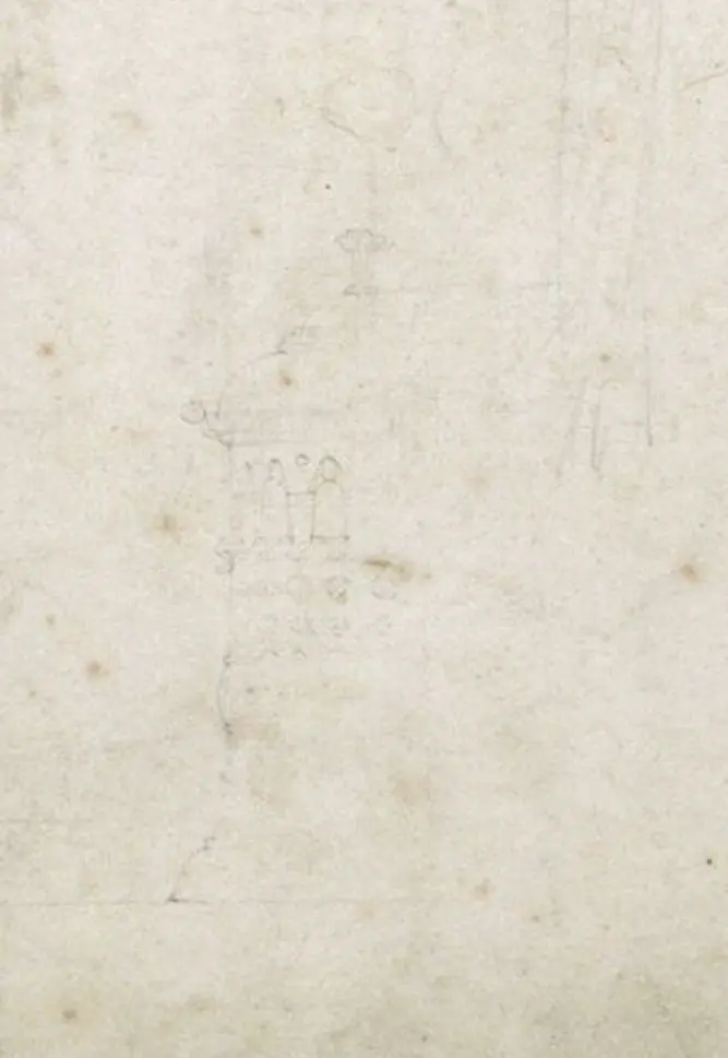
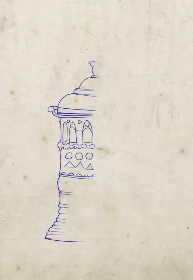
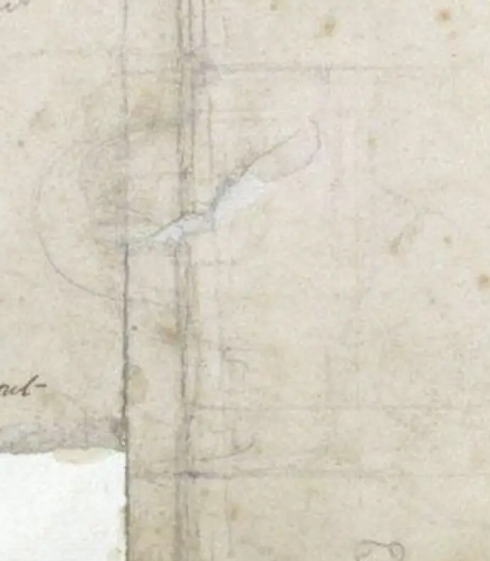
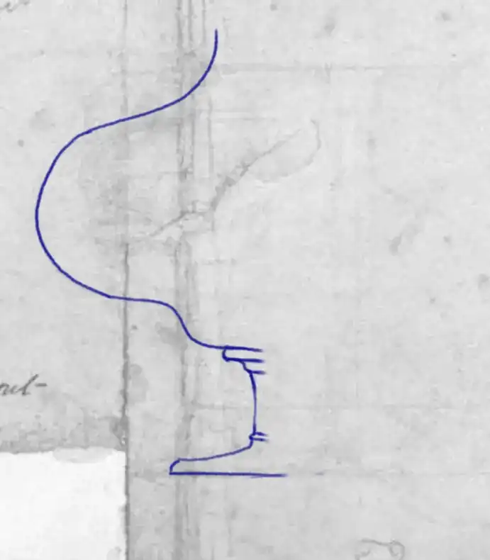
The grace cups were a mystery for a long time until I scrutinized the reference image thoroughly and noticed faints outlines on the lower right part. It’s almost erased, but it’s there. It looks like half a tankard. Why wasn’t it inked like the rest of the pieces? Has the author finally decided otherwise ? I do not know. But this is digital, and we “easily” can have a look at what it could have been !
An astute observer will also notice another shape aside this one, one that could be the base of a decanter or the mystery vessel from the last line of the list. The shape doesn’t seem to have a neck.
Because these pieces are not undeniably deduced from the source, we must think of a way to make them neutral in a way.
Then, there is a question as to what the different decors were made of: were they intended as variations on prunts? Or as painted elements ? Or a mix of both ?
I think will choose this last option. Here is my reasoning. The arts and crafts movement makes a point in putting forward the skills artisans can develop in their arts. Therefore, showing as many techniques as possible seems to be a way to showcase their crafts as fully as possible. Again, I may be wrong. But as this is 3D, we have the opportunity to test and try !
Messing up histories: too much sources can be confusing
In my queries for information, I stumbled upon a very intriguing image.
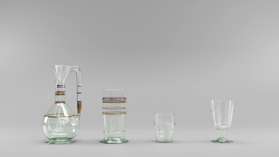
The text dates the pieces from 1872. See anything familiar ? Out of the 4 pieces, we can clearly see that 2 of them, albeit in altered versions, are also on Webb’s drawing. The plot thickens.
Now, Webb’s glassware for the Red house was eventually produced by the Whitefriars company and sold by Morris and Co in their catalogue.
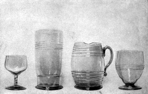
Are those “simplified versions” of the first drawings (that we may be working on) ? Obviously, a scaled up production of the pieces would need adaptations. But If the third piece from the left is the new water jug, I feel cheated !
Or, and that could explain a lot, there are of course other drawings from Webb about the table glassware for the Red House. Most definitely, yet, as we don’t have access to them, that is not going to help much.
There are other pieces in collections that have traits or similarities to our corpus yet do not appear on the reference drawing. They appear in catalogues and auction houses lists, sometimes identified haphazardly. That induce a sort of background noise to our researches that blurs things.
3D notes: a 3D reconstitution process
This is an exercise, shown for documentation purposes only
The nature of the main material, glass, incentivizes us to do things a tad differently this time.
Glass is a wonderful material to work with, yet it is a tricky one. First, it is fickle to get right, though there have been incredible progress on that front in the 3D apps lately. Then, because of its inherent transparency, it makes the inside parts as important as the outside ones to get the final effect as right as possible. For specific pieces, such as our cases, these usually hidden parts must be considered as well.
It is therefore critical for us to test things as we go along to make sure it works as intended on the final pieces. We could do with a quick glass material to start with. It won’t be much longer to create the final material first and tweak it as we go along, the modelling part. So let’s do that instead.
Texture the shape
Glass and the bulbous nature of things.
Webb insists on marking “the waved outline” (bottom centre of the image). It is an effect that is present on a lot of his created glassware pieces that I could find online.
We do have a better idea of the colour and look of all the pieces because some are kept around the world in various institutions.
One of the best example might be the goblet preserved at the Metropolitan museum, produced by Whitefriars Glassware for Morris and Co from Webb’s designs for the Red House. This model however is not present as such on our reference drawing.
Contrary to Webb’s later production, there is no green tint to the glass. It looks crystal clear. It was a bit of a downer to discover that because I kinda like it. Maaaybe I’ll throw a slight twist in that regard in the final renders on an alternate version of the pieces !
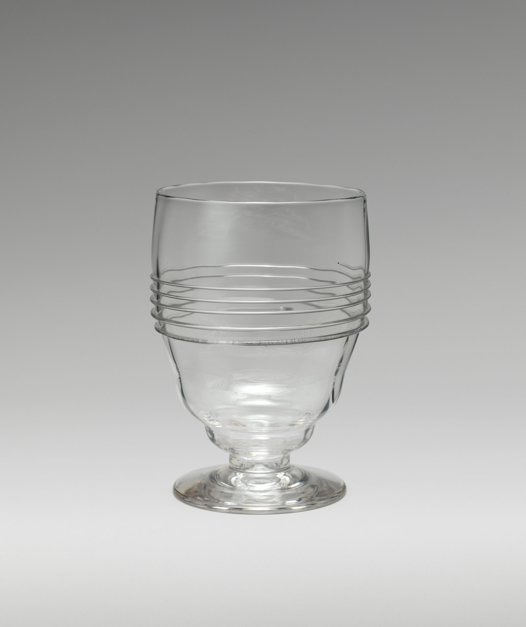
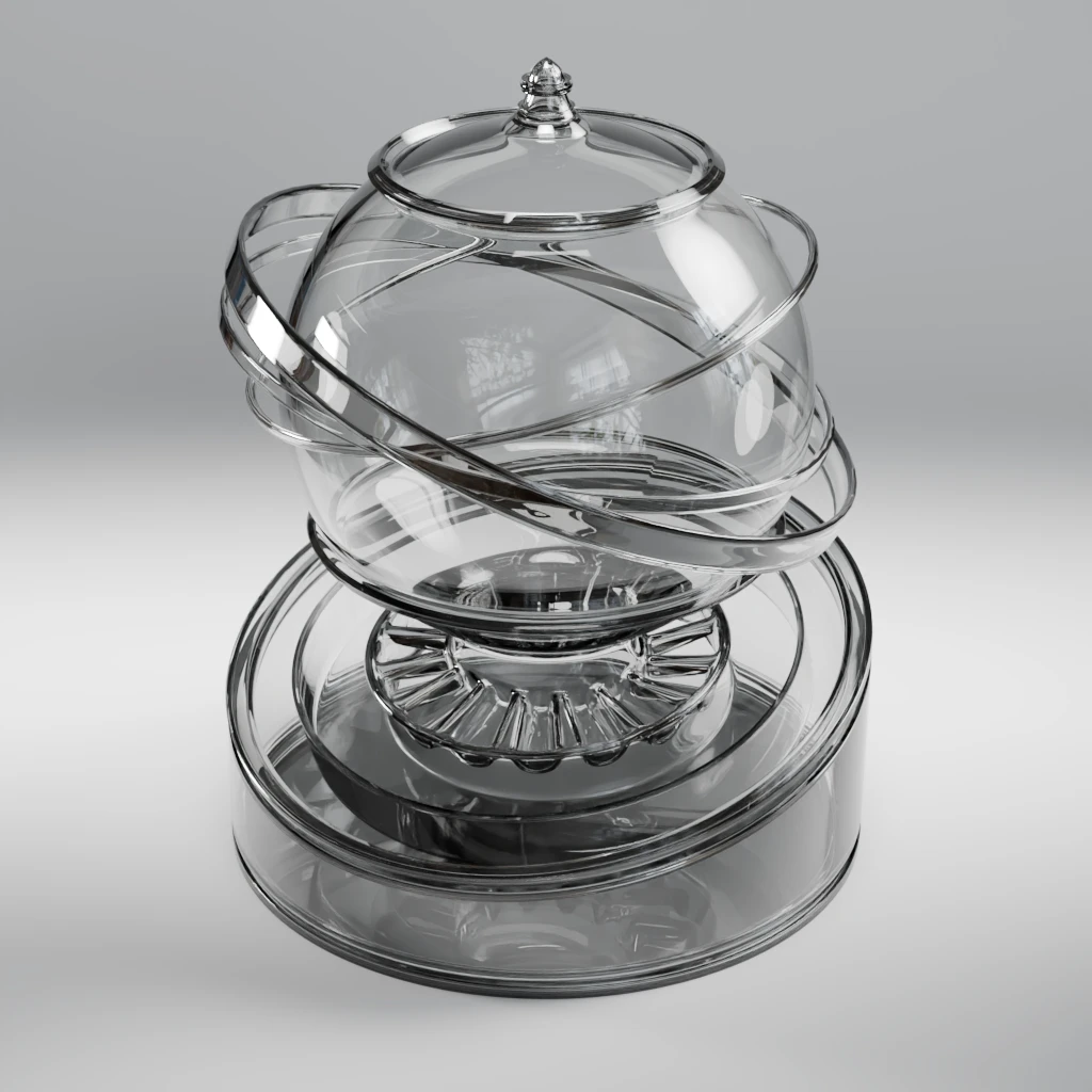
There is a waviness to it, though, both in the shape and in the material. I’m not certain where it comes from. Out of the blue, I’d have said it stems from a sort of moulding process combine with a twisting of the cane, but I can be wrong.
Note that in order for my regular material balloon test object to work this time, I had to make sure the model’s walls had a thickness however tiny. Otherwise, I could not make Cycles render transparency properly.
Friezes and motifs
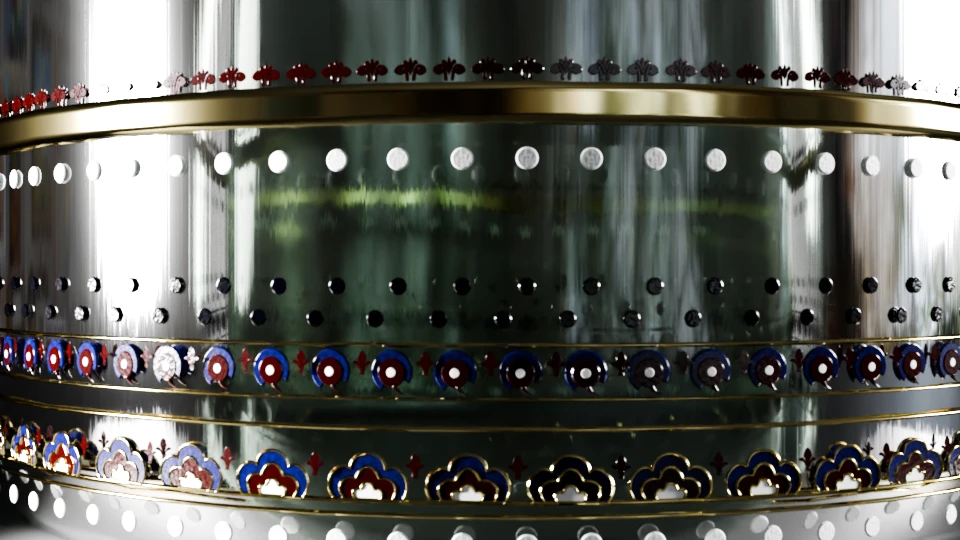
Beside the glass material, the decor is made with coloured lines, ornamental friezes and gold parts. Let’s drop the last one immediately, gold can be “easily” rendered using a simple PBR method. The same goes for the coloured lines: the only question about them is to decide whether they are painted on or coming from glass threads being put on the body.
In his drawing, Webb makes his intention clear whenever he wishes for the later so we could probably safely choose the former when there are no indications. However, the pieces also have to look good and coherent with one another. So, because we can test things more easily in 3D than in a glass studio, let’s see on piece by piece basis.
In my opinion, the main difficulties are the friezes. First because there is not always a definite sequence shown for them. On the large drinking glass, for example, we can see two seemingly different variants. One has rounded motifs and one has cloves or clouds-like forms. The drawing separates them in the middle.
Are we supposed to mix them as best we could ? Must we create two different variants ?
My personal guess would be the latter.
Because the pieces are simple modified cylinders shapes, there are at least two ways of making the decors. The choice is less a matter of technique than a matter of goals. If this is to create fixed close-ups, stills or animated showcase of the pieces then geo nodes instances are probably a good option. If I intend to export the model for, say, a web browser experience, then the lighter, the better and geo nodes generated geometries may be heavier than texture maps. I feel the technical cost to fluidity of the user’s experience ratio must be taken into account.
On this project, as far as training is concerned, geo nodes could be the way. I don’t think I will try to convert the models into a web experience this time. I won’t have time to try to implement an accurate glsl shaders and sticking to maps or render engine generated materials does not work well for me when ornate glass material is concerned. Don’t get me wrong, it can absolutely render glass neatly. I just can’t manage to have the exact effect I want with it yet.
So, geo nodes it is ! One of the advantages of this method is the possibility to tweak materials as I please and to share it through the entire corpus of models, ensuring continuity.
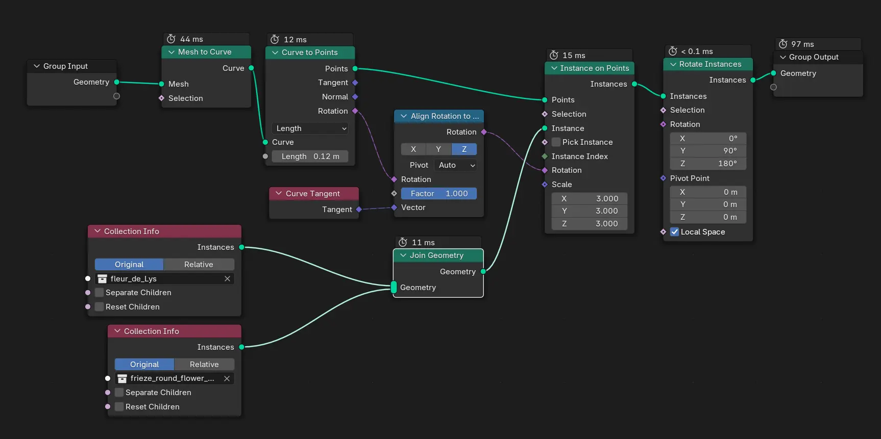
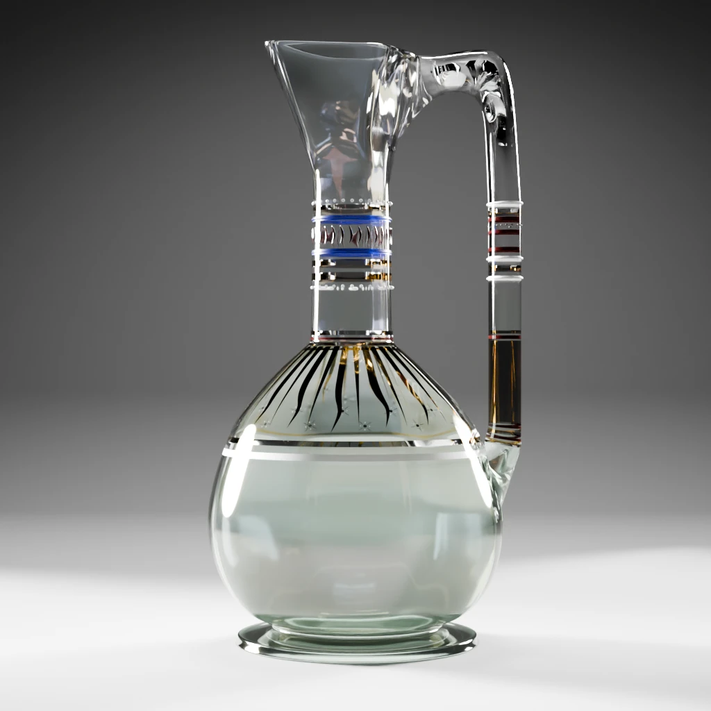
I stumbled upon one issue I was not, yet, able to solve. I couldn’t manage to make the gold rays (basically triangles) instances to deform onto the sinuous surface of the jug. I know it’s probably really easy, but I’m still having a hard time with this part of geo nodes systems, hence the convoluted rotation scheme of the nodes.
Note that I chose to believe the decors on the hypothetical pieces are applied by brush, after the creation of the glasses and then fired to settle it. That means some imperfections on the surface may still be visible. One of the other advantages of the node system is that it allows us to create and modify the thickness of the decor elements, just like a paint layer on a real piece would. With the right shader, it should give us the right effect in the end.
Model the shapes
The ones we know
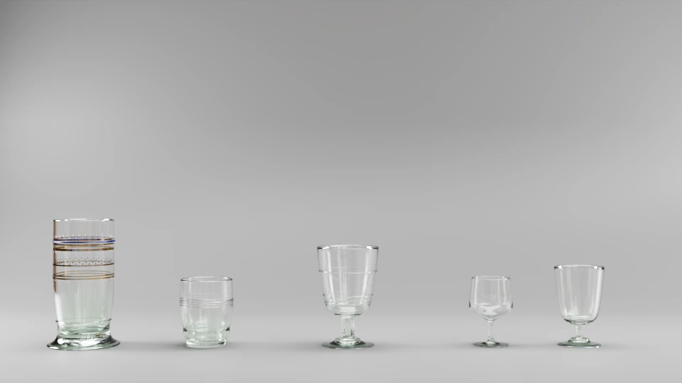
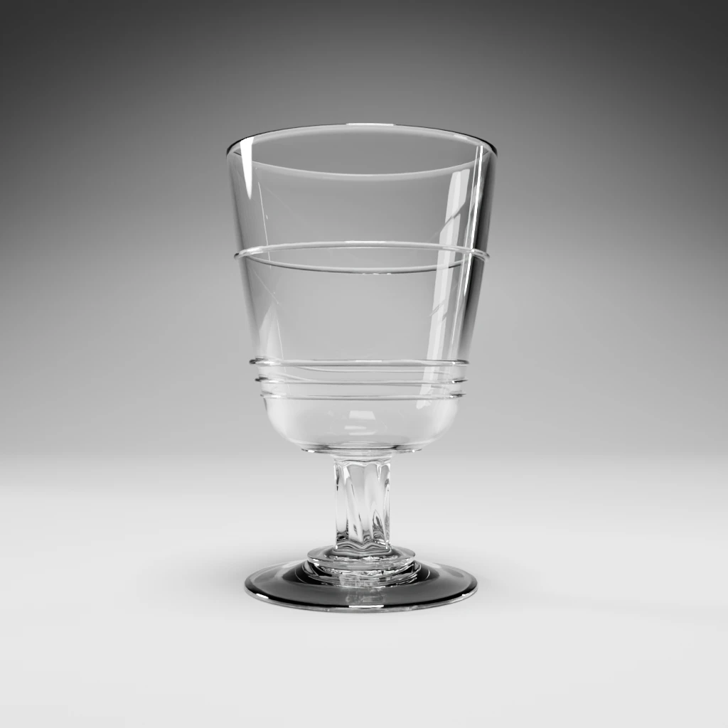
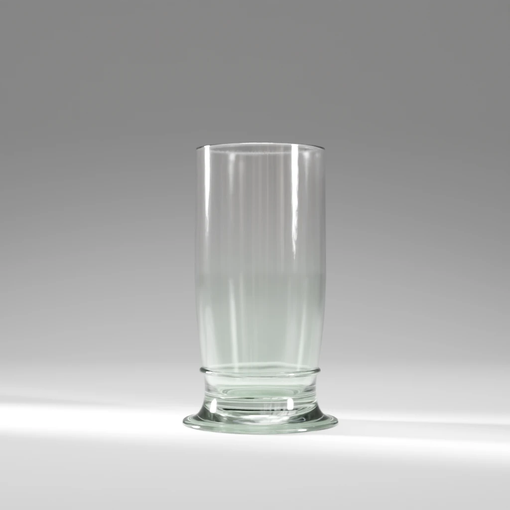
This part was fun to make. I played a little with the glass threading (thickened curves, for the connoisseurs) and tried my best to stick to the wavy deformation effect the designer is keen on.
The not ornate ones
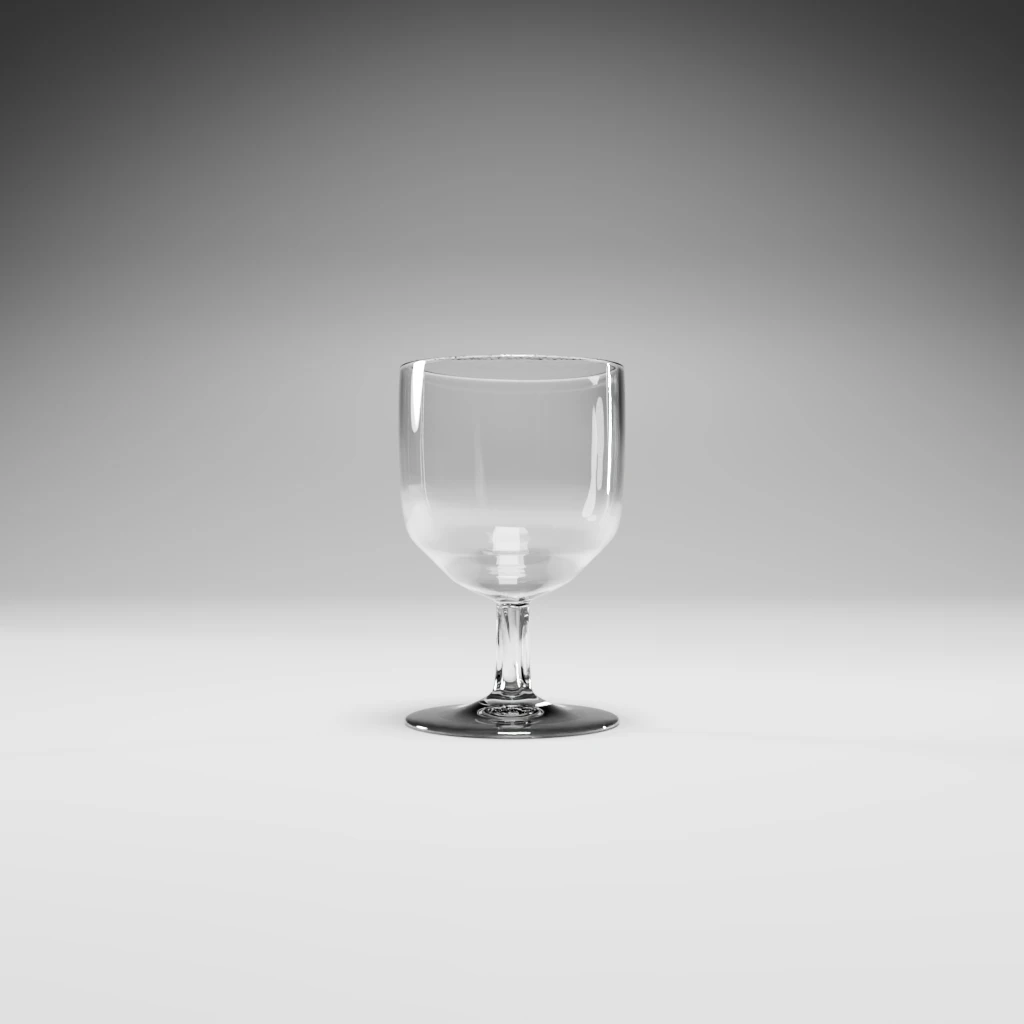
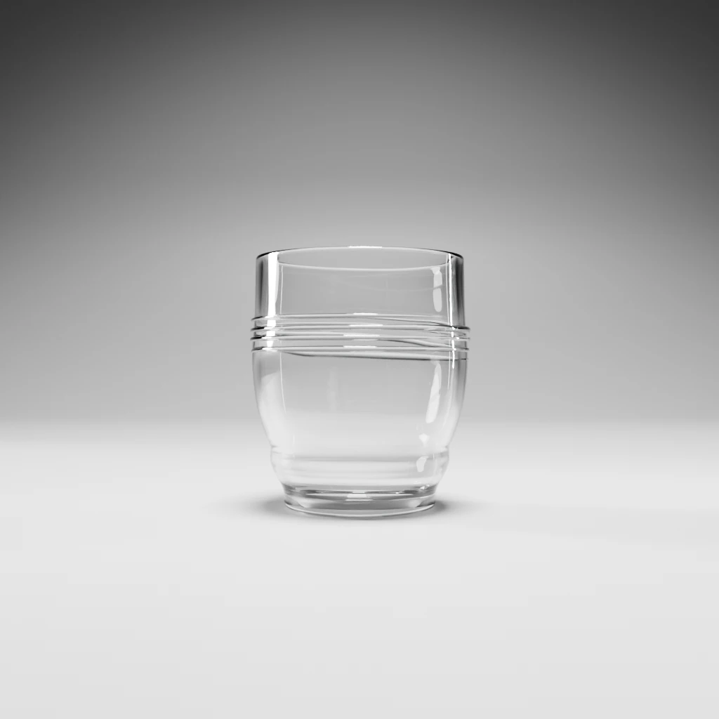
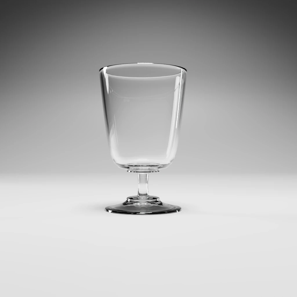
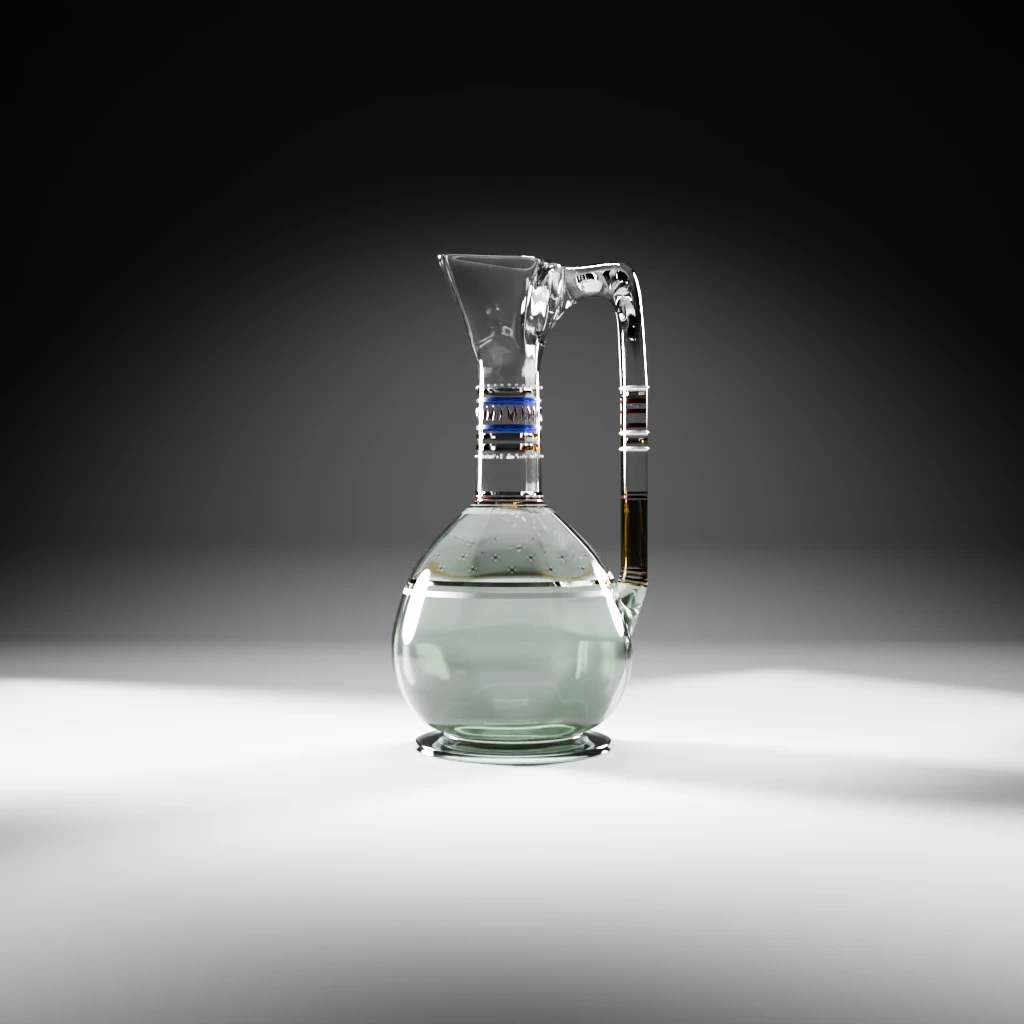
Evolution of the water jug
In order to solve the gold rays issue, I needed to draw them on the UV map to make sure they fit perfectly. I fumbled a bit and was about to create a dummy shader and bake it all to export a version of the UV map when I was reminded that Blender has a native functionality that does just that. Duh !
Evolution of the large drinking glasses
We will need two variants of this piece: one with a clouds or cloves like motif and one with rounded shapes.
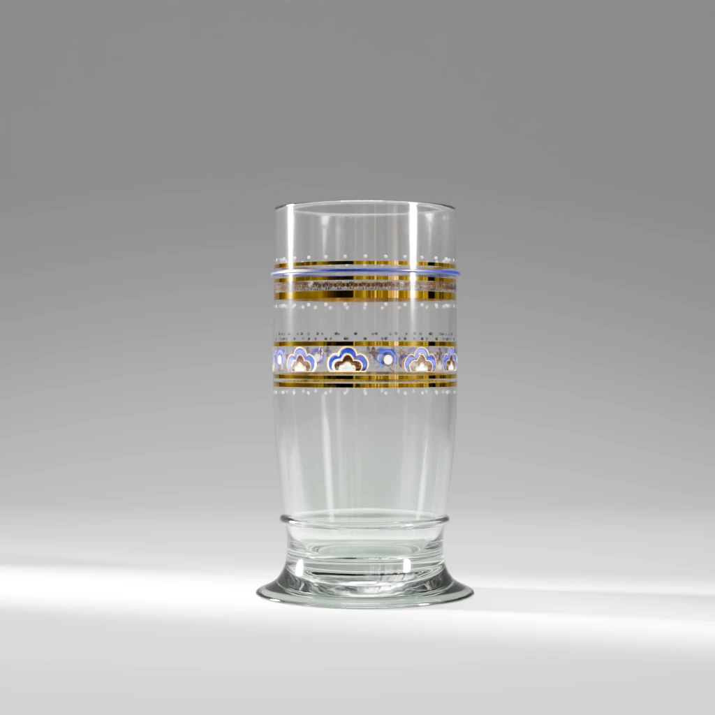
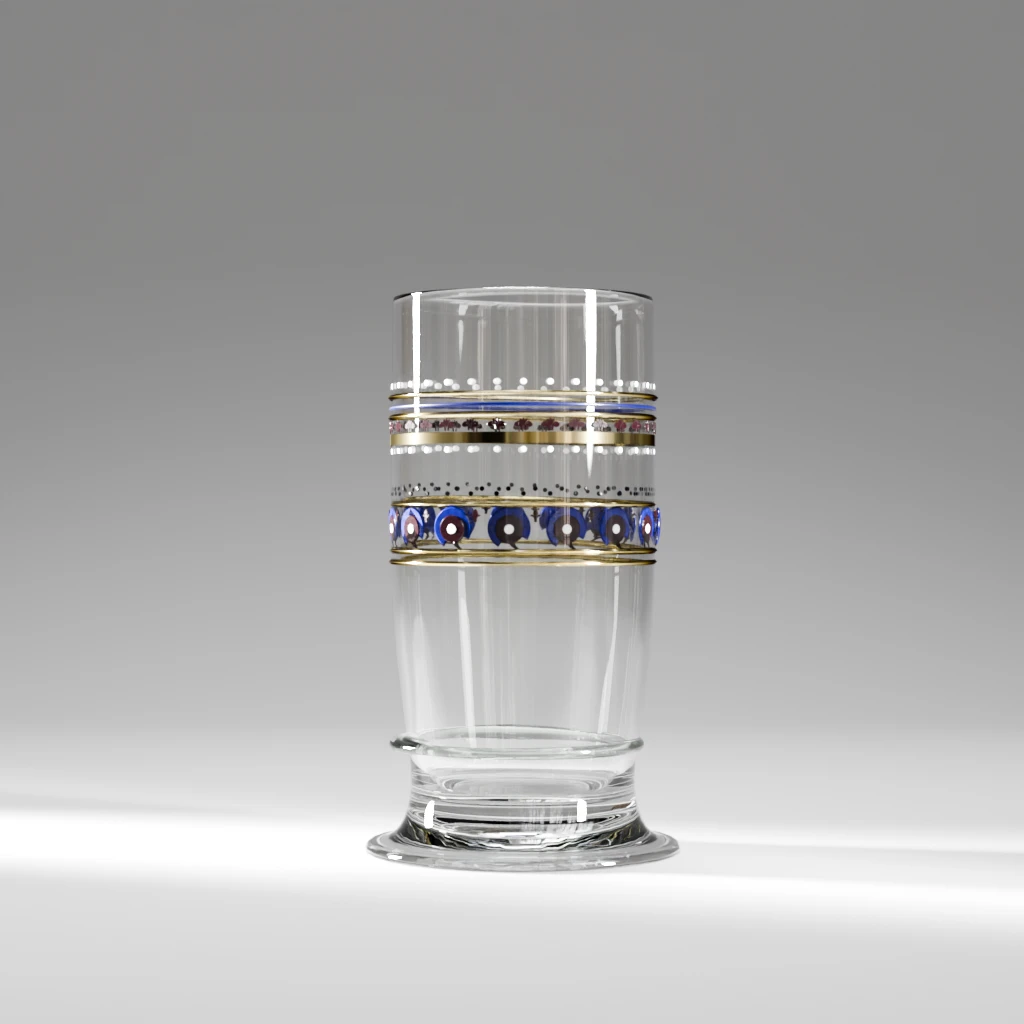
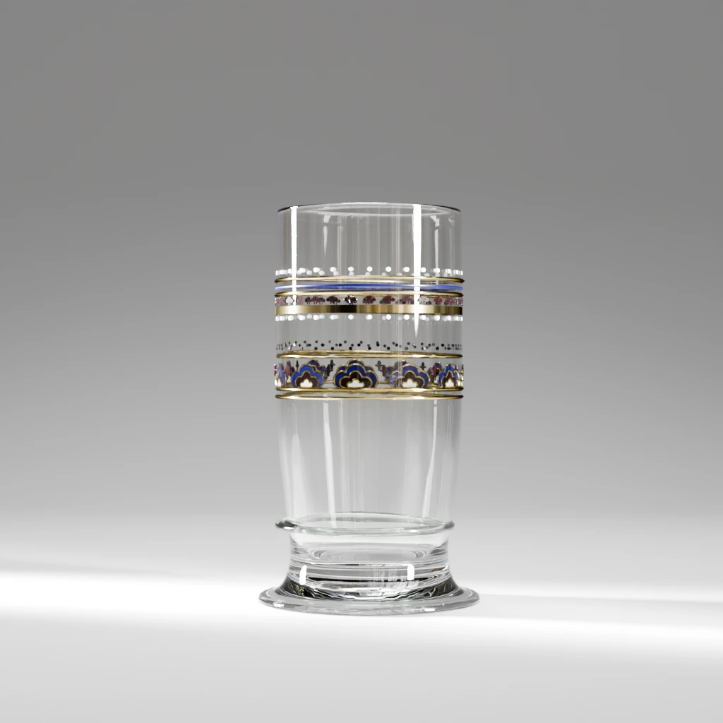
The shapes we don’t know -much- about !
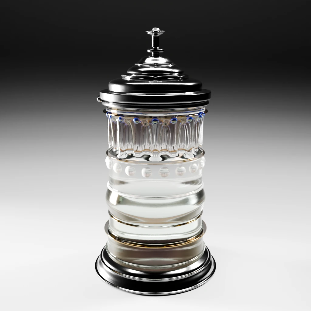
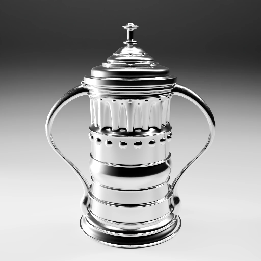
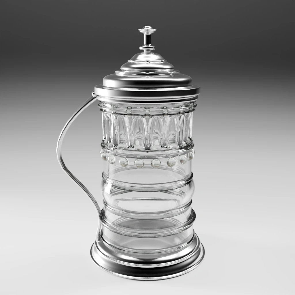
The ethereal grace cup tankard.
Now, we do have a sort of maybe kind of shape but what we don’t have is the certainty that it was made of glass. All the elements I could find for this time period, despite the medieval reference, tend to agree most Grace cups were actually silver. So, yeah, there’s that. If you look closely at the “reference”, you’ll notice what can be a hinge on the left-hand side. Therefore, a multipart object might be required.
It also needs handles. Being shared from guest to guest at the end of the meal around the table means they will need something to hold on to. Otherwise, one can spill its precious cargo on one’s neighbour. Very disgraceful.
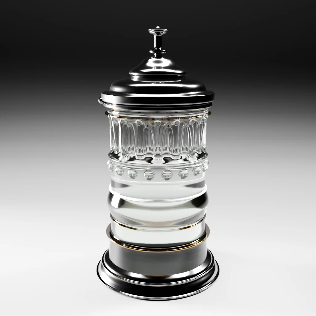
The decanter hypothesis
For this one, I mixed and matched the outline we scrutinized and a known Web piece. It’s a pure hypothesis. I’m not really convinced by the topper, but it doesn’t break the shape’s outline.
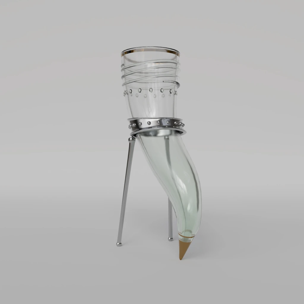
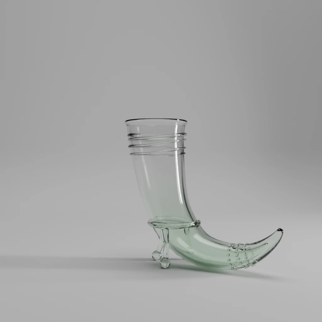
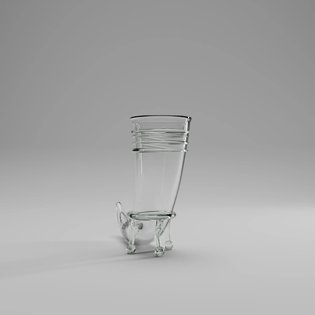
This is the part where I went a bit mad: horns for everyone !
Remember the undecipherable word ? Beginning with “h” ?
How about a horn ? As in a drinking vessel ? Don’t look at me that way. History backs me up on that !
As we know that the project inspiration has medieval accents, it could make sense. Maybe ? Ok, ok, I deemed it would be fun to try and it was late and I was on pain medications. Happy ? Sheeeeesh.
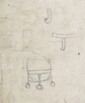
What does M.Webb think it should look like ? Who knows !? I will however try to make use of a tiny sketch from the original drawing and adapt it to the shape, taking technical hints from a piece from the Corning museum collection. I’m way off grid here as these sketches were most likely for the decor.
After few (terrifying) iterations, I’m choosing the simplest one. Do remember this is all for fun as I have no way of knowing for certain what the designer would have wanted. Or even if it is indeed drinking horns he wanted. Here’s a lesson for everyone: always write as intelligibly as you can ! You never know.
Shine a little light: stills renders using Cycles
Now that we have everyone or so, let’s do glamour shots. Because we can !
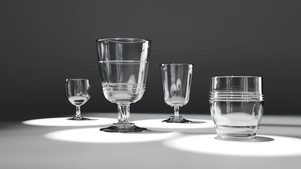
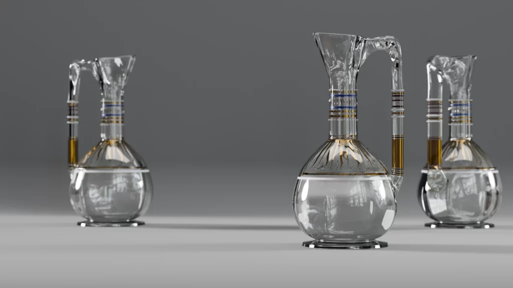
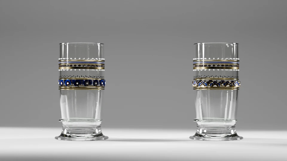
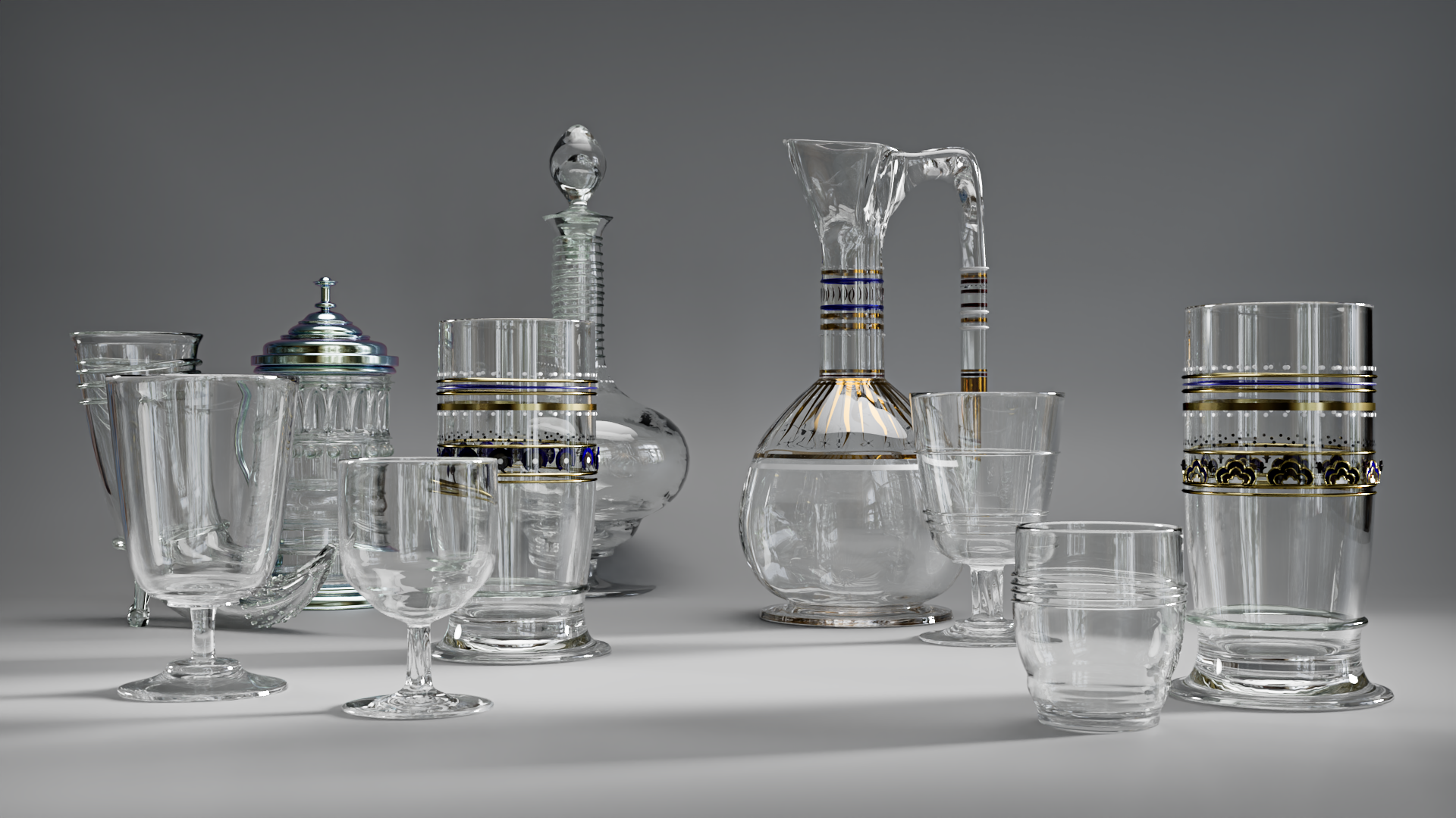
Cabinet de curiosité
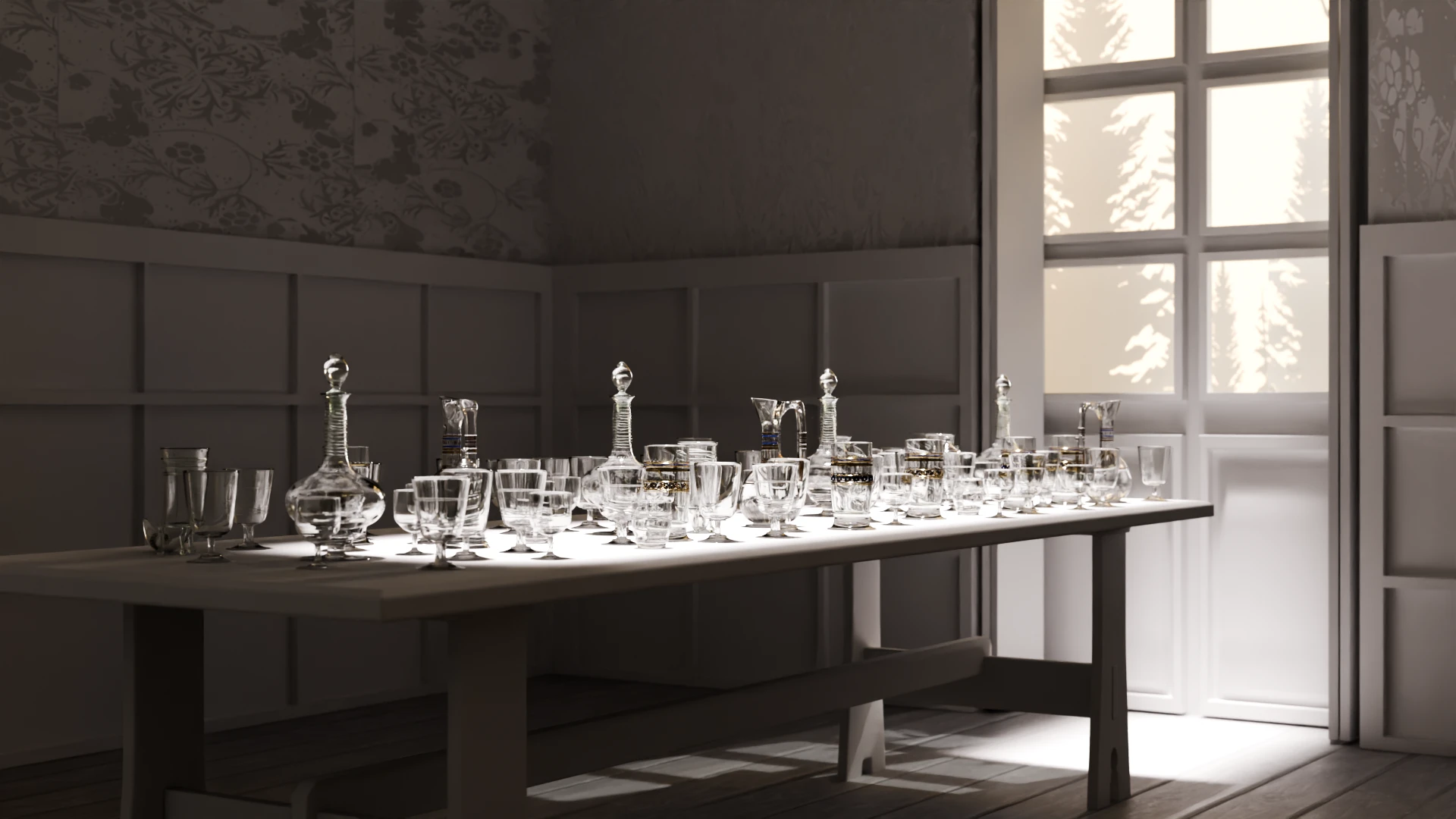
Now with a bit of 3D masonry, a slap dash panelled wall and a historically accurate Webb’s dining room table, we can see the pieces in the Red house dining room, in the asked for number !
Contact
If any of you, dear reader, want to further the conversation, you can do so on Mastodon or Pixelfed.
Credit
Unless otherwise mentioned, all images credit to LGS.
Iconography
Glassware Design, c.1860 (Drawn), Webb, Philip (Speakman), England (made), , INV n°E.340-1944, Victoria and Albert Museum
Table, designed by the architect Philip Webb, 1860s, manufactured by Morris & Co., 1860s, solid oak rectangular top, angled turned legs, central joining stretcher with seven turned spindles, Christies auction house website.
Footed goblet with bulging bowl, Designer: Philip Webb, maker: James Powell and Sons,
Manufacturer: Whitefriars Glassworks (British, 1834–1980), Retailer: Morris, Marshall, Faulkner & Co. (1861–75), 1860, Flint glass, Accession Number: 2015.249, Metropolitan museum
Glassware designed by Philip Webb for William Morris, extracted from Encyclopaedia Britannica, 11th edition, Glass section, vol. 12, Plate II (between pp. 98 and 99), fig. 12, 1911, CC0 via wikimedia
Drinking horn, Rheinische Glashütten-Actien-Gesellschaft company (1872-1937), 1872-1899?, Germany, Corning museum of Glass, INV n°59.3.34
Bibliography
McConnell Andy, “# The decanter : an illustrated history of glass from 1650”, 2004, Woodbridge, Suffolk : Antique Collectors’ Club, pp 408s (about the Whitefriars production for Bexleyheath Red House), available online
Whitefriars Glass Catalogue, 1860, available online
Morris & Company, Decorators, Ltd., “Specimens of furniture and interior decoration”, Morris and Company Decorators, Ltd., 1912, London, available online