

Invitation to the Thirsty
The following texts and images are the results of a training exercise to go from the pictures or the description of an artefact to the creation of a 3D digital double, sometimes restored version of it. If you wish to know more about the process, explanations are in A journey into learning a (3D!) restoration process workflow article.
While perusing the web in search of exercise models, I found this architectural project for a fountain. To the best of my knowledge, it seems it was never executed. Thankfully, we can try to see how it could have looked using 3D !
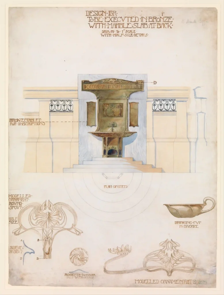
Title: Design for a Wall Fountain to be Executed in Bronze with a Marble Slab at the Back
Datation: ca. 1895
Artist: Kay Maude Coggin
Provenance: England
Dimensions: 71.1 x 53.3 cm
Media: Brush and wash and watercolour, over graphite
Source image: INV 1973.513.1, Metropolitan museum of art
Description and historical context
Katherine Maude Coggin and the Cymric shadow
The “regular” method to document a project is to start by its author and go from there. The museum information are rather laconic, and it took me some time and efforts to finally find more about the mysterious “Kay Maude Coggin”.
Spoiler alert, it isn’t that much. As far as biography goes, all the information I have are from the 1890-1905s era and from only a few sources. I was not able to find anything before and after that. I suppose direct research in physical archives would be useful, but that is not an option at the moment.
So, what do can we know about the artist ?
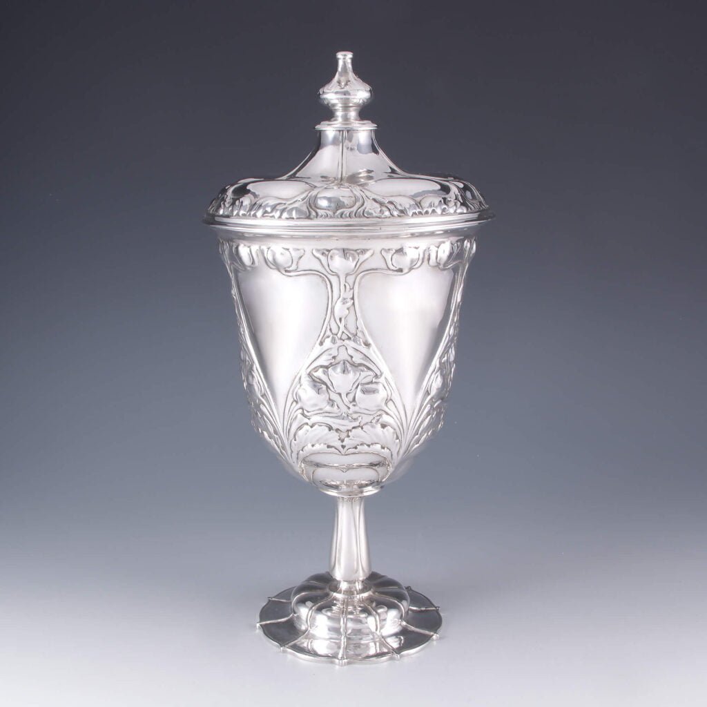
All I was able to find started with the of her presentation vase for the Cymric collection of Liberty and Co Ltd, around 1899. The Cymric name refers to Wales (nowadays it is also a cat!). As it turns out, it’s also a name Coggin used multiple times for different creations of hers. This is the tenuous thread I pulled to discover more.
Her “Cymric” silver cup was mentioned in the magazine “the Studio” in 1904, with enamel panelling designed by Cecil Aldin. Once I had my teeth into this reputable source, I discovered that she was a student in a New Cross School, often being acknowledged in the magazine for decorative metal pieces.
The interesting part of the story is that she is mentioned in the magazine from 1896 to 1905, mostly as a student and for entries to the publication contests.
The wall fountain represented on the museum piece is her entry for the National competition of South Kensington of 1898. The opinion of the magazine is as short as it is positive: “A design for a wall fountain by Katharine M. Coggin (New Cross) is worthy of being carried out, to say more is therefore needless; this admirably gifted student has beaten her record this year” (mentioned in The Studio: An Illustrated Magazine of Fine and Applied Art 1898: Vol 14, p282). The watercolour of the fountain from the MET is reproduced on page 268. I was not able to find if there was a precise theme or if the competition was open to all projects.
Here is the list of Katherine Coggins’ works I was able to find:
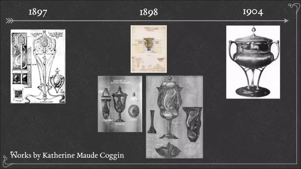
- For the national competition south Kensington, students category, in the “Design for surface ornament” category, she entered what was described as “a very large and broadly treated pattern of teazle heads” deemed “practical and good”, in “The Studio: An Illustrated Magazine of Fine and Applied Art”, 1896: Vol 6, p47
- awards in “the studio” prize competitions, “Honourable mention” in the “design for a cloth book-cover” category, for the piece “Kit” (she is listed as Katherine Maude Coggin, North View, Chadwick Road, Peckham), in “The Studio: An Illustrated Magazine of Fine and Applied Art”, 1897: Vol 11, p134
- Design for a fire screen, in “The Studio: An Illustrated Magazine of Fine and Applied Art” 1897: Vol 11, p254
- Second prize in “The Studio” competition in the “Design for a Silver cup” category, owing her 2 guineas for her piece “Elgitha”, in “The Studio: An Illustrated Magazine of Fine and Applied Art”, 1898: Vol 12, p208 and 210
- She re-used the design (?), or at least the name, on the “Design for end papers” category, where she got an “honourable mention” in “The Studio: An Illustrated Magazine of Fine and Applied Art”, 1898: Vol 12, p285. There is no reproduction of this work.
- and on the “Design for damask table cloth” where she got an “honourable mention”, in “The Studio: An Illustrated Magazine of Fine and Applied Art”, 1898: Vol 13
- Design for a cup to be executed in silver, in The Studio: An Illustrated Magazine of Fine and Applied Art 1898: Vol 14, p268.
- she created a presentation vase for the Cymric collection of Liberty and Co Ltd, around 1899, a variant between of her Elgitha and prefiguring her own Cymric cup.
- “Cymric” silver cup, designed by Miss Coggin, enamel panel designed by Cecil Aldin, The Studio: An Illustrated Magazine of Fine and Applied Art 1904: Vol 32, p344-345
1851 and the South Kensington system
Katherine Coggin scholarship seem to have been a good example of the results of the “South Kensington system”
The great exhibition of the Works of Industry of all Nations in Hyde park in London in 1851 is famous for being one of the first world’s exhibition fair. From the royal attendees to the exuberant architecture of Paxton’s Crystal palace, everything was set to create a magnificent showcase for, well, sellable goods. It created a moment in time where all the production of the “planet” was compared. The United Kingdom, as host, wished it to be a display of its own grandeur.
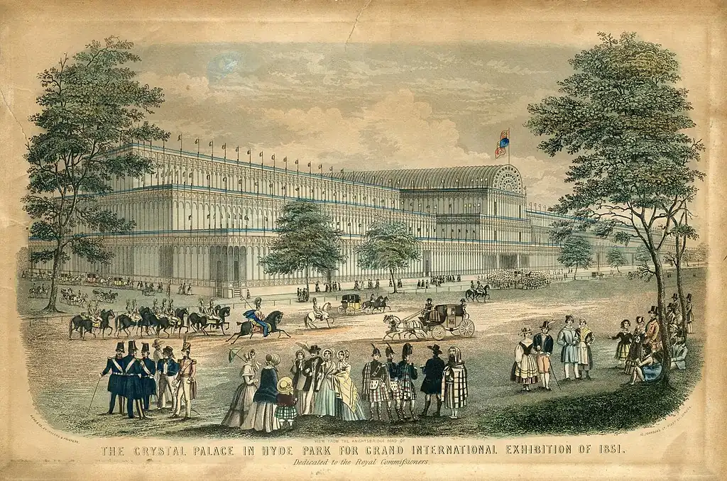

For decorative design industry, it did not really go as planned. The English productions were deemed lagging behind. The subject is, of course, a little more complex, but one of the results of the exhibition was to sent all the English designers back…to school.
The Parliament got involved and inquiries were made as to why and where and who and “are we sure about that” of the situation? Exclamations were made, vehement discourses were discoursed, and dusty networks deep inside the Royal Academy of Arts were asked politely to vacate. 87 acres of land were purchased to create a place where institutions dedicated to art, science, and industry would stand. The “new” South Kensington was born. Having school buildings is good. Having something to teach is even better: a specific syllabus for the teaching of art was issued and various manuals for designs were published, injecting formalism and scientific methods into scholarships. The inclusion of women in the same curricular as men is effective somewhere around 1861 though it is still with “accommodations” depending on the lessons (i.e. “please stick to flowers and pretty things, maybe an occasional knight in full armour but that’s it”).
This national impulse to an artistic and technical renewal lead the way to a new era in apprenticeship. Other similar structures were born, either in opposition like Ruskin’s , or as a modernization of livery medieval traditions like Coggin’s alma mater in New Cross. The sourcese never specified which one it is but I think it most likely is the Goldsmiths’ technical and recreative Institute. The school opened in 1891 as a place of “promotion of technical skill, knowledge, health and general well-being among men and women of the industrial, working, and artisan classes”. It eventually merged with the University of London in 1904.
What to do, or, mastering the art of educated guesses
Once more, we are in front of a project that despite being formalized is lacking on the precision part. I think what it is will nowadays be referred to as a “concept art” piece, though particularly detailed. We need to take it to the pre-production stage, so we will have to make accommodations while not straying too much from the artist’s vision.
Hitting a wall
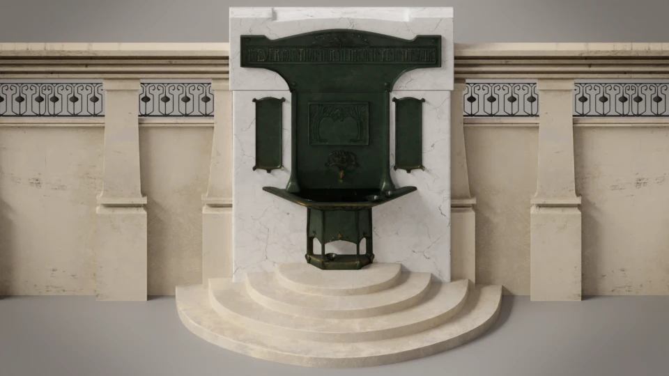
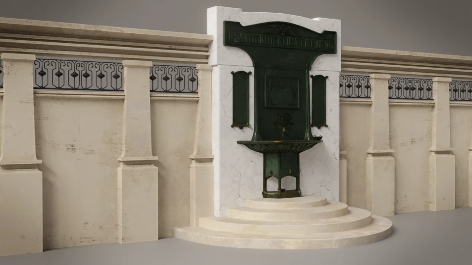
The reference watercolour shows a large white marble wall on top of a flight of 4 semicircular stairs. The fountain itself is a large expanse of bronze with a wide and shallow basin on four legs and four part canopy on top, displaying inscriptions and motifs. The artist has given us a detailed view of the ornaments on the very top and the one around the spout. She has also given us side views and cuts of some profiles.
This is an architectural statement. I’m not sure that I understand the balustrade’s role around the fountain itself. Is it supposed to be a split-level topography ? Then why is there what seem to be a side view on the right side where it looks encased in the surrounding pillars? Why not create a definite end to the side walls, then ? Remember, we don’t know the circumstances on which this piece was created. Maybe there was a fixed location in mind for the fountain, where this conformation makes sense.
I’m afraid I will have to make choices that may not coincide with the artist’s vision. I’m choosing the split-level topography because it is the one that makes the most sense to me. But maybe you, dear reader, know more about it ?
The writing on the wall
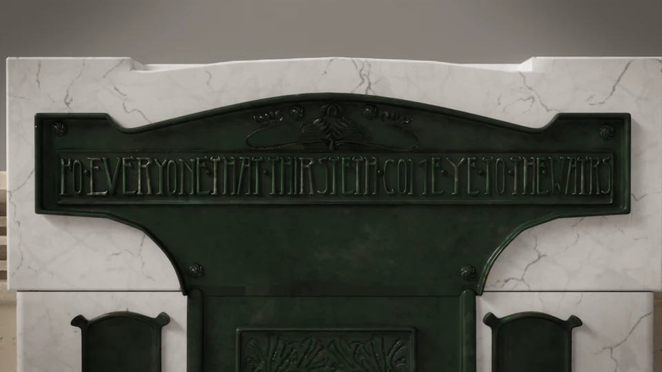
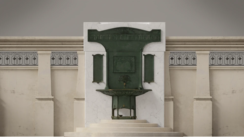
The only inscription present is at the top of the frontispiece. It reads “ho everyone that thirsteth come ye to the watrs ” (sic). This is a bible quotation from the book of Isaiah, in the old testament, 55:1.
While an understandable reference when a fountain is concerned, this is also on par with the overall altar impression given by the design. The basin itself is the altar itself, the canopy panels act as an altarpiece and the not very practical steps leading to a sacred space place, above the ground.
There are mentions of the side panels as being tablets for inscription, and I suppose it would have been let to the client’s discretion. As I can’t think of something deep and meaningful to say, and I suspect ulterior motive from the artist, I will let them tastefully blank.
As well, the central panel’s motif looks like trees and I think they echo the base of the basin, but they lack the refinement of the other motifs. Maybe it was detailed on another drawing ?
How to do it: a 3D reconstitution process
Disclaimer : this is an exercise, shown for documentation purposes only
Model the shapes
Once all the elements are identified, the modelling phase is relatively straightforward. The toughest part to deal with are the vegetal vines decor, but nothing a resolute spline can’t solve !
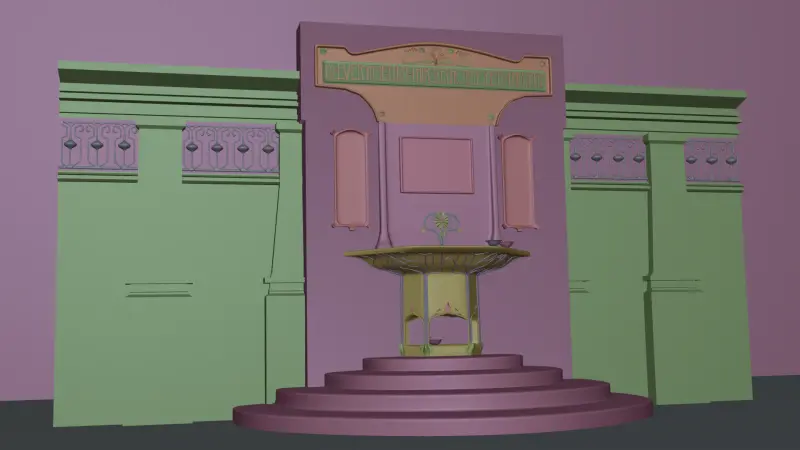
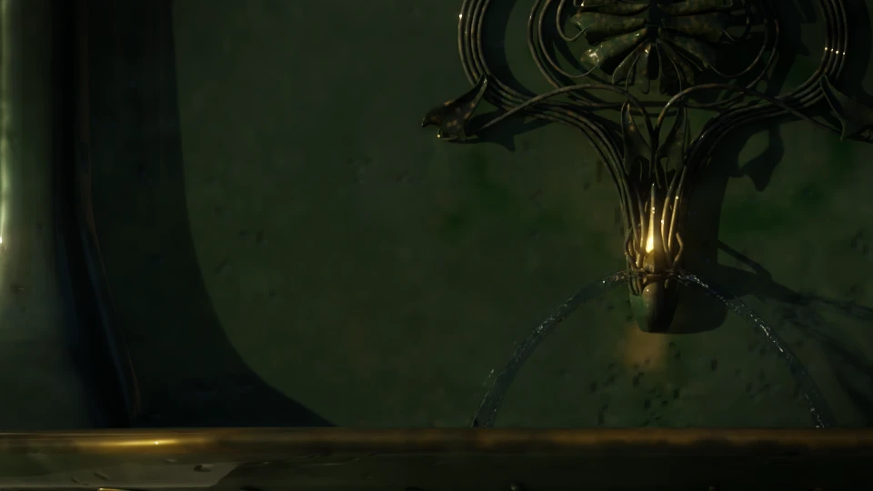
I encountered one issue, though: the spout as the artist draws it on the fountain and the details she gave about it do not coincide. To mitigate the situation and allow for the stream of water from the spout to be seen, I chose to put the whole block slightly higher than is drawn.
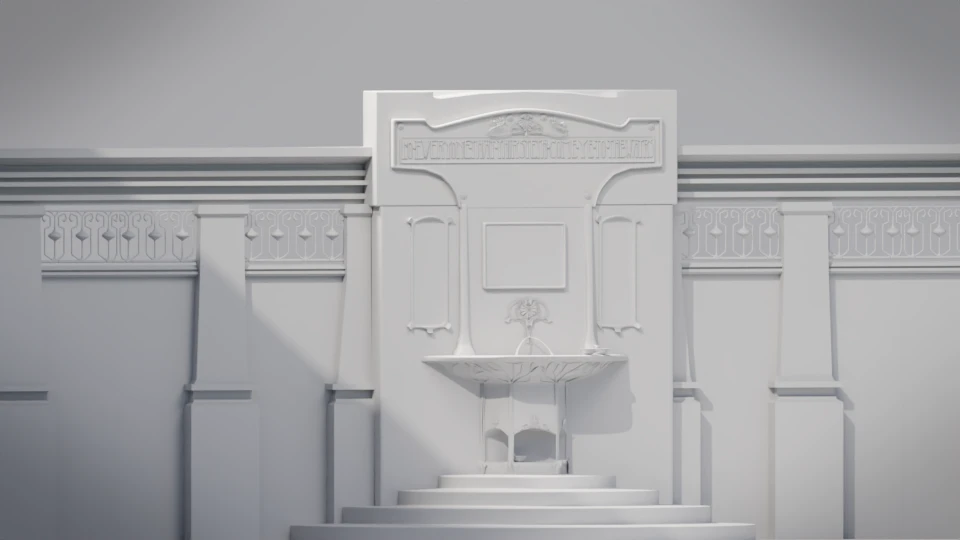
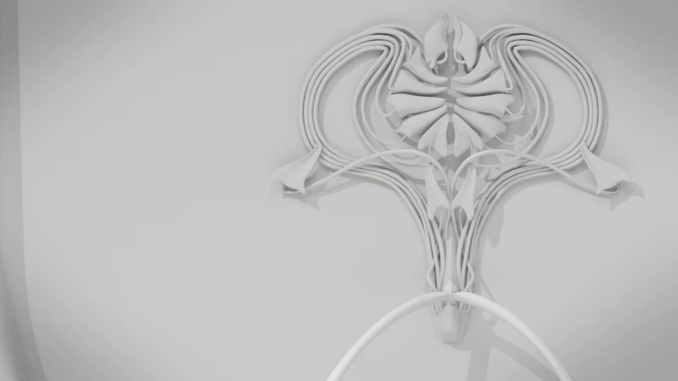
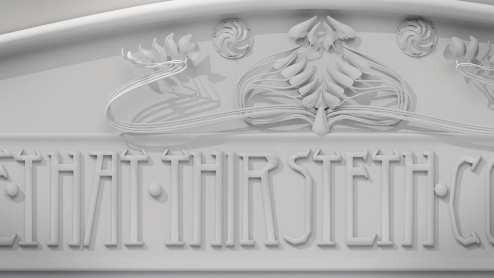
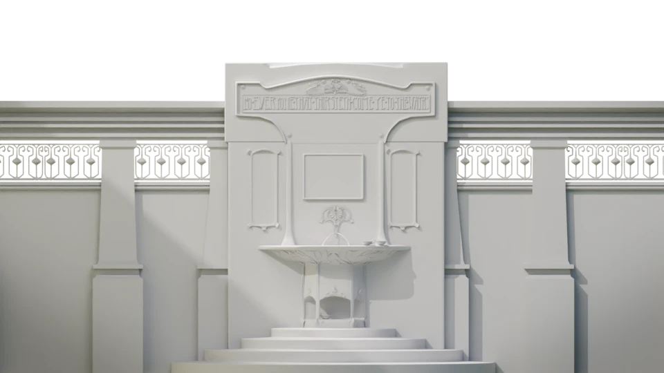
In order to speed up the overall process, I tried to dutifully create the UV maps as I went. I found that it is easier to deal with this part of the exercise this way.
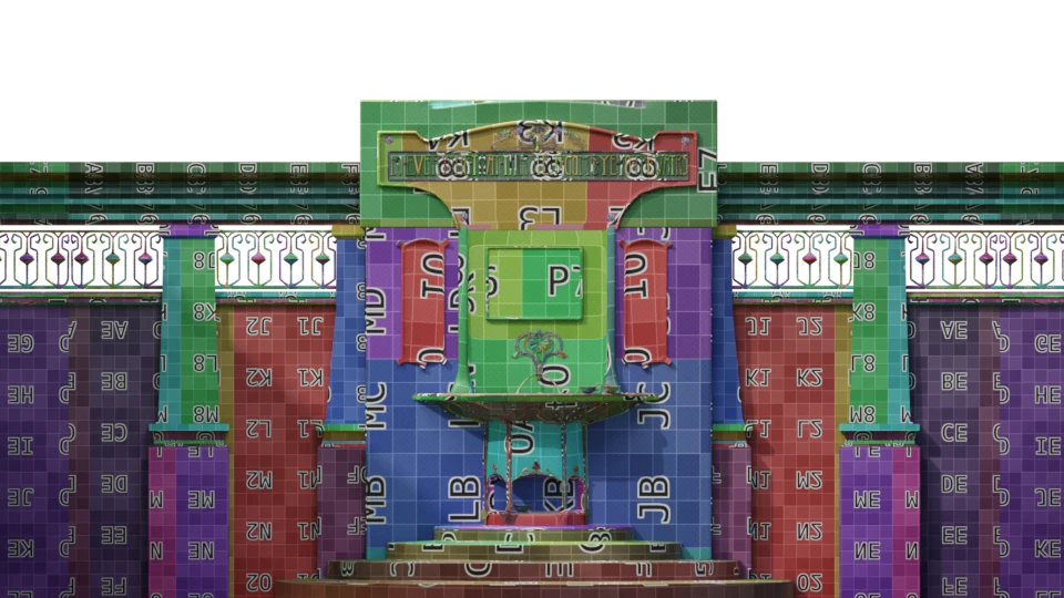
Texture the shapes
For once, all the textures of the model are done in Substance painter. The main reason is they need to be unique, and I want to be able to control the accents of colours precisely. I worked with slap-dash node made textures to find the shapes and camera angles, but I feel the final render needs a more personal approach.
Not stones left unturned.
My researches were really not very fruitful in the stonemasonry area. I couldn’t find a definite answer to the question of the usage of stones on public monuments at the time. I tried to see what other monuments were available at the time and might have inspired the artist, to no real avail. Everything is blocked under the generic “marble” name. I’m at a loss for a specific type, a preferred quarry… The English weather is not the most accommodating, and there is for certain historical best practices in that area.
I’m afraid we’ll have to make do with educated guesses.
I think the most accurate thing to be done is to pick a white-grey marble for the wall behind the fountain. Then, we can use a lower grade, more atoned coloured marble for the steps. That would theoretically give us the tonal effect of the concept art, while at the same time keeping the contrast emphasizing the dark fountain.
Bronze, patinas, and alterations
It is interesting that the artist picked bronze as a material for the fountain. This is particularly expansive and the trend at the time was to use the cheaper cast iron, as for the Wallace fountains in Paris (1872 onward).
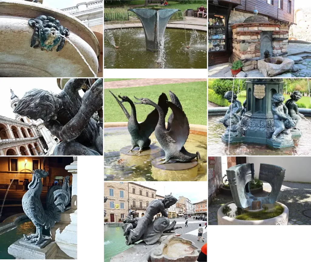
My main concerns about the bronze texture are the golden tones on the artist’s render. They can either be a drawing trick for values and shadows to mimic light rays on the surface or a texture wish where the golden bronze is seen in places amidst the dark green patina.
This may seem trivial, but the overall effect will be dramatically different.
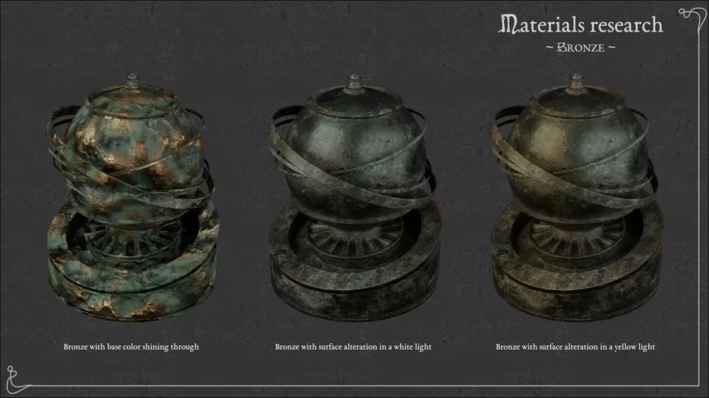
The last example looks the closest to the watercolour render. Still, I think I will keep the idea of the golden colour shining through.
I think we can obtain a more realistic look by placing these areas where the fountain is touched the most by the passers-by. The patina and the alterations recede there. This a well known and seen results on all public bronze statues and reliefs.
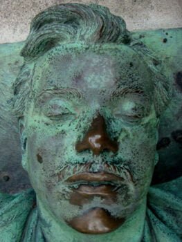
Shine a little light: stills renders using blender
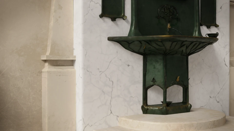
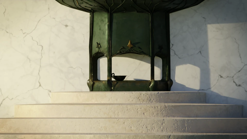
All together, now, here is where we’re at.
Interactive rendering
I thought about if for a while, and I think we will do things a little differently this time.
Because I want the model to be web-friendly, I need the lowest size possible. But the nice vines and leaves asks for a huge computation price in order for you to get decent close-up possibilities.
There is, however, an independent element that is present on the original drawing, but that is not easily seen if at all. The leafy cup !
So, because I happen to like it, I will try to make this one available to you.
All hands on code with a little help from blender
Process
I had to do a little more modelling to obtain the shape of the cup and a little bit of texturing to make sure the cup is pretty.
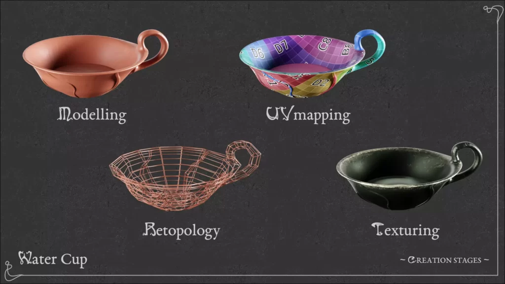
I took the opportunity of working on this model to test out the newer version of three.js. Furthermore, I may have played way too long with the .iridescence class and its affiliates. Shiny things have an effect on me.
Code lines
Here are the most relevant lines of codes behind the materials of the model in the web viewer. Remember that I’m working with a JSON file to feed the model to the viewer, so the syntax is irrelevant here. Just gather the information you need from it !
      "textures": {
        "map": "./assets/models/coggin_cup/textures/coggin_cup_diff.webp",
        "normalMap": "./assets/models/coggin_cup/textures/coggin_cup_norm.webp",
        "roughnessMap": "./assets/models/coggin_cup/textures/coggin_cup_rough.webp"
      },
      "values": {
        "normalScale": [
          0.3,
          0.3
        ],
        "roughness": 1,
        "metalness": 1,
        "iridescence": 0.1,
        "needsUpdate": true
      },
      "modules": {
        "side": "frontSide",
        "envMap": "hdrEquirect"
      }
    },
    {
      "name": "water",
      "textures": {},
      "values": {
        "roughness": 0,
        "transmission": 1,
        "thickness": 0.01,
        "ior": 1.35,
        "envMapIntensity": 1,
        "needsUpdate": true
      }
3D view
Disclaimer : technical limitation to material render in web app can let artifacts show, particularly in zoomed views.
See the full screen view (this will open a new tab in your browser).
Context
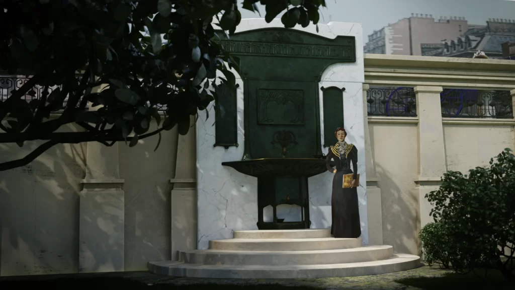
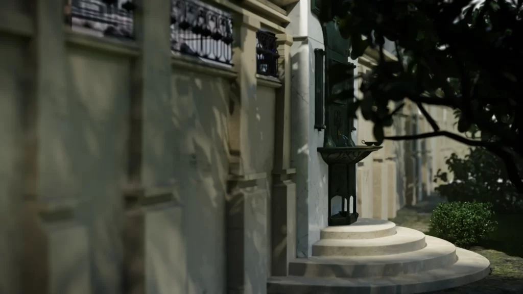
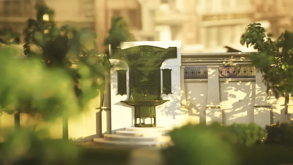
Because we can, here’s what I imagined Katherine Maude Coggin project might have looked like.
Credit
Frayling, Christopher: The Royal College of Art, One Hundred and Fifty Years of Art and Design, 1987, Barrie & Jenkins, London
Victor Noir gisant’s head, via Wikimedia Commons, Mamiejeanjean, CC BY-SA 3.0

Lady at the top of the steps, extracted from Penfield, Edward. “Harper’s Christmas number.” Print. [1893]. Digital Commonwealth (accessed November 27, 2023).