

Mascaron, beer and bubbles
The following texts and images are the results of a training exercise to go from the pictures or the description of an artifact to the creation of a 3D digital double, sometimes restored version of it. If you wish to know more about the process, every explanations are in A journey into learning a (3D!) restoration process workflow article.
This time, let’s dig into an interesting yet different exercise. The piece itself isn’t complicated. The catch is that there is only one documented image of it, with little to no context. A white and black image that I’ll have to use a reference, for what is probably a colourful piece. So, most of the work will be making educated guesses as to what could its colours be.
The other difficulty will come from the material itself: glass. No risks of breaking it digitally, but plenty to not render it convincingly enough.
This particular piece is part of the Met museum collection online catalogue. Despite my best efforts, I couldn’t find a coloured image of it or a contact that could confirm this hypothesis… It’s funny to think that the result is as uncertain as most archaeological renderings are for a not so old piece.
Anyway, if any of you, dear readers, have more information on the piece: please let me know !
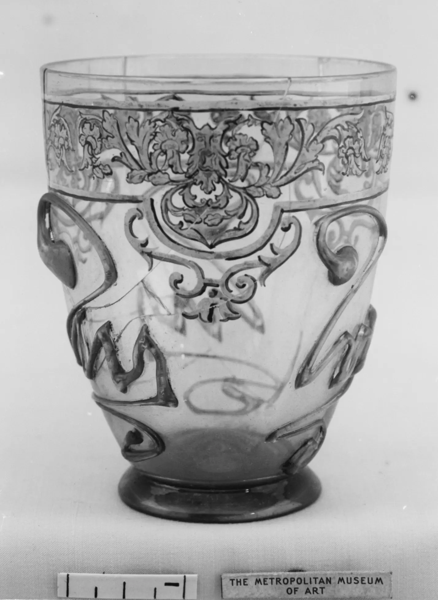
Title: Beaker
Datation: 19th century
Provenance: possibly German
Dimensions : Height 9.5 cm
Media: Glass, enamel
Source: Accession Number 91.1.1208 (Metropolitan museum of Art)
Description and Historical context
Think of a hedgehog
The beaker’s form
A beaker is a small round drinking vessel shaped to be held in the hands, mostly described in the context of beer consumption. It is common from European medieval archaeology up to the modern times. Nowadays, the term “beaker” is more frequently used in scientific laboratories, though most of our drinking glasses can be called thus.
The etymology of this word is uncertain. It could come from the Old Norse “bikarr” or the middle Dutch “beker” both referring to “an open large mouthed vessel”.
There are numerous examples of medieval beakers in public collections, such as this one from the Corning museum.
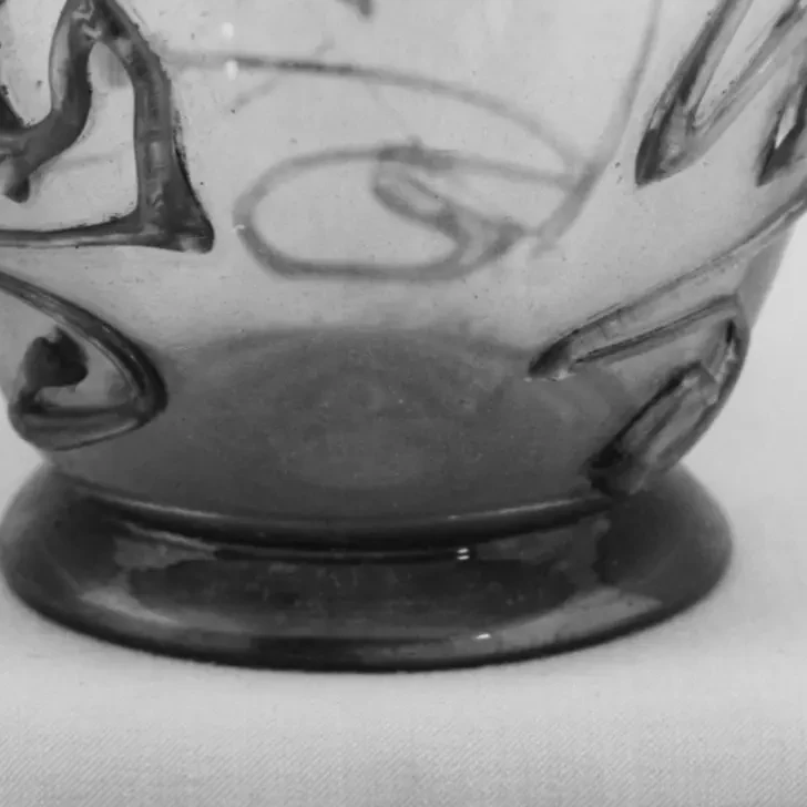
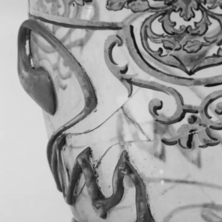
The shape looks semi-mechanized (maybe moulded?) with an almost perfectly even thick lip. It seems the puntil scar is still present, therefore human hands probably finished the general shape before adding the decorations.
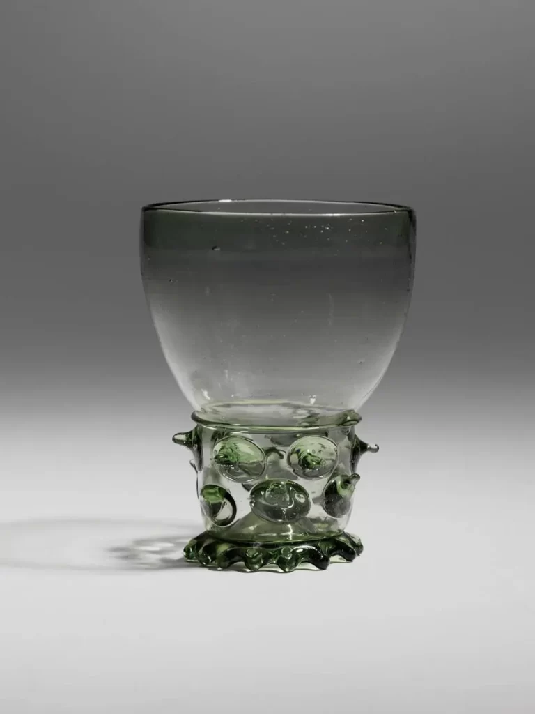
Prunts
Prunts are small blobs of glass fused to another piece. They have a decorative and practical function because they help with prehension. Think greasy hands and slippery beer glass: no one wants a good evening ruined.
They are commonly seen in German and Slavic glassware, like rummers and berkemeyer. Beakers with applied melted droplets are the most typical medieval beaker type, like this example also from the Corning museum.
Prunts are not that common on beakers after the Renaissance. On our piece, the prunts are taken to another level. By making their tails long, the glassmaker has created 4 paraph-like reliefs decors all around the circumference of the beaker.
Painted Decor
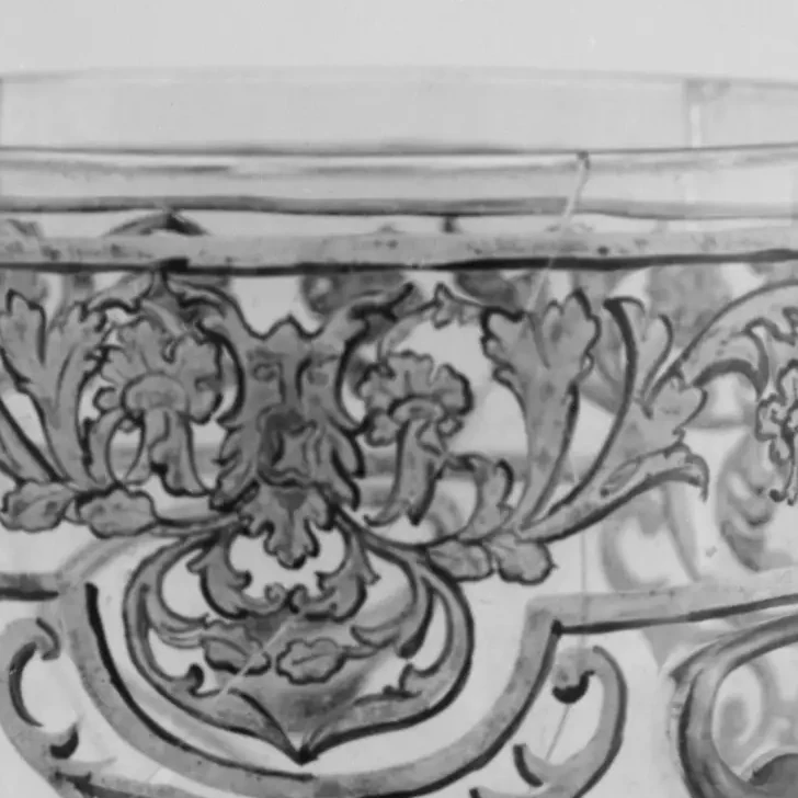
The beaker shows a classical decor of mascarons, along the lines of the green man figure amidst vegetal ornaments, positioned a little way under the lip and scansioned between the prunts.
The seemingly two tones decor may have been hand painted. There seems to be dents left by heterogeneous brushing of enamel to flood the larger white parts.
The image being black and white, it doesn’t allow us to know what tones, if any, are used. Collections around the world preserve pieces, going from the more ancient grisaille-like monochromes to really colourful pieces like the Imperial beakers.
The museum datation of the piece outside the bulk of the production era makes it a craft piece. Therefore, one cannot exclude that it was subjected to the gilding trends of the XIXth century in Europe. When in doubt, make it bling !
According to the Victoria and Albert Museum :
“gilding involves decorating a glass object by applying gold leaf, gold paint, or gold dust to its surface, which is then fused during firing. Gilding can be applied in numerous ways: gold can be combined with mercury to form an amalgam that can be painted onto the surface; gold leaf can be applied using a glue named ‘water size’; or gold leaf can be picked up on the hot glass when being shaped on the marver before the object is blown.”
I deliberately choose to discard the hypothesis of a reverse painting decor (Hinterglasmalerei) because it is not suitable for a drinking vessel. But if the piece was meant only as a decorative one, I could be wrong in doing so. This idea seems preposterous at that point, but do bear in mind, dear reader, that I’m endeavouring to reproduce the decor. Therefore, the order with which the layered decor is applied may have consequences for the final render. The overall effect might be ruined if I’m not following along.
Final observations
It is a skilled work of art. It’s a refined piece, and the number of techniques demonstrated makes it a precious one.
The museum datation of the piece places it in the 19th century. Mechanized glass production was already fully functional then. It leads to thinking this particular piece may have been a part of the pastiche trend, whether commissioned as a single unit or coming from a small (and probably pricey !) production.
Visible condition report
The beaker shows hairline fractures and cracks all around. It is unclear if it is still in one cohesive piece or if it has been restored from fragments.
The decor seems globally unaltered. The darkening patches on the lighter layers could be photographic artefacts coming from the uneven surface. It can also be dirt or alteration of the enamel layers.There seem to be dirt accretions on the prunts.
Creating a 3D model of the piece
Disclaimer : this is an exercise, shown for documentation purposes only
What to do : digital restoration choices
No more cracks
As I have no certainties as to the colours of the piece, I’m choosing to make educated guesses after comparing this piece to others in public collections.
First, the obvious: let’s get rid of the cracks and hairline fractures that pollute the overall effect of the piece. This is easily done by, well, not doing them after the overall shape is done. It will be a treat because however skilled a conservator is, there is no way to make them disappear on the piece itself. With tremendous work, a healthy material budget and sufficient time, it can be mitigated and become almost ghost traces under specific lighting conditions, but that’s the extent of it.
However, I don’t think giving it a perfect modern finish is a good idea. It still is a two centuries old piece after all.
Colourisation
Then, the elephant in the room: what to do about the colours of the different elements ?
I’ve decided on a green colour for the coloured glass. Contrary to medieval examples, there does not seem to be a shift in hue from inside to outside on this beaker. On the picture, the colour seems homogenous without shifts in reflectance. Is it because of a higher pigments concentration ? An industrial grade quality (here that means “constant”) ? Or a better mixing of it in the molten glass? Or linked to the difficulty, at that time, to light the piece for the picture to have this effect ? Too long time in the development tank, over extending the contrasts of the picture ?
I don’t know.
But it will be green.
And because, this is becoming a guessing game at that point, I’m going to have two versions of the decor. One sticking to the black and white theme and the other will be done the gilded way, as an accent for some darker parts. It will probably be funky looking, but grisailles makes me sad. The digital creation process allows for try-outs without consequences for the actual piece, let’s make good use of it.
How to do it: a 3D reconstitution process
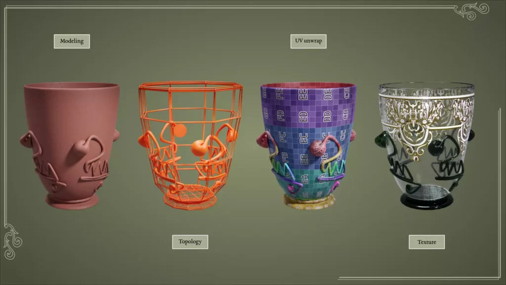
Model the shape
The overall shape
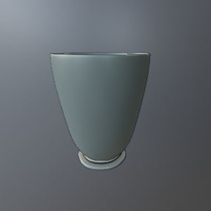
The overall proportions are easy enough to extract from the picture. The precision level is lessened because of the unknown effect of the lens aberrations and the emphasizing effect of the slight high-angle shoot.
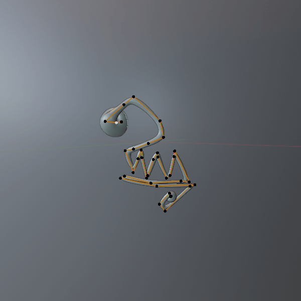
The prunts are more difficult to model because the image only gives partial views of them. Because the glassmaker used the outer points as anchors (think icing decorations on a cookie) most of the lines of the lower parts of the paraphs are straight. The uneven thickness comes from the glass thread being unevenly pulled. The indentations on the sides comes from the put down molten glass setting itself on the surface. I choose to use a Bézier curve to model a basic shape, shrink wrap it to the surface of the glass and convert it to a mesh to tweak it to conform to the picture.
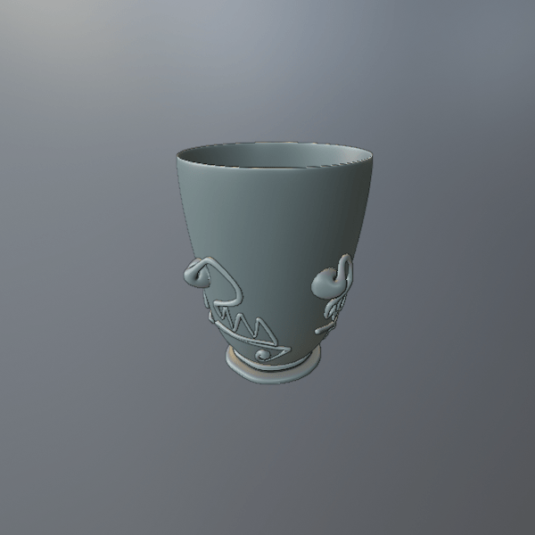
Which rendering method to choose: to bump or not to bump.
The materials of this model make it a slick and smooth one. The dents and asperities of the surface cannot be too prominent. Therefore, displacing the mesh points physically will not serve any purpose. I’m going the normal and roughness map way, i.e. bending only the light to create a bumpiness effect on the surface.
Texture the shape
Note: Maps are basically information encoded into images. It gives the computer information about the material, so it can render it as you want it to.
All the pretty bubbles
Because the material is transparent, most of the work will be done internally by Blender. for this project. However, upon close inspection of our source document, this piece of glass isn’t perfectly transparent. There are bubbles and speckles inside the material.
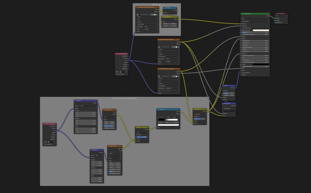
There are different ways to tackle that part. After many (many many many) tests, I decided to go two different ways, a regular roughness map for the speckles and a PBR material for the bubbles. Mainly because I wanted to try my hand at the latter, and also because I wanted Blender to deal with putting the bubbles at the appropriate places.
These bubbles are formed by gases trapped inside the cooling material. These occur “naturally” everywhere, but are mostly present where the material is thicker and more worked upon. On this case it seems to be the foot, the base of the chalice and a little on the rim. The prunts probably have some too, but the image does not really let us see that clearly. So, what I expect from the PBR material is to randomly put bubbles according to a “map”: a mask in that case. It’s a gradient indicating which parts of the overall shape should have more bubble concentration. The overall effect is achieved by mixing normal and roughness maps.
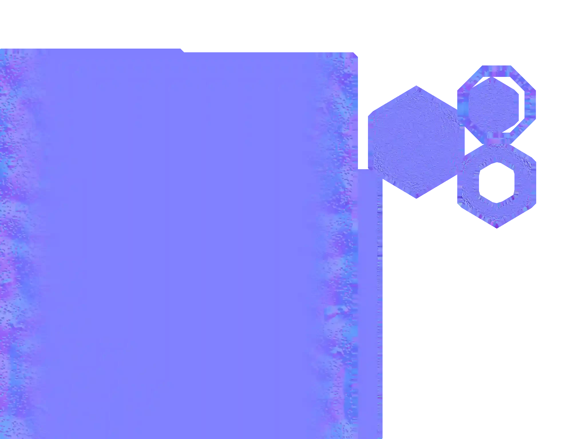
For the ones among you interested in this kind of things, here’s the noodle soup recipe I used to create it:
This is what this gives us:
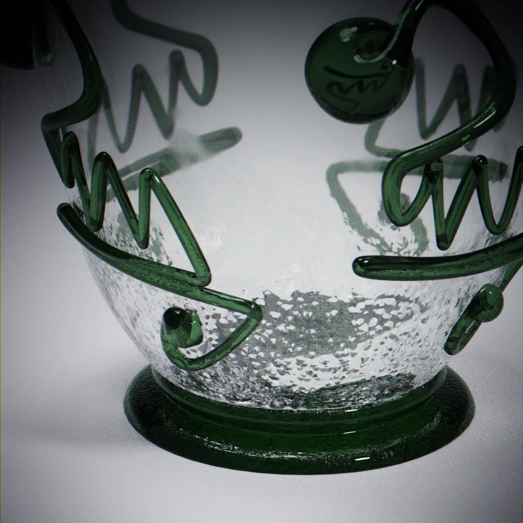
The PBR part can certainly be improved, particularly in the shaping and reflectance of the bubbles. This is an exercise, and I’m learning as I go !
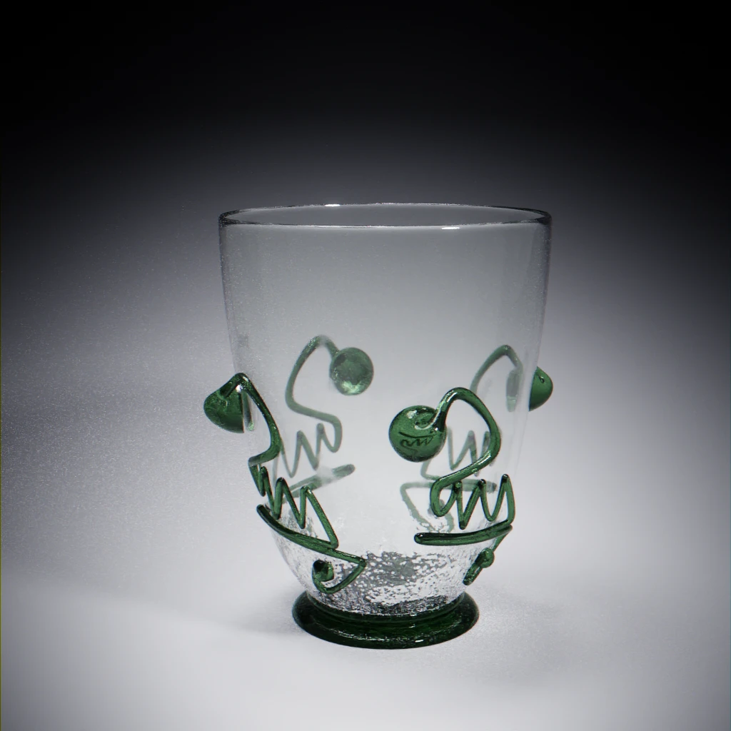
Combining everything, here’s where we’re at so far:
Grab your brushes, we’re going painting !
Last and definitely not least, let’s tackle the painted decor.
I could try to delineate the decor in a photo app to retrieve it, then placate it on the shape as a decal. Sadly, the image does not allow that. It is not high enough in definition to yield good results and, above all : it doesn’t show a full element. All we can be sure about is that a seemingly identical decor is repeated 4 times around the glass.
I’m going to assume it is the same decor. Again, that might be false, but that is all the information I have. I’m keeping the idea of the “decal” though, and I intend to put it on the glass, letting Blender deal with duplicating it and making it go along the curvature of the glass.
But, yes, there’s no way around it: I need to re-create it from scratch first.
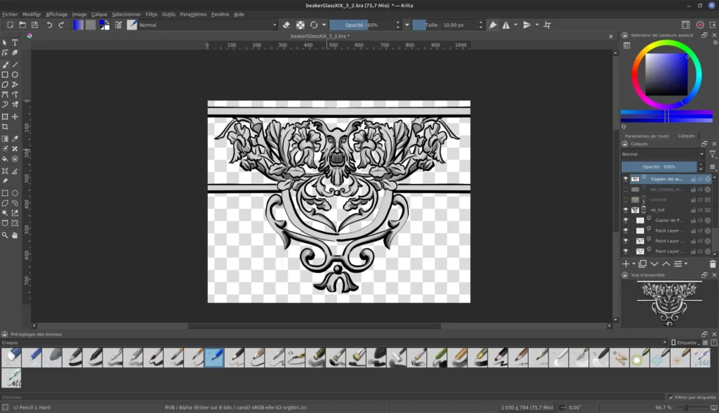
So, let’s fire up Krita and start painting, using the image as reference and mirroring things at first in order to speed up the process. Once the main parts are in place, I can come back and refine the details.
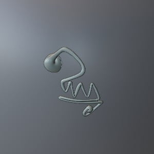
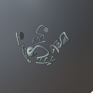
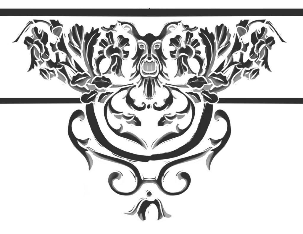
Here’s the base, lines and hints of shading:
From that base, I can grab masks to target the outline or the colour blocks, as well as the base for a coloured version (remember the bling !).
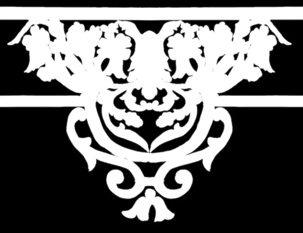
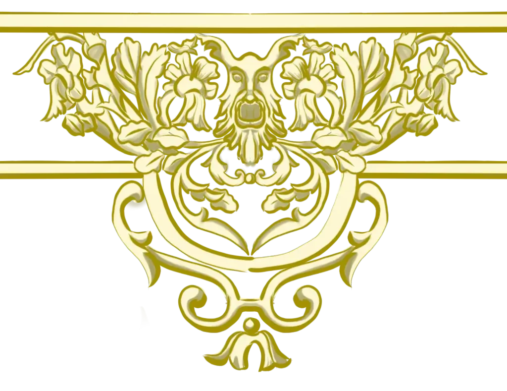
Once back in Blender, it’s time to tweak and polish things up.
I couldn’t make the initial plan on making decals for the decor work to my satisfaction. After many tries, I choose to use a new simple cylinder enclosing the glass where the decor should be. It will act as a screen on which I intend to put the decor.
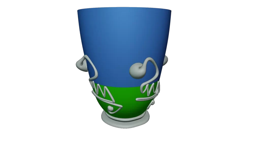
Then I’m using the image in a simple PBR material to repeat and position it, with alphas enables (i.e. allowing for transparency). This worked really well, apart from a section at the seam of the mesh’s UV map where the bottom straight lines pinches a little. I’m not quite sure what gives this effect. A little UV tweaking and it is almost invisible.
Here’s the noodle recipe for the decor part:
We’ve now completed the modelling process.
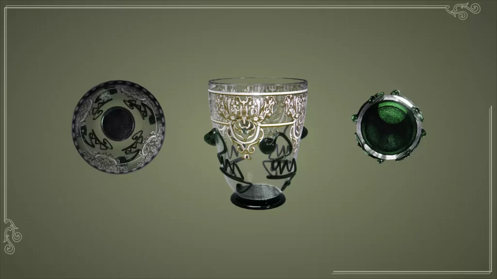
Shine a little light: stills renders using Blender
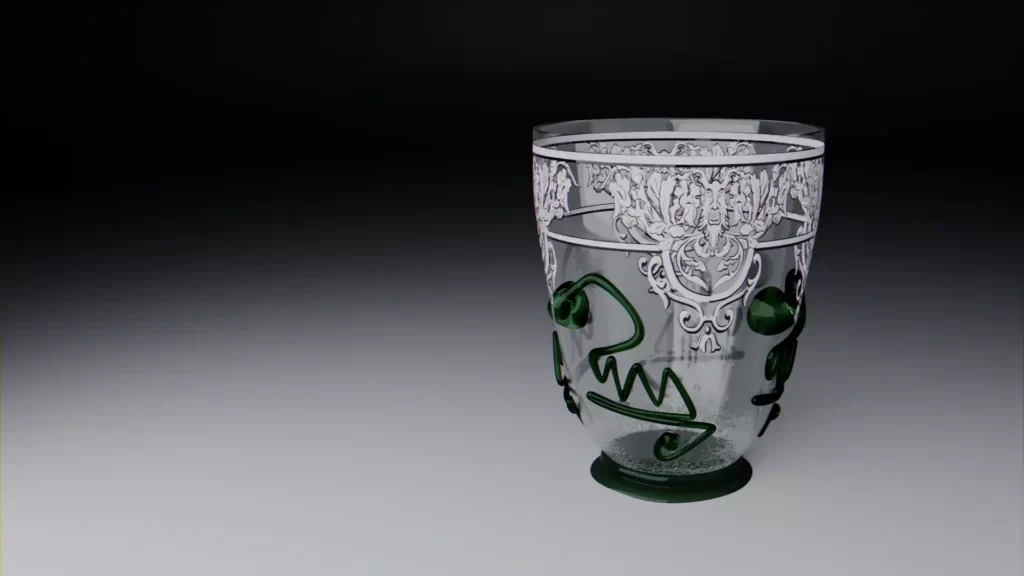
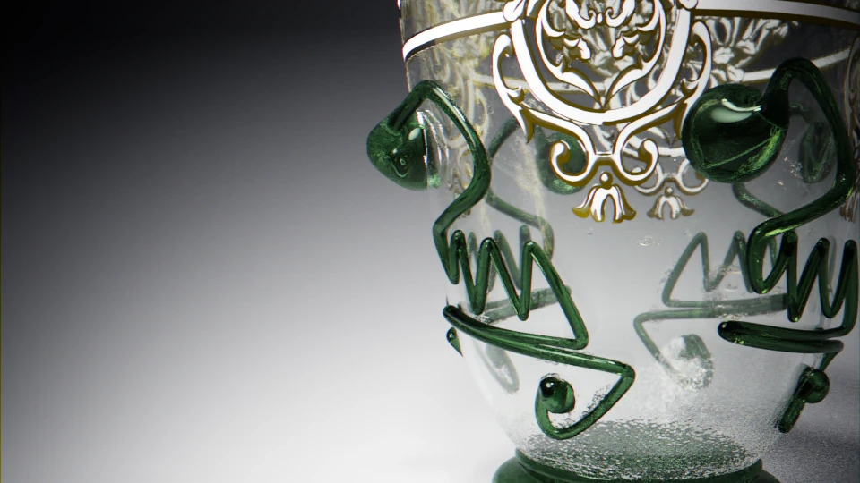
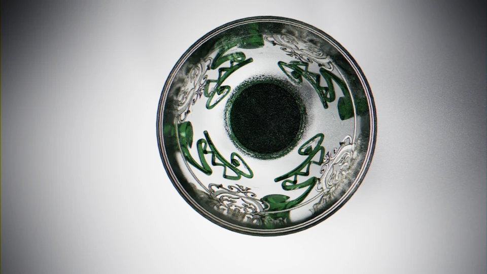
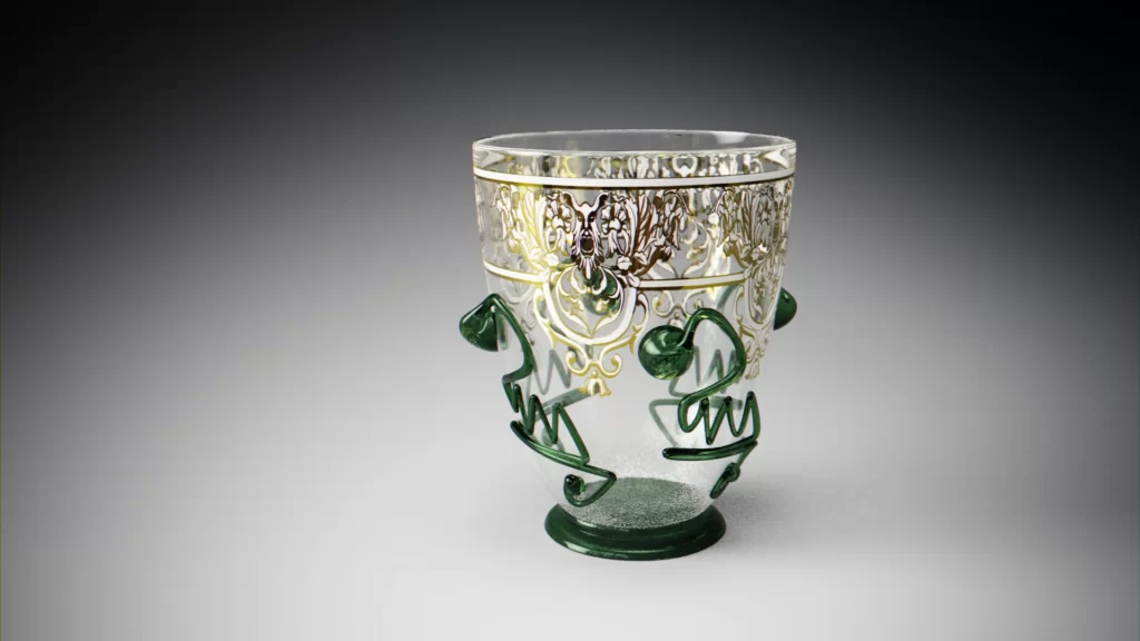
Interactive rendering
All hands on code: making the model web available using Three.js. Or not ?
If you’ve read other articles on this blog, you know this is the part where I go into code lines to try and translate the model into a web browser experience.
The principal issue here is I need transparencies, depth and blending of opaque elements on the same mesh.
The decor needs to be seen on the outside of the glass. It also needs to show the prunts from the other side of the viewer as well as from the inside of the glass, with a variation stemming from the shape of the beaker.
After many many many tests, tryouts and as much despair, I am not able to show you the results as I usually do.
GPU’s computing comes with a limitation: depth (how far an object is from the camera) and blending (transparency) do not work together yet. So, I had to tweak, approximate and most certainly go away from the strict physically based concept. The results were less than satisfactory.
There is maybe a solution in creating a texture in a glsl shader from scratch, particularly because it may be able to use the light information and influence the renderer.
I won’t do it because I have no solid idea where to start building on that concept, and transparency remains a difficult subject for real time renderings. I mean they do, indeed, do transparency perfectly well. There is the catch : it is a perfect one. The result is picture perfect in a brand new glass fresh from the factory kind, no matter how many roughness and normal maps you throw at them. At best, this blocks out the transparency. That is not what I’m looking for here. Furthermore, it doesn’t allow applying the painted decor: I’m not sure why, but it ends up being blurry from afar.
Secondly, it won’t integrate seamlessly with the Seshat3DWeb viewer concept I’m using on this blog.
So, l acknowledge my limitations for now, save it for another time, and move on. I can revisit that model when my skills have grown. Hopefully, maybe.
Context
Now that we have a digital version of the piece, let’s try to put it in context. Well, in “a” context, provided we can actually find one.
…
…
Okay, okay, this is sort of a pastiche piece.
So, let’s do a pastiche context !
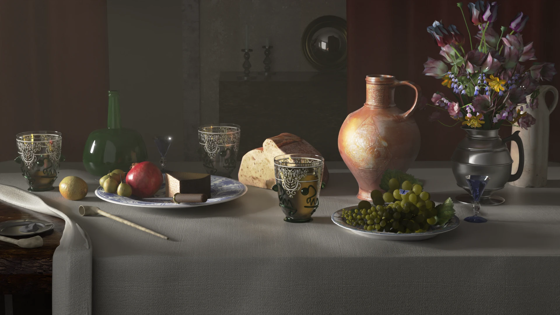
I’ve always admired Dutch and northern painting schools still lives of all periods. Not so much the gamy and warrish pieces, but rather the flowers and memento mori ones. I thoroughly enjoy the intellectual game behind them. Let’s try to use their vocabulary to create a piece of our own.
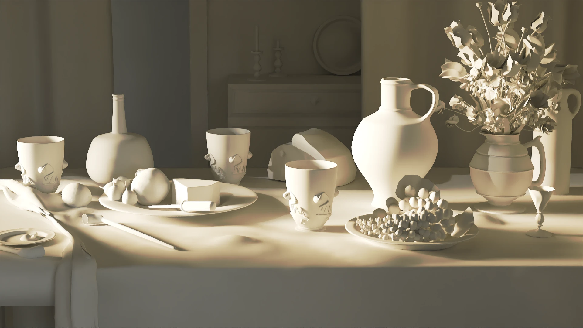
If you want to know more about the creation process of this piece, this article will try to answer some of your questions.
Cabinet de curiosités
How about trying the motif for yourself ?
It is versatile and can fulfill (almost) all your mascaron’s need !
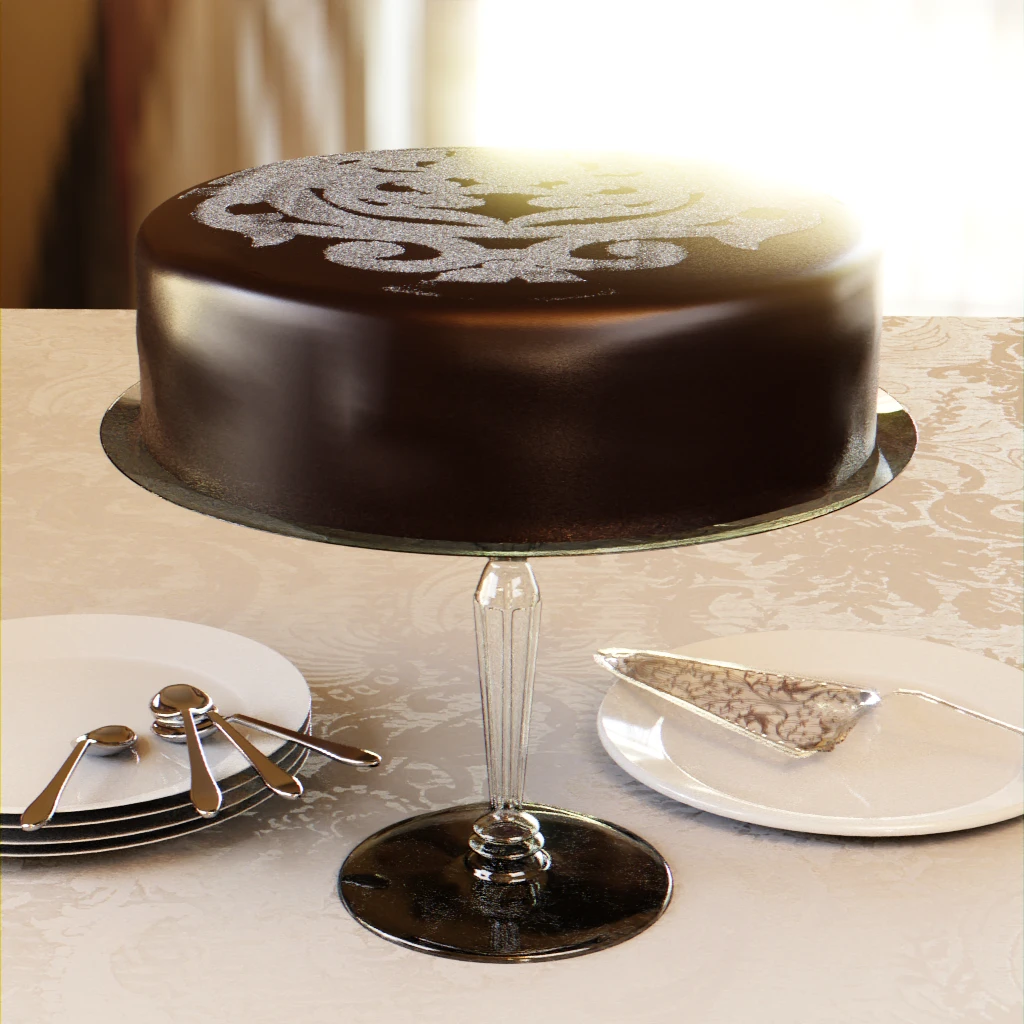
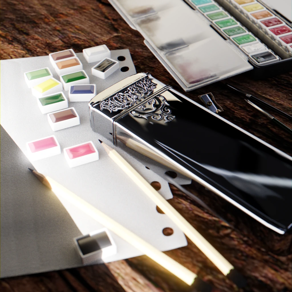
Your turn to play ! You can find the motif file following this link.
Credit
The pudding trowel reference can be found in this place.