

Of fish and glass
The following texts and images are the results of a training exercise to go from the pictures or the description of an artifact to the creation of a 3D digital double, sometimes restored version of it. If you wish to know more about the process, every explanations are in A journey into learning a (3D!) restoration process workflow article.
Let’s play with something different today.
What if we can try to create a digital version of an artefact from a sketch from one extraordinarily famous artist ? This is both exciting and terrifying at the same time.
On the plus side, there’s bound to be loads of documentation to guide us. On the not so plus side, there are also a lot of expectations on a project like that.
But, what can I say ? I do like dem fishies !
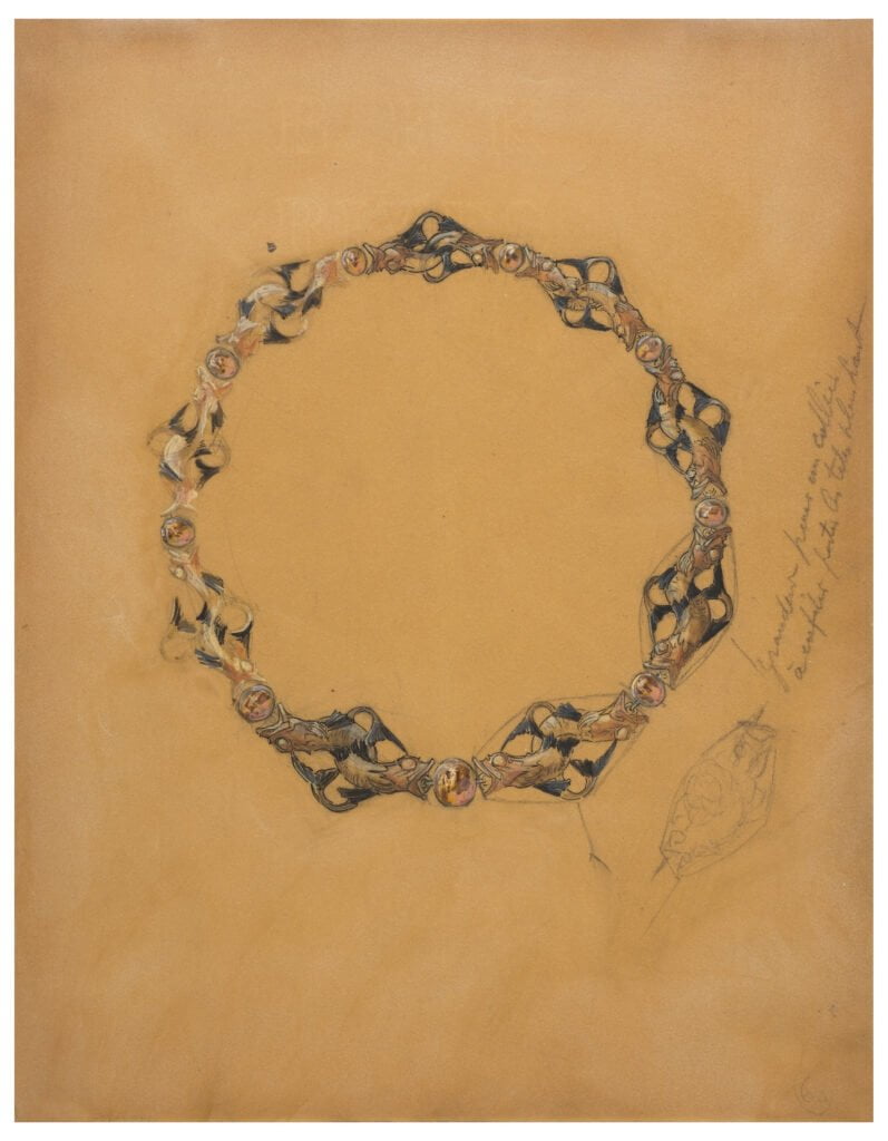
Title: Design for a necklace with pairs of opposing fish with tails entwined in diamond shape on either side of opals. Line drawing at lower right of one of pairs with inscription running diagonally above it.
Author: René Lalique, French, 1860–1945
Datation: 1900–05
Provenance: Paris, France
Dimensions: 28.3 x 22.1 cm
Media: Graphite, brush and gouache, watercolour, pen and black ink on discoloured wove paper, possibly treated with resin
Image source: Wikimedia Commons
Institution preserving the piece: Smithsonian museum, Accession Number 1994-29-1
Description and Historical context
A gifted jeweller turned glass poet
Right, right. René Lalique. Right. Maybe I’ve bitten more than I can chew, here.
I will not be making a small biography of him because I wouldn’t be able to do it remotely accurately and there are many -many- people doing it awfully well already. I strongly encourage you to give them a read, it’s well worth your time.
Let’s focus on the period the reference drawing was made, 1900-1905, to limit the scope of our research. The 1890s-1914 era sees the apex and decline of the “Art nouveau” in the Parisian Belle époque. It is a time of change and renewal, both artistic and social. The late XIXth century have created very wealthy industrialists. Their patronage is what allows artists to develop ideas and concepts on every media, last but no least jewellery.
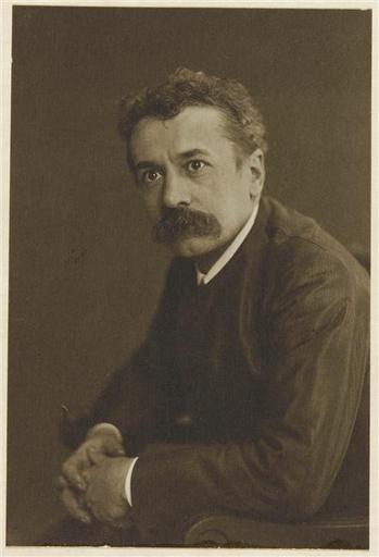
Wikimedia Commons
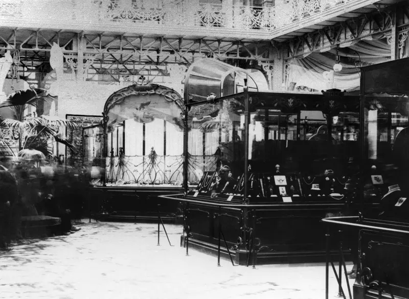
The relationship between patrons and artist is particularly well illustrated by the exchanges between René Lalique and the oil tycoon Calouste Gulbenkian. As in the latter bought almost every uncommon pieces Lalique made during the 1900-1912 period or so.
There are pieces of that period in most of the famous museums around the world but the Calouste Gulbenkian museum in Lisbon houses the highest number of them.
The shift towards glass
As the Lalique museum puts it, Emile Gallé -famous French glassmaker, ceramist, and cabinetmaker- called him “the inventor of modern jewellery”.
This sobriquet is grounded on both the shapes and forms of Lalique’s designs but also by the use he makes of common materials, like horn, ivory, semi-precious stones, enamel, or glass.
Authors seem to agree that there is a shift in Lalique’s work after 1910, sometimes seen as early as 1907, towards glass. First, he incorporates it with other materials as early as 1902 on designs like the “Ferns” necklace, then he uses it as the only material. Authors seem to suggest that the transparency and the way the material uses light is what was fascinating to the creator.
First, a disclosure. I couldn’t find a definite answer to whether or not the piece was ever created by Lalique. We know for a fact there are many drawings that were turned into actual pieces. We also know some didn’t.
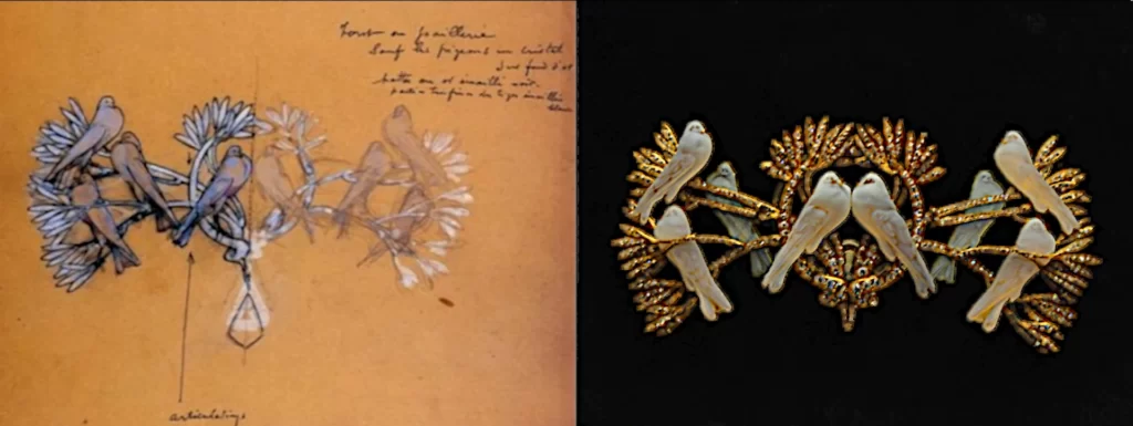
The first of my hypothesis is that this piece was never created. Of course, if any of you, dear readers, know more about this subject, please reach out !
Now, you might be wondering why this is such a big deal. Well, let’s put it into context to try and see more clearly. See what I did there ? Okay, okay I’ll stop (I won’t).
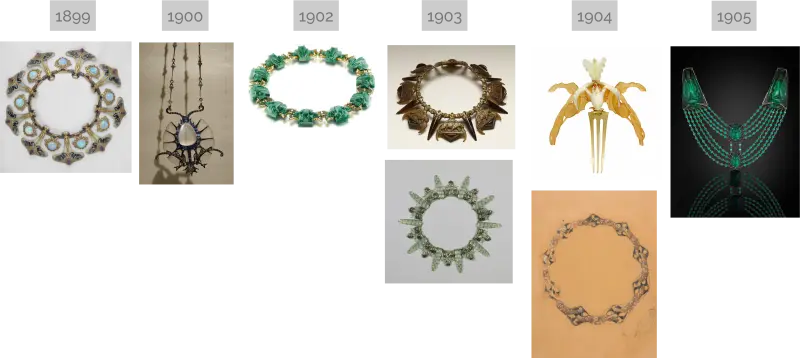
The inflexion of Lalique’s work from 1900 towards the end of 1905 goes towards using more clear lines, with a more clearly visible inspiration from nature. The materials and shapes look simplified, as if to accommodate for a more prevalent overall design.
Glass, moulded, allows for sculptural forms to emerge and be repeated along the piece using methods like the tour a réduire (reducing lathe) to modify the scales of a first reference piece.
That’s a big clue for someone trying to emulate the idea of a specific piece without any precision as to what it would have been made of !
Something smells fishy: it is all a game, after all.
As to the model represented on the piece, the fish, there is no way to be certain of what they are.
Really, what kind of fish is represented? Well, “stylized” may be more accurate. Art nouveau is based upon close observation of natural life before everything goes into lines and swirls in the final stage of the design.
All we know is that it has a large mouth, a thin stretched body with a dorsal fin far from the head and a dorsal one close to it. The zoologists amongst you may see a mix between a bleak (Alburnus alburnus), a young Fario trout (Salmo trutta fario), a European perch (Perca fluviatilis) or maybe a yellow perch (Perca flavescens) ? All of them endemic to the Marne valley where Lalique was raised or in the waterways around his house in the country outside Paris.
But, let’s face it. It might as well be inspired from an academic XVIIIth century architectural dolphin, or maybe from an Italian fountain ?
The batrachians on the “Frogs” necklace of 1902 are a lightly veiled reference to Ilsée, as put forward by the Sotheby’s auction house in 2021 when the piece was last seen on the market :
“The story behind the creation of this necklace lies in a literary source: that of the frog-woman, inspired by the ballet created by Jean Lorrain, La Princesse au Sabbat, staged in 1898 for Les Folies Bergères and set to music by Louis Ganne. It tells the story of [Ilsée], a vain princess who lived in a palace adorned with mirrors and frogs, whose conceit was punished by a curse. In this necklace, circa 1902-1903, René Lalique returns to the frog theme with a style that makes use of moulded glass and stylization that he favoured at the turn of the 20th century.”
As I was not able to find any context or information on our drawing beside those given by its actual custodian, we’re at an impasse. This may well be a game too. A literary reference that is lost. It sadly is to me, anyway.
What we do know is that the fish theme is recurrent in Lalique’s work throughout his career. The closest piece I was able to find is a brooch-corsage from 1905 now under the care of the Metropolitan museum of art in New York.
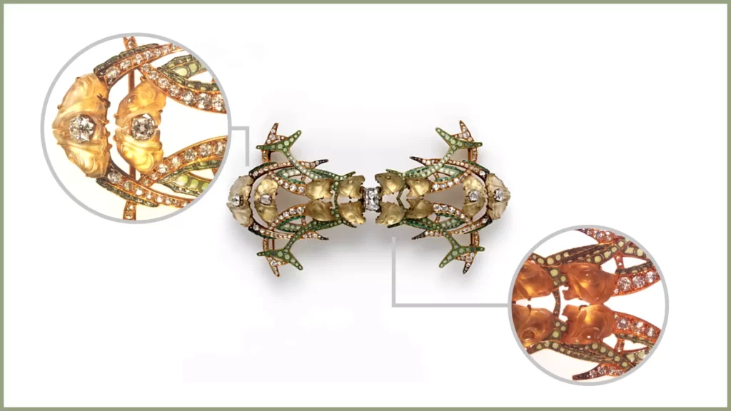
What to do: visible assessment of the image reference
We have a better if succinct understanding of the context the drawing was created in. We must now try to make the most of the information it gives us.
Can I call you René ?
First, let’s get the writing part out of the way. As a French speaker, well versed in historical abstruse ciphers, this one puzzles me.
This is what I can read : “Grandeur pour un collier ; A enfiler, porter les têtes plus haut”. That roughly translates to: “Size for one necklace ; to put on (by the head)…”. The rest of the note is cryptic. It can either translate to ‘”bring the heads higher” or “wear (with) heads higher”.
René, darling, I have no doubt it was clear in your head at the time, but it does not travel well through time. Because it is accompanied by a rough sketch, I’m assuming it can refer to the fishes’ heads. Because if that is an incentive to the lady wearing it, that’s borderline rude !
So, we learned that:
- the necklace is to scale. That is not going to help us much because it’s all web crawled therefore there is no size reference.
- it was not meant to have a clasping mechanism and it is supposed to be put on from the head. Therefore, it can’t be as tight as a choker and will probably rest a little on the solar plexus of the person wearing it. Before you ask, yes. Yes, one of the reproaches made to Lalique was his jewellery sometimes were lacking practicality, case in point this hair pulling apparatus.
Old resin is bad, whitening is worse.
The drawing’s cartel mentions that it was “possibly treated with resin”. Because of the lack of context, it is not easy to use this information. If you have already stumbled upon one of Lalique’s drawings, whether online or in an exhibition, you probably have noticed that they all seem to share the same orangey hue. This seemingly is happening wherever the drawings are preserved now.
Shall we extrapolate it is coming from Lalique or his staff ? It very well could be.
First, the drawings were made to be then interpreted by skilled artisans to create the jewel. It does make sense to protect the paper from the odds and ends of a functioning workshop. The hue can be a time related side effect of this. Then, none of the texts and books I read describe the way Lalique jewellery studio worked. Was he truly alone? Was there a sketch artist whose job it was to finish and colourize the master’s rough drawings ? Some texts hint at his daughter, Suzanne, having this role.
The application of a varnish or a resin could have been the last step in a well established process to protect the powdery medium from staining and disappearing. It could also have been a later addition by a well-meaning individual to protect the family’s archives.
Now, why am I rambling on about that ? Because, chances are the paper the drawing is on was never that dark and brown while it was being “used”. The museum description mentions watercolour as one of the medium. In order for watercolour to be seen, the paper needs to be light-coloured. The museum adds it is wove paper: that is historically white or off-white at that period.
So, in order to try to better see what colours Lalique envisioned for the piece, we can try something that would attract a paper conservator’s ire in real life. We can try to digitally whiten the paper or at least lessen the brownish hue.
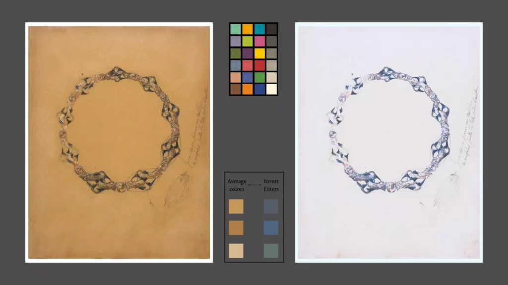
That gives us a slight hint as to what colours might be expected, though not as much as I’d have liked. I’m going to assume the red-orange hue on the heads was expected to be present on the bodies and the stones, albeit less so. My whitening process may have lessened the warm tones too much because they share wavelength with the orange hue I wanted to remove.
Stones in the pond
Whether on the drawing or on the whitened version, the nature of the stones in between each fish couples is uncertain at best.
From the colours, amber seems to be the closest fit. We also know that Lalique made a liberal use of moonstones. The white part on the drawing can be their characteristic adularescence, yet I couldn’t find an orange variety. Can also have been intended as enamel or novelty glass ?
Maybe the weight consideration should prevail ? It is a necklace, after all !
Digging around a little more, I found this piece from the Metropolitan museum.
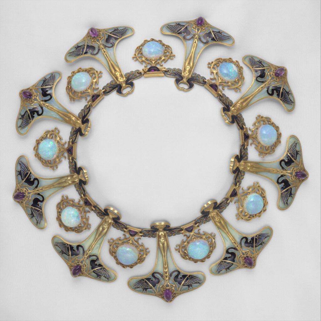
image source: Wikimedia Commons
The museum’s cartel mentions: “… He designed this powerfully evocative necklace for his second wife, Augustine-Alice Ledru, around the turn of the century. The repeats of the main motif —an attenuated female nude whose highly stylized curling hair swirls around her head and whose arms sensuously curve down to become a border enclosing enamel-and-gold swans and an oval cabochon amethyst— are separated by pendants set with fire opals mounted in swirling gold tendrils…”
Opals can have an orangey hue. So fire opals it could be ? More accurately, “precious fire opals”, because of the colours displayed on the drawing. Moreover, it appears stones of the Ethiopian variety can fit the drawing perfectly with astonishing variations. Sadly, it seems Ethiopian sources are recent (1990s), though opals have been mined since antiquity. A better source would have to be either Australia —Queensland mines were discovered around 1875— or Hungary or the Slovak republic. The latter were the main producers of opals before Australian’s gems inundated the market as soon as 1890s.
Opals are relatively soft, so that would make for a fragile piece. They would need to be well in-cased to be protected, which the cabochon crimping drawn would do nicely.
To slab or not to slab ?
The drawing gives us another puzzling clue. There seems to be a slab a losange shaped slab behind the figures.
I’m not sure what to read, here. It can be a drawing guide to help with blocking out the repeating and diminishing shapes.
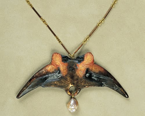
The final piece can have resulted in something like this pendant with birds, where the glass is held by a “thin copper covered with dark glass”.
It can also be a hint at the presence of the slab-like part at the back or bottom of every moulded glass piece. It is more or less present and more or less included in Lalique’s designs.
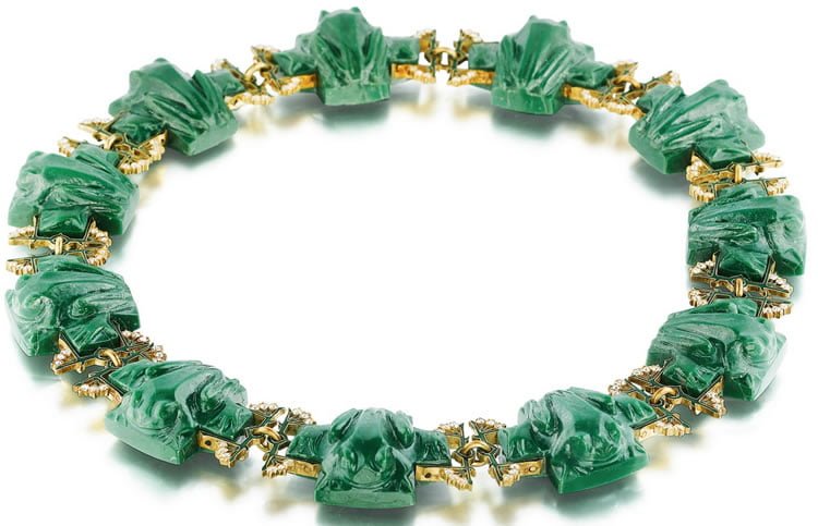
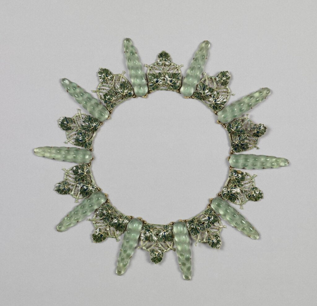
I’m still undecided about the fishes being on a glass moulded plate (meaning the fishes and the diamond shape under them is one and the same relief). The drawing is light, and it isn’t clear if it is intended as a mounting slab or just a polygon shape idea.
The good thing about a digital workshop is that with a little planning ahead, I might be able to make versions of the piece and choose what I deem the closest to the drawing.
Hopefully.
Maybe ?
How to do it: creating a 3D model from the drawing reference.
Disclaimer : this is an exercise, shown for documentation purposes only
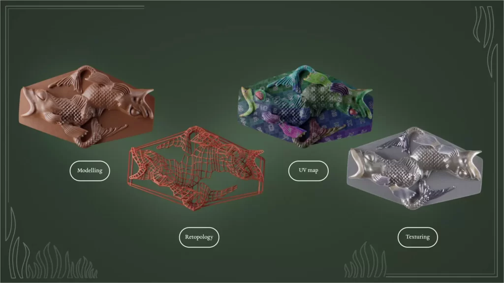
Model the shape
We’re in the thick of the matter. Because of the nagging precedent question, let’s try to be cunning on our modelling strategy.
Note:
Not being a jeweller, I’ll try my best to stick to the drawing as far as technical elements are concerned. To my unknowing eye, it seems the depiction of the rings linking the pieces together is enough to be plausible. Thankfully, we do not have to think about a clasping mechanism !
Considerations of weight and the way the piece will embrace and stand on the neck will probably elude me to a certain extent. I ask for the professionals’ forgiveness and will gladly listen to any advice on the matter.
Fish
The key elements are, of course, the fishes. Let’s assume it is moulded glass. If it is so, then the out-of-the-oven result will be soft. The details and shine will be handmade later on by cutting and polishing.
Because of the very present symmetry, I surmised the easiest way to start would be to make a first one and duplicate it before joining them. Then, I can adapt and sculpt the parts that intertwine.
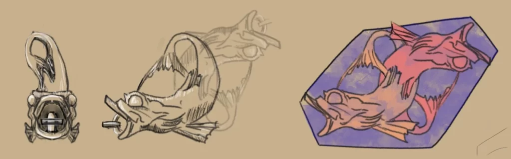
The refinement of the scales has, is, and probably will be a constant battleground. I think I have tried every method I could find in order to have a definite solution. Turns out, so far, artists from all eras seem to be obsessed with the idea of making their own version of them on their art pieces. No method fits every situation and I have to rethink them every time. For example, the ones on the Athenian’s fish nearly drove me to madness.
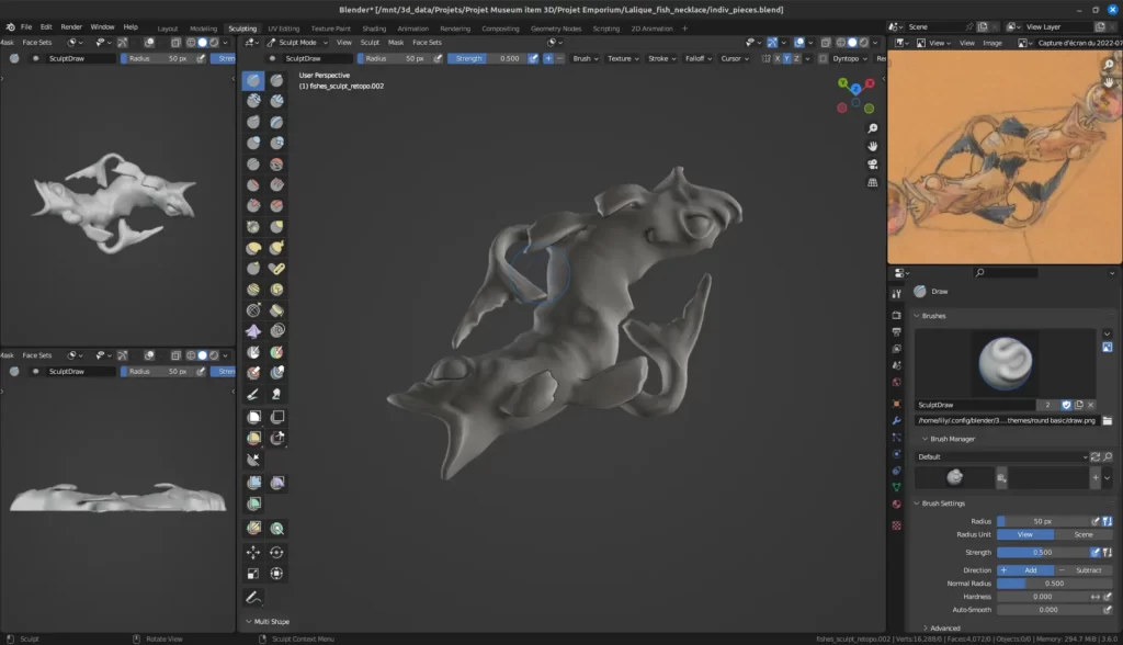
Here, it is a “simple” alpha brush. Simple as in the 25th variation of it and I’m still not convinced, mainly because the drawing doesn’t show them and I extrapolated it from other pieces. But I’ve been advised by a team of medical professionals to move on.
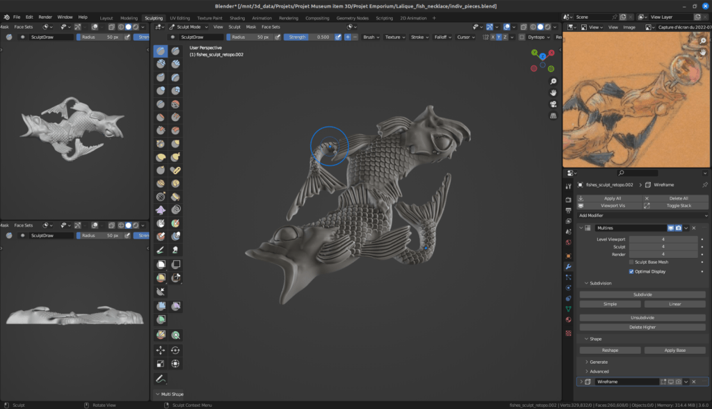
The slab
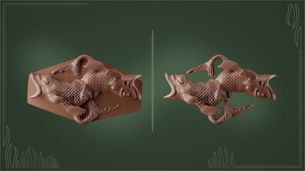
I am still undecided about that. It is a simple shape, so I’ll model it anyway and eventually drop it when polishing the final piece.
Cabochons and attaching rings makes a necklace complete and a modeller worry
The issue here is not much modelling the stone and its lodging as well as the connecting rings, but to multiply and scale the pieces so that they fit together to form the necklace.
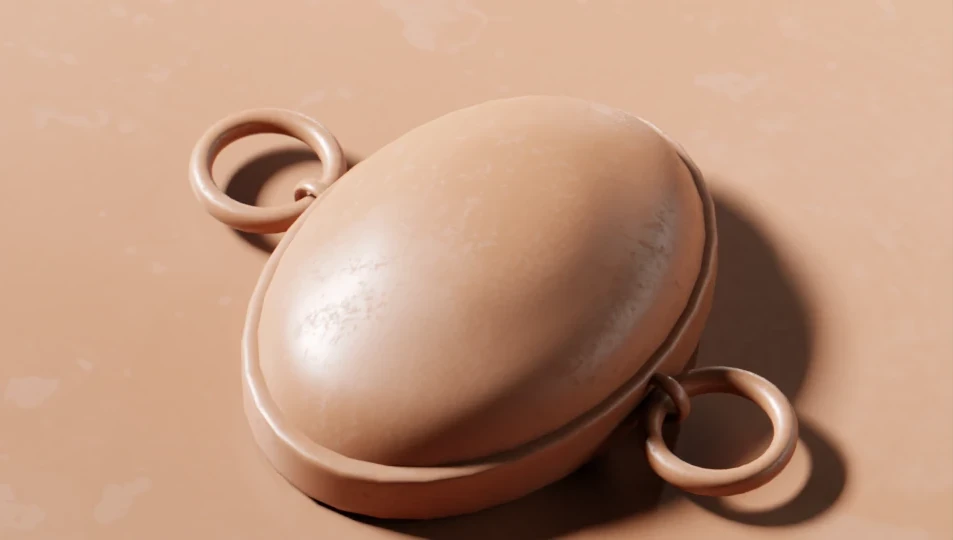
Enter Blender’s geo nodes.
You may have seen or heard from them. They are incredibly polyvalent and powerful tools. They are also a little terrifying. Because I am fundamentally a little insane, I thought this project was the perfect one to try my hands at simple operations with them.
Ah, the naïveté of youth.
To summarize: I need to create a circular array of 9 pieces (the fishes), alternating with 9 stones, all connected with rings. There should also be a decrease in sizes of every piece.
Let’s be brutally honest. It didn’t go as planned.
My thought process also lead me to believe it could then be “easy” to make the necklace lay on whatever surface I decided to put it on.
Now, there is a result, albeit not as neat as I would have wanted.
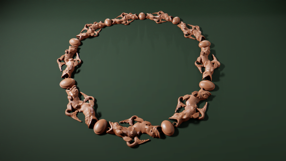
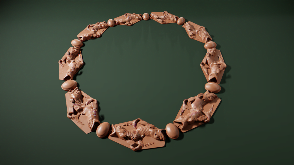
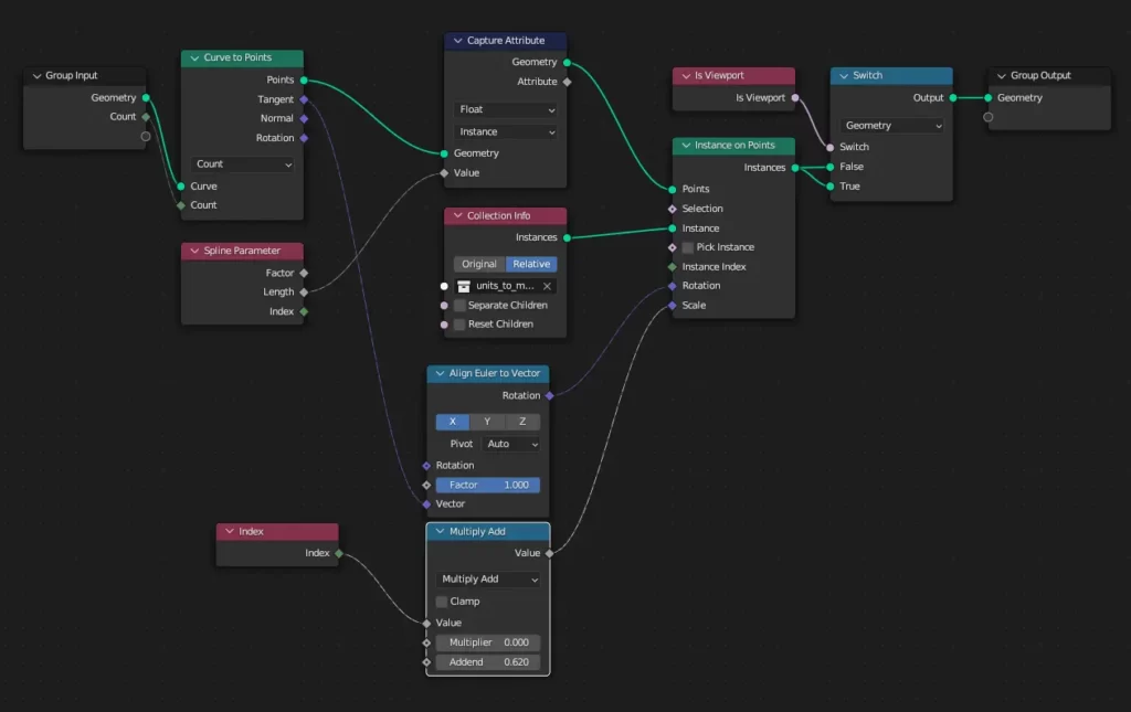
The different parts are grouped in a collection that is being replicated on each point of the curve. The scaling part is not working as I wished it would be. I’m not sure i’m doint it right: I’m guessing I should be tweaking the index node input.
Besides the main problem is that on close inspection, I cant seem to be able to make certain the different elements do not collapse into one another.
Moving the necklace around works-ish. It needs tweaking because the rotation is all over the place more often that not. Again, I’m probably missing something. Considering this is really new to me and not my forte, I’m still ticking it as a “sort of win”. I’m adding this to the “revisit later when my skills have grown” pile !
Here is the geometry nodes noodle soup, if you are into that kind of thing.
Texture the shape
The ground work is done, let’s focus on the materials.
A glass school of fishes
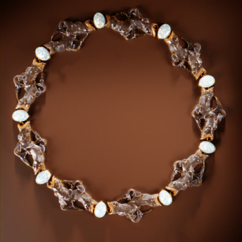
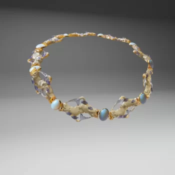
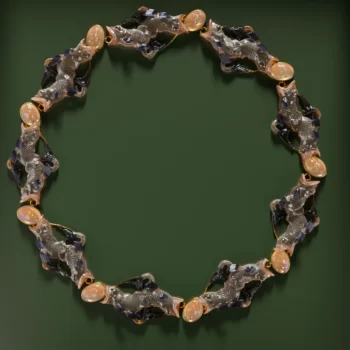
As we’ve previously established, the fishes were quite possibly intended to be made of cast glass. The hues Lalique was envisioning are a little less certain.
There seems to be two colours, clearly set, differentiating the bodies of the animals from the fins.
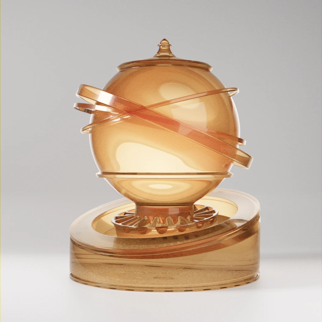
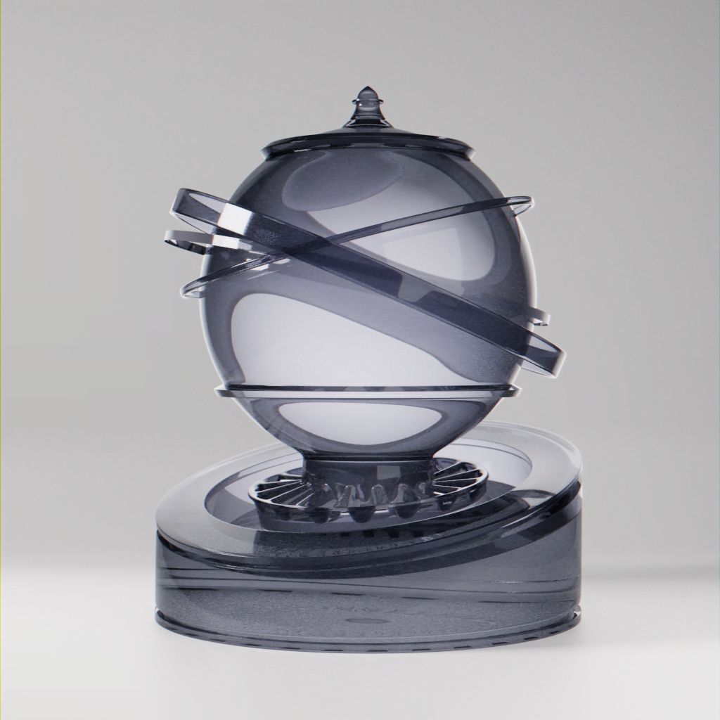
Then we can try them out on the fishes. In both cases, I chose to add metallic plate under the shapes, otherwise they are dulled out. It mimics what’s been done in the pendant from the Corning museum mentioned above.
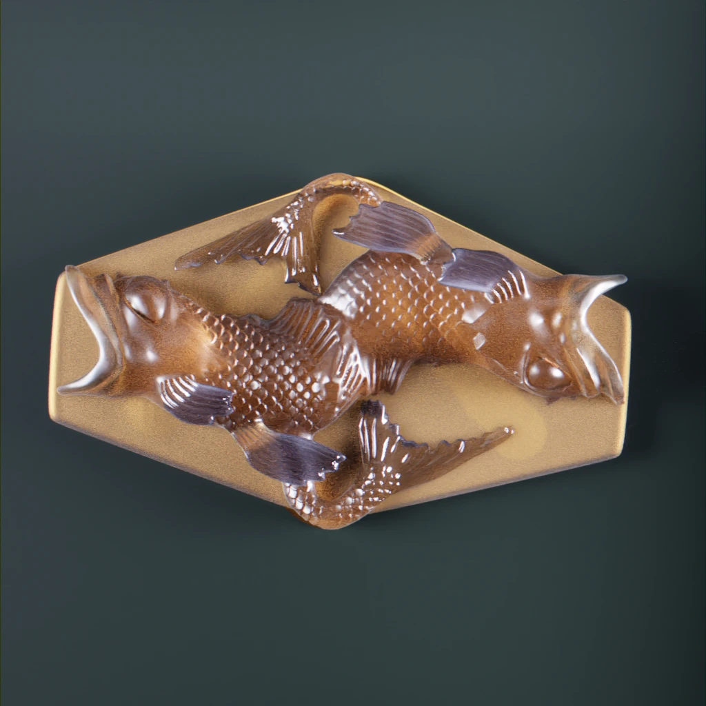
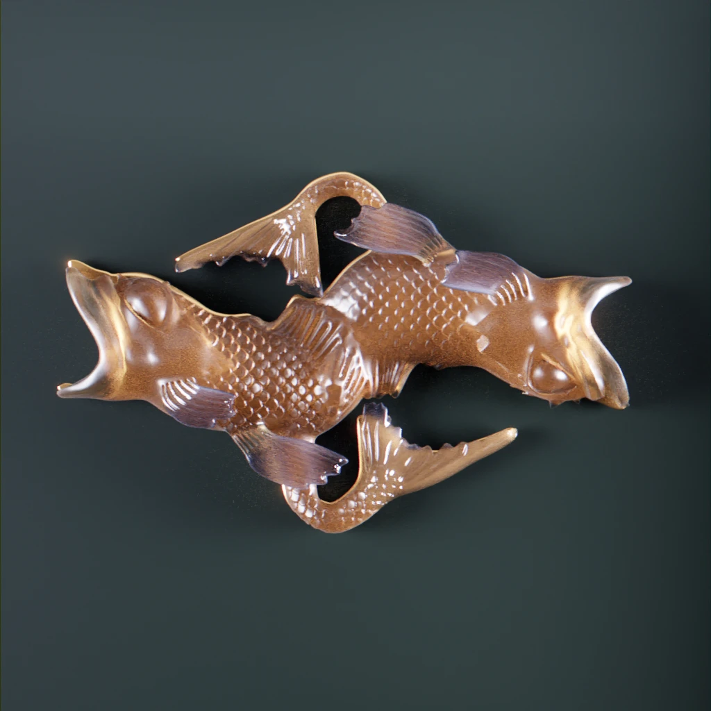
I’m thinking that I will probably drop the slab version. It will undermine the necklace elegance in the final piece.
Cabochons or how to fire an opal
After many -many- unsuccessful try-outs in order to create the fire opal material, I finally based the version I’m using on the work by JettG_G described in one of the blender artist website forums for an opal material as base. Their work manages to grasp the opals’ characteristic “play-of-colour” shimmer. After a few tweaks to try and fire it, here’s the final material.
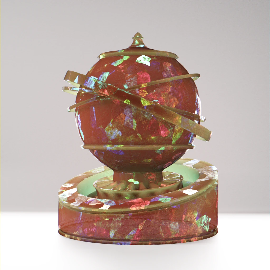
for the bodies of the animals.
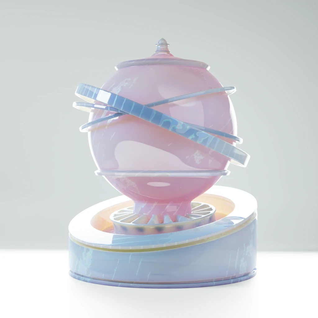
for the bodies of the animals.
Just for the heck of it, let me also throw in a moonstone inspired material. I intended it to be a quick and easy one. I really should know better by now. Turns out, it wasn’t. Firstly, there are as many examples of moonstones as there are actual cut stones. Then, I’m having issues rendering the blue-ish under layer of the stone in a satisfactory manner.
It will do the job on the piece because of the smaller size of the cabochons. It is weird on my usual material sampler. I’m putting that one on the “to revisit later” pile.
Shine a little light: stills renders using Cycle
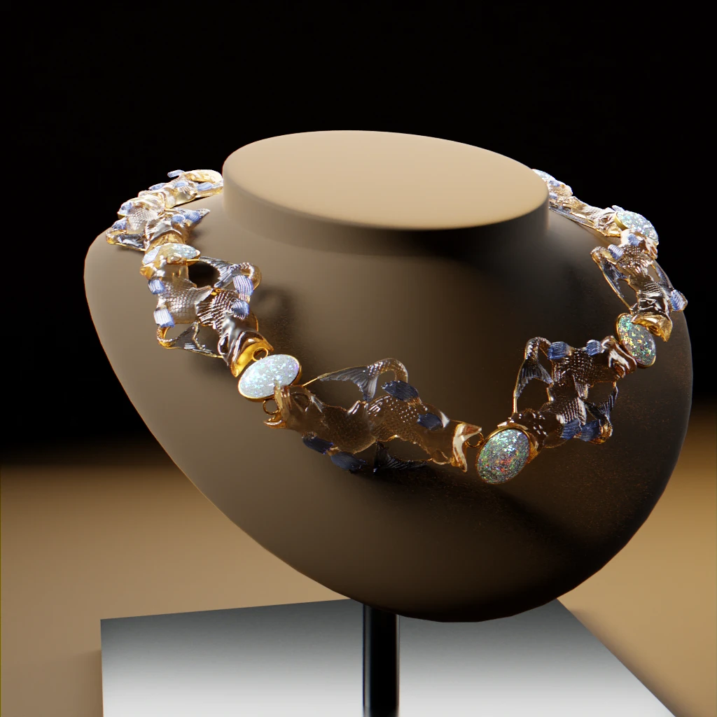
For once, considering the number of unknown and hypothesis we made, I think it is reasonable to not have a definitive end piece. As in, because this is digital: we can have them all.
Have a look at them and pick your favourite !
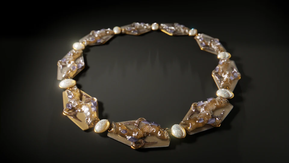
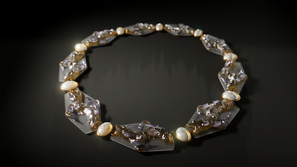
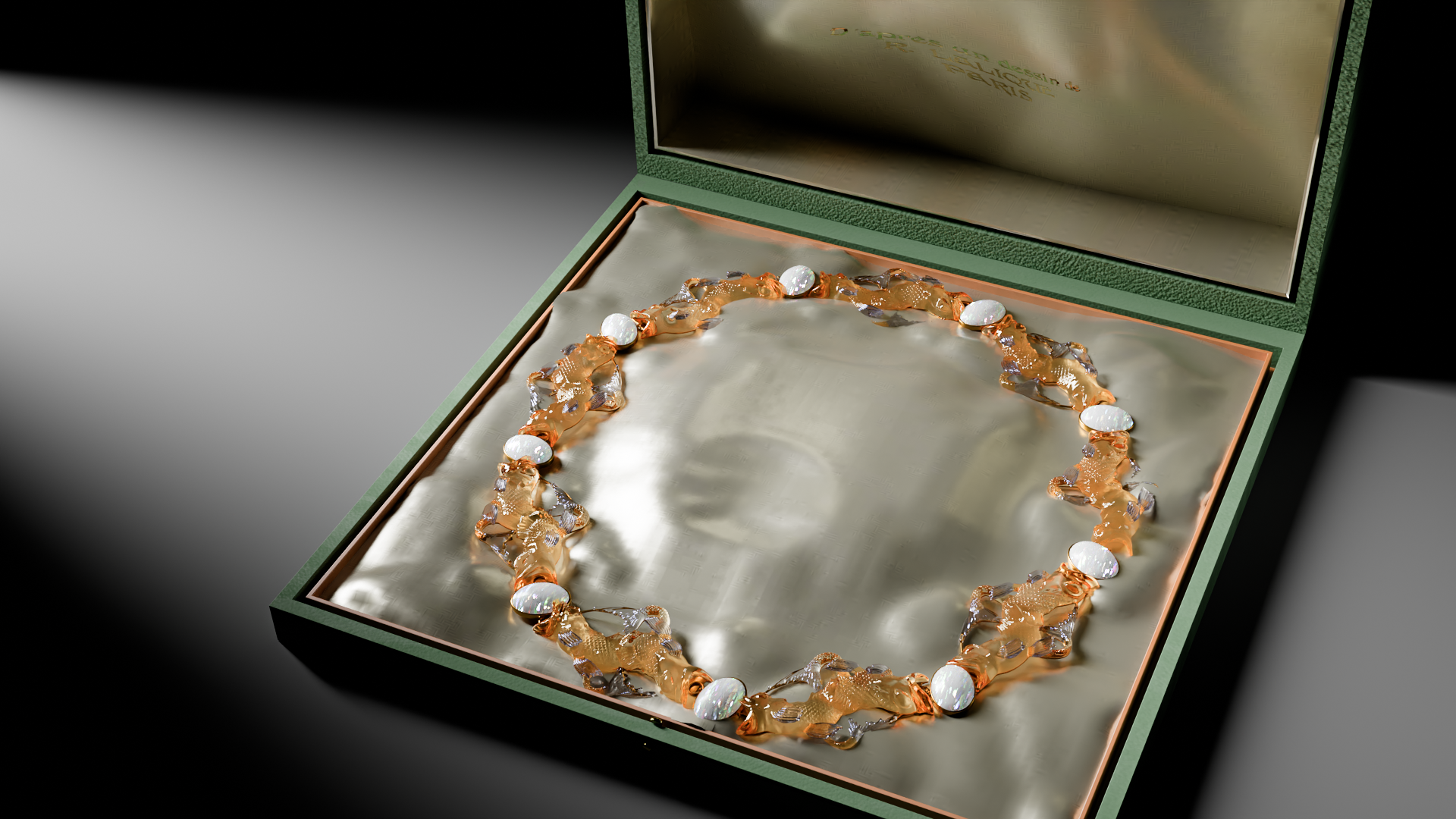
Interactive rendering
All hands on code: making the model web available using Three.js
A single unit for a whole school of fish
I tweaked and prodded the model every which way, but I couldn’t find a way to drastically lower its size. Best I was able to do is around 8Mo.
I know it isn’t “that” heavy nowadays. Still, that would probably hinder some of the viewers with older devices and, basically, be a poor decision on my part.
The issue is of course the number of vertices involved. Because the idea is for the viewer to be able to zoom in, normal maps and other solutions giving the illusion of heights will not do.
Therefore, I can but only show a part of the necklace, namely the “fish unit” we mentionned.
Glass, scale and all that
Here are the most relevant lines of codes behind the materials of the model in the web viewer. Remember that I’m working with a JSON file to feed the model to the viewer, so the syntax is irrelevant here. Just gather the information you need from it !
"3Dmodel": "./assets/models/Lalique_fish/Lalique_fish_base.glb",
"meshes": [
{
  "name": "fishes_sculpt_retopo",
  "textures": {
    "map": "./assets/models/Lalique_fish/textures/lalique_fish_unit_diff.webp",
    "aoMap": "./assets/models/Lalique_fish/textures/lalique_fish_unit_ao.webp",
    "roughnessMap": "./assets/models/Lalique_fish/textures/lalique_fish_unit_rough.webp"
  },
  "values": {
    "roughness": 0.08,
    "transmission": 0.8,
    "thickness": 0.1,
    "ior": 1.55,
    "specularIntensity": 0.9,
    "specularColor": "#005AFF",
    "alphatest": true,
    "needsUpdate": true
    },
  "modules": {
    "side": "DoubleSide",
    "envMap": "hdrEquirect"
  }
},
{
  "name": "fishes_sculpt_retopo001",
  "textures": {
    "map": "./assets/models/Lalique_fish/textures/lalique_fish_unit_diff.webp",
    "aoMap": "./assets/models/Lalique_fish/textures/lalique_fish_unit_ao.webp",
    "roughnessMap": "./assets/models/Lalique_fish/textures/lalique_fish_unit_rough.webp"
  },
  "values": {
    "roughness": 0.05,
    "transmission": 0.99,
    "thickness": 0.1,
    "ior": 1.55,
    "specularIntensity": 0.9,
    "specularColor": "#3366ff",
    "reflectivity": 0.8,
    "needsUpdate": true
  },
  "modules": {
    "side": "DoubleSide",
    "envMap": "hdrEquirect"
  }
},
{
  "name": "fishes_sculpt_backplate",
  "texturess": {
    "map": "./assets/models/Lalique_fish/textures/lalique_fish_unit_diff.webp",
    "aoMap": "./assets/models/Lalique_fish/textures/lalique_fish_unit_ao.webp"
  },
  "values": {
    "aoMapIntensity": 0.02,
    "metalness": 1,
    "color": "#ffcc88",
    "roughness": 0.20,
    "specularIntensity": 0.2,
    "envMapIntensity": 1,
    "needsUpdate": true
  },
  "modules": {
    "side": "DoubleSide",
    "envMap": "hdrEquirect"
  }
}
3D view
Disclaimer : technical limitation to material render in web app can let artefacts show, particularly in zoomed views.
This link will get you to the full view (this will open a new tab in your browser).
Context
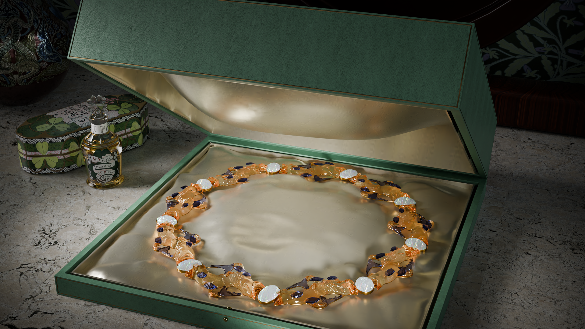
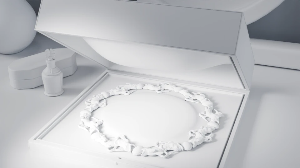
I was lucky to be able to sort a picture, giving us an idea of how Lalique’s creation were sold to clients at the time.
A little 3D magic later and here’s the necklace inside its own luxurious case.
Credit
Image references
“Frogs” necklace, circa 1902-1903, glass, enamel, diamond. Sotheby’s .
Tiger necklace, ca. 1903, gold, agate, horn and enamel, The Walters art museum.
Grape necklace, René Lalique (French, 1860-1945) (Artist)
ca. 1903, molded glass, cloisonné enamel, gold. The Walters art museum.
Pendant with Birds, René Lalique, Paris or Clairfontaine, France, about 1900─1905, Corning museum of Glass.
Beetle necklace, circa 1905. Gold, enamel and moulded glass. Wartski.
Swan necklace, 1897-1899, gold, enamel, opals, amethysts. Metropolitan museum of art, image via Wikimedia commons cc0.
Thistle pendant, Glass, gold, enamel, moonstones, sapphires and diamonds, 1898-1900, Calouste Gulbenkian museum. Image by Yelkrokoyade, via Wikimedia Commons.
Orchids diadem, Ivory, horn, gold and citrine, 1903-04. Calouste Gulbenkian museum.
Brooch, René-Jules Lalique (French, Aÿ 1860–1945 Paris), ca. 1905, Gold, enamel, diamonds, glass, 45.28.2, Metropolitan museum of art.
“Pigeons on Olive Branches”, Design for a corsage ornament, c. 1905-1906, pencil, ink, watercolor on paper, Lalique museum. Inv. 3.1.079.
“Doves on Olive Branches”, Design for a corsage ornament, c. 1905-1906,goldn enamel, cast glass, diamonds, Smithonian Institution, National museum of American History, image from wikimedia commons
Bibliography
“The jewels of Lalique” , Catalog of an exhibition held at the Cooper-Hewitt National Design Museum, Smithsonian Institution, New York, Feb. 3-Apr. 12, 1998, International Gallery, Smithsonian Institution, Washington, D.C., May 15-Aug. 16, 1998, and the Dallas Museum of Art, Dallas, Texas, September 13, 1998-January 10, 1999 , 1998, Ed. Flammarion, 224p
“René Lalique. Bijoux d’exception, 1890-1912”, Yvonne Brunhammer – Maria Fernanda Passos Leite – Marie-Laure Perrin – René de Ceccatty – Da Sautot. Ed. Skira/Musee du Luxembourg, Paris, 2007.