

The many faces of a Bodhisattva
The following texts and images are the results of a training exercise to go from the pictures or the description of an artefact to the creation of a 3D digital double, sometimes restored version of it. If you wish to know more about the process, explanations are in A journey into learning a (3D!) restoration process workflow article.
Today, let’s try another exercise. The 3D digitization practice has really taken off in the heritage world, and more and more models are now easily available online. To push further my exploration of digital restoration, I wanted to try my hands at using a scanned model as a base. I will not drag the suspense any longer: we will be looking at colours and textures today !
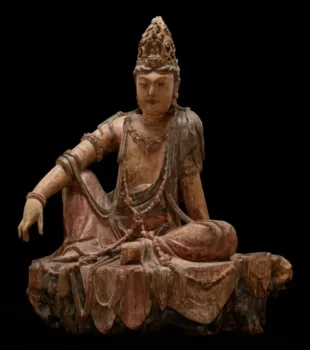
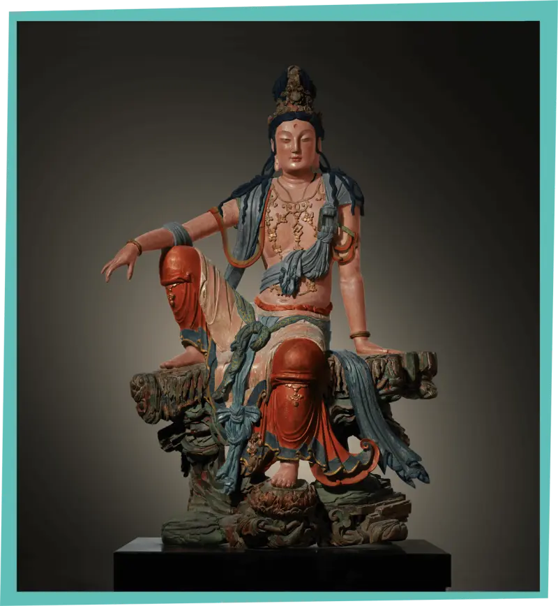
Title: Avalokiteshvara Bodhisattva in the Water-Moon Form (Shuiyue Guanyin -seated guanyin-)
Datation: 12th century
Provenance: China
Dimensions: 102.9 x 85.1 x 50.8cm
Media: Wood, gesso and pigments
Source image: Minneapolis Institute of Art
3d object source: Minneapolis Institute of Art page on Sketchfab
Description and Historical context
The embodiment of kindness
Avalokiteśvara is a bodhisattva of the Buddhist pantheon. Originating from India, the figure of the “compassionate one” has diffused into eastern cultures and evolved into forms like Guanyin in China or Kannon in Japan. Represented as a serene, meditating figure, they can either be male or female. Most of the time, the representation might be seen as androgynous.
The Minneapolis Institute of Art gives this short description of the sculpture:
“Of the many manifestations of the bodhisattva Avalokiteshvara, perhaps none was more prevalent in East Asia than the uniquely Chinese form known as “Water-Moon Avalokiteshvara,” which later also spread to Korea and Japan. This form of the bodhisattva presides over his own paradise, Potolaka, which is described in scripture as a rugged seaside cave from which Avalokiteshvara could admire the reflection of the moon in the water. Appropriately, he appears meditative and relaxed and is seated informally in the “royal-ease” posture. Ornately dressed, with silk robes, fluttering sashes, jewellery, and an elaborate hairstyle, he also wears a headpiece that features an image of Amitābha, the buddha to whom Avalokiteshvara attends. Believers might look to a sculpture like this as a guide for their own journeys toward enlightenment.”
The other common form of the deity is known as the self describing “thousand-armed” one. This representation is a nod to the gifts bestowed upon them by the Amitabha buddha so that they can help all those in needs.
It is fitting to ask for the deity’s magnanimity for the scope of this exercise, I thought !
12th century in Northern “China”
XIIth century “China” is a divided place to say the least and actually not the China we know nowadays.
The museum cartels often mention pieces from that period as either from the “Liao” or the “Jin” dynasty. Those were two of the main political entities then, though not the only ones. Why the commingling, then ?
The Liao dynasty ruled north of the modern China territory, while the Song rules over the South.
The Jin dynasty started as a rebellion against the Liao empire in the northern parts of their territory and progressively conquered the bigger part of it between 1115 and 1234.
Add a touch of Mongols invasion, a pinch of southern incursions and a brush of western tribes influences, and you get a very fluctuant map. Therefore, it is sometimes complex to decipher which piece was created under which dynasty, some of them having probably changed patrons multiple times.
There were periods of relative peace and economic prosperity, though. Buddhism thrived in both empires. In both dynasties, emperors and their courts funded several projects, from monasteries to tablets and libraries. Both empires mandated versions of the tripitaka, the buddhist canon. As a result, buddhist related art was thriving too, as many pieces in museums and collections can attend, including the piece we’re looking at today.
Identified similar pieces
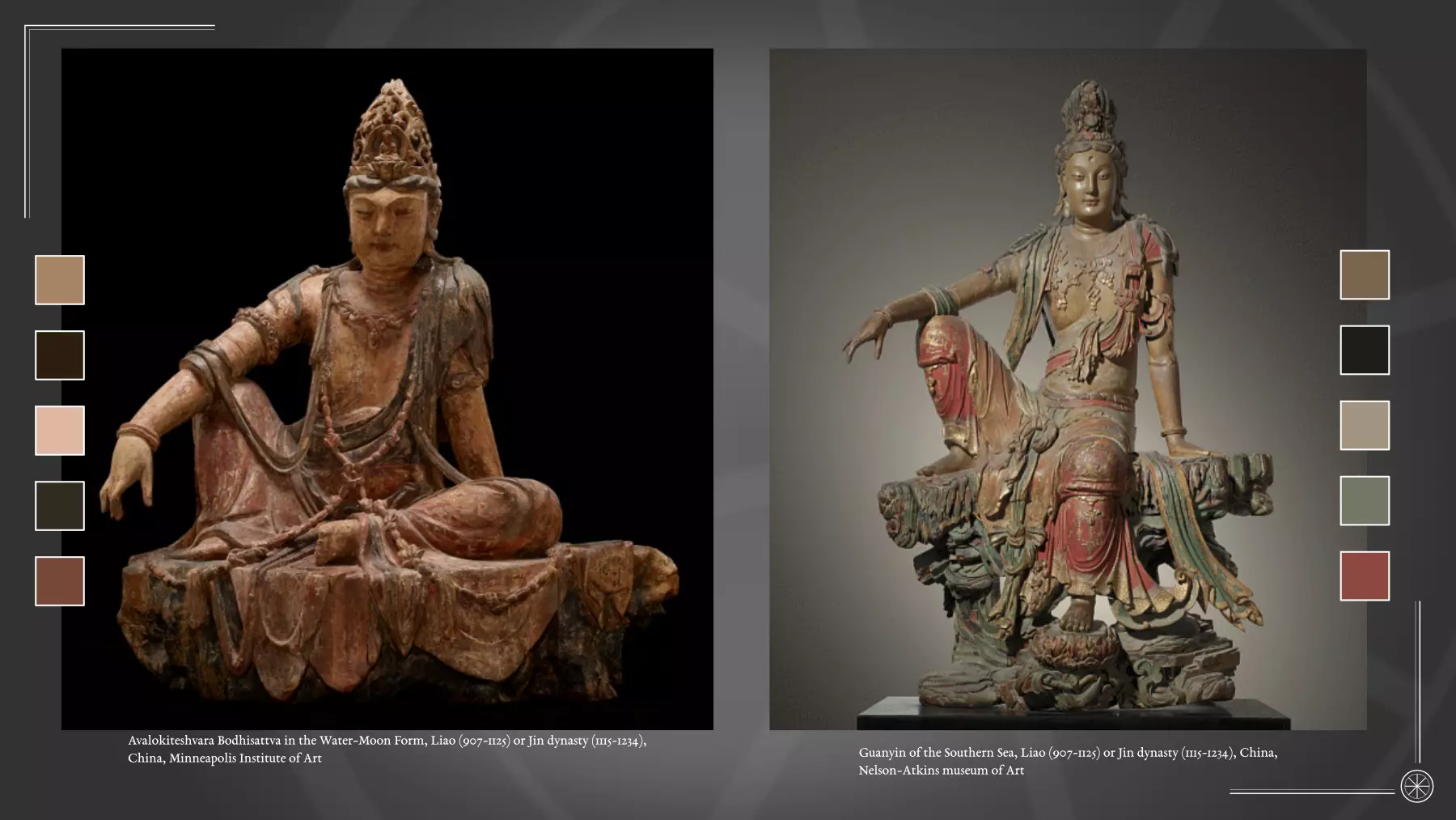
Without taking too much from the coming work, let’s just say we are going to need references and comparisons. Roaming the world’s online collections, I found a few examples of sculptures of the same subject and of the same era.
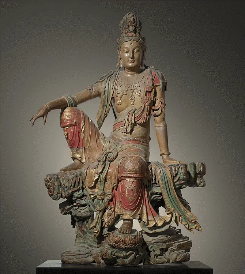
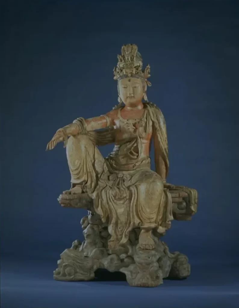
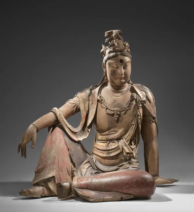
As you can see, there are similar elements in the pose, clothings and accessories, but the figures couldn’t be more different.
The Victoria and Albert museum is the only one that links its piece to the Jin dynasty after attributing it to the Song’s (see the album pictures on the thumbnails on the museum’s website). I was not able to find an explanation as to why they changed their minds and chose the Jin dynasty more than the Liao’s. I figured it could be linked to the 1985 study by John Larson and Rose Kerr, though I couldn’t find an available copy of it.
If any of you, dear reader, knows more about it, please let me know. Pinpointing elements, techniques and markers that fuelled this decision might help us in our own endeavours.
There is however a part of the museum’s description that can be of interest to us: “The original, naturalistic painting of the figure was completely changed during Ming dynasty restorations, when it was made to look like a gilt-bronze sculpture.” Let’s keep that in mind and move on.
Visible condition and beyond: choices to be made
The most incredible thing with a 3D version of this piece is to be able to look at it up close. As a conservator, this definitely gives me “pre-work workshop’s condition assessment” vibes, without the manipulation issues (and the cold rooms and the “no coffee cup anywhere near the piece” mandate). It is still not equivalent to working on the real piece, but it’s a very close second and one that will fit our purpose magnificently for now.
Visual description
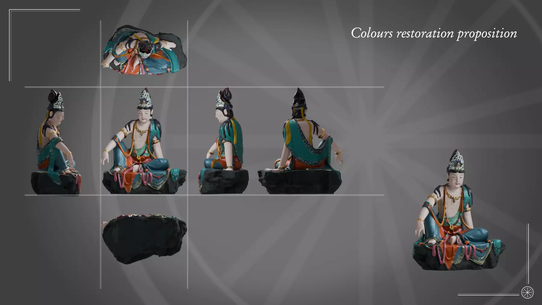
Before jumping into a quick condition survey, I think it will be easier if we have a visual map of the piece we can use throughout the process. As in, let’s try not to describe the different parts as “the thingy on the left” or “the long part, but not that one”.
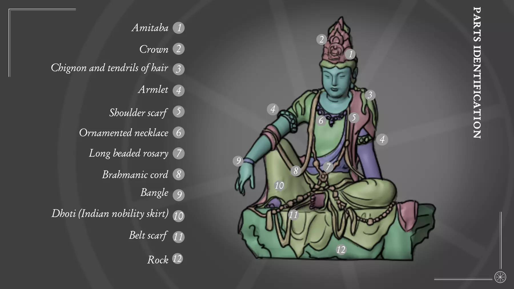
That should do the trick.
The sculpture itself is in pretty good condition, though it has been restored in a sympathetic way: cracks in the wooden parts are filled and scales look stabilized. There doesn’t seem to be any lacunarity. There are weird artefacts and punctures, but I think they are linked to the 3D model and its rendering more than anything else. Bottom line is, there is nothing major for us to re-create. Well, nothing major except for the elephant in the room: the epidermis of the piece, and it’s more than strange texture. It looked as if it was painted numerous times, then the paint flaked and fall, each new layer positioned above the remnants of the old ones. Fun fact, it’s probably what happened !
The Refurbishment issue
Sculptures are the subject of many things in their lives. Sacred sculptures, even more so. From the touch of the devotees to the fumes of incense and candles : they’re usually worse for wear rather quickly. Take this remark at face value, we’re trying to be clinically objective here. Nothing to do with faith, everything to do with conservation. Different clergies found different ways to remedy the situation. The most common one is to make the care of the statues (and buildings and ornaments) part of the cult.
As this study of the Nelson Atkins museum piece cited above mentions: “…The sculpture would have once been a component of a larger temple assemblage depicting Buddhist concepts regarding progress toward enlightenment. As such, it would have been subject to periodic devotional refurbishment of its painted and gilded decoration. Its appearance would have been transformed over time in accordance with evolving tastes in statuary…”
It goes for official/public pieces as well as domestic/private ones.
This is probably the reason for the state of the deeper layers of the epidermis. There is, however, another one that I think is way more insidious. It’s a trend, collectors, curators and conservators know all too well. Once again, the aforementioned study puts it very eloquently: “…Chinese sculpture has typically undergone additional work when transferred on the art market, most often so as to present a more uniform surface when the original history of repair and refurbishment has left a complex patchwork of partial losses and non-contemporary paints…”.
That is a very diplomatic way to put it.
Deciphering the historic parts from the “glamour” ones is sometimes difficult, but scientific studies can be conducted to help even out the odds. For the record, it can be extended to every piece in every cultures on every market around the world.
Colours of the past: a myth.
I have gone back and forth about this project for months. Because, you see, it touches something both key and critical to heritage conservation: the myth around colours and the very touchy subject of what is often resumed in the hair-rising “original state” comment.
Except, there is no way to know what that was for certain, just educated guesses.
I won’t go into details. Numerous established sources have discussed the matter way better than I can ever do. It is true, however, that the fundamental point behind this position is maybe philisophical. Yet, it can have real and irreversible consequences on tangible pieces, loosing information and endangering their preservation.
In the case of public collections artefacts, this reasoning leads to the “least intervention” rule. Every action on a piece has consequences, hopefully controlled. The less is done, the less might endanger its heritage qualities, material and immaterial.
I will once again cite the Nelson Atkins museum Guayin case study when it refers to the conservation treatments conducted on the piece: “The treatment itself will focus on setting down lifting paint, stabilizing cracks and loose elements, and possibly removing or reintegrating modern restorations. The goal of the treatment is not to bring the sculpture back to an “original state,” but to stabilize its current condition so that it can safely return to public view. When treatment is complete, the sculpture will be displayed in an exhibition case with microclimate to ensure a stable environment”. The same idea is developed in a Bodhidharma restoration in Lingyan
In the case of sculpture like the Guanyin, trying to imagine having to answer the question of the “original state” can become overwhelming. What origin ? What period ? Why the origin instead of, let’s say the more famous “Ming” era state ? Etc. You only have one artefact. One very old, very fragile, absolutely unique, artefact. You can only act once.
This dilemma is very well illustrated in this study for the restauration of a polychrome Guanyin at the Chicago Art Institute .
And this is where 3D digital double, undoubtedly can help. Once the scanning is done, the piece can go back to its protected environement. The curators and conservators can breath again. We then can give shape, colours and forms to hypothesis and theories, hopefully scientifically backed, while the originals are kept safe.
A palette in shades of greens and blues
Now, I will stop rambling and explain why I made you read through that diatribe. First, I needed to prepare the stage for what’s to come. Then, the Nelson’s museum study I keep refering to (a definite must read) has some juicy information for us about the polychromy, having done scientific colour analysis of one of the Guanyin in their care and it turns out it has similarities with ours.
The study particularly have information about the Jin sculpture colours and decorative style: “[…] The original painted decoration of Jin Dynasty sculptures is thought to have been naturalistic in its rendering of flesh and garments, while later periods brought a preference for bronze and gilt sculpture that prompted the redecoration of wood sculptures with finishes emulating those of metal […]”.
This, dear reader, is the exact reason for this project, beside the obvious training exercise. As a western individual, most of the ancient buddhist sculptures I have seen and work with have the same colours: reds and greens with metallic accent when not fully metallic. I am actually looking forward to seeing what it could be when it’s not “beautified” according to what most often boils down to an antiquarian view of the Ming’s canon.
I will be going out on a limb and take the intellectual leap to try and sympathetically project the information obtained in this study and others for the colours and textures, balancing them with observations of the original piece. I know, it’s a choice. I may have gone mad. As I said, it is an exercise and this gives us a base. As usual, this work would benefit from a back and forth with scientists and specialized historians, as would be expected in any profesional context.
So.
What do the studies tell us about the Jin or Liao dynasty visual elements ?
Generalities
It is able to attribute elements to the Jin Dynasty (1115-1234 C.E.), deducing them from stratigraphic microanalysis.
- Manmade botallackite with distinctive particle morphology as an important pigment of the intermediate period decorations. That means shades of light to mid-greens.
- Manmade atacamite used in other colours, derived from corroded bronze. That means shades of dark greens to blacks.
- Shades of gold leaf applied in different periods from cross-sections without divesting the sculpture of later paint applications. The cross-sections also provided evidence for the existence of flat gold line-work in areas subsequently redecorated with raised gilt brocades. That is consistent with a painted motif.
- Several combinations of the organic pigment indigo and inorganic paint constituents such as lead white, azurite, malachite, and quartz reveal the means of adjusting shade and optical effects in closely-related paint applications.
- In ensuing publications, the recognition of acicular spheres among the green paint applications led to speculation, by analogy to European examples, that synthetic malachite might be present. So, you guessed it, brightly coloured greens.
Specific per parts discoveries
The study also points out these specific elements:
- Hair colour: the dark colour is obtained by a layer of indigo based dark blue distributed among colorless mineral matters to dilute and modified its hue.
- Shoulder scarf: the colour is obtained using indigo with copper green decor.
- Rock: the colour is obtained using botallackite as a main pigment, mixed to obtain a dark blue-green.
- Gilding: evidences of flat gilding applications are found in the earliest extant layers, the brocade effect is a later addition. The study adds a very peculiar finding: “Simple calculations based on density, weight and area, show that handmade gold leaf can be as thin as 170 nm. Although highly reflective, it is semitransparent at this thinness when held up to light and is commonly applied atop a red layer that intensifies its colour. This grey-blue underlayer, in a colour that does not accentuate that of the gold, departs from common practice in Western art and from later applications on the Guanyin itself [the underlayer use mostly red hues there], so its visual impact is hard to anticipate.”
I must say I’m intrigued !
Because of our goal, I’m choosing to interpret this blue-grey layer combined to gold as resulting to something akin to the look of mercury with yellow-green light tones. This effect could be in line with the image of the moon reflecting in the water, which is in par with the Water Moon form of the bodhisattva. But I might be completely wrong ! This is as educated a guess as I can muster for now. My final reasoning is a technical one: although a silver gilding would give a similar effect, it would also tarnish and blackened very very fast.
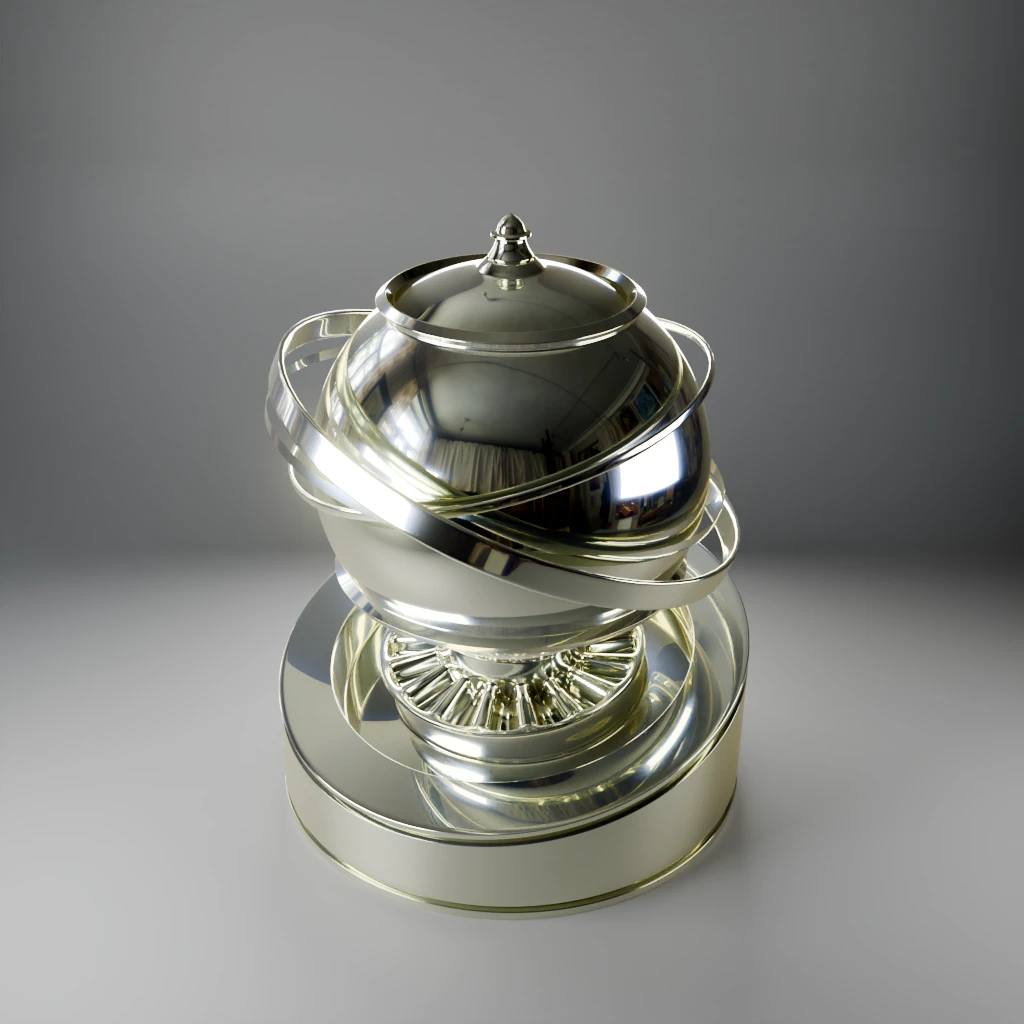
From these readings and the other sources found, we are dealing with a green and blue palette heavily relying on indigo and copper related compound. The overall effect of the sculpture will indeed be different.
12th century textiles and ornaments
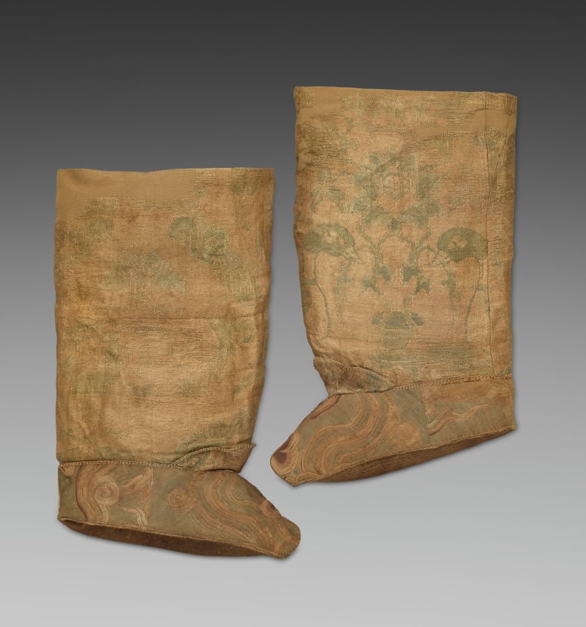
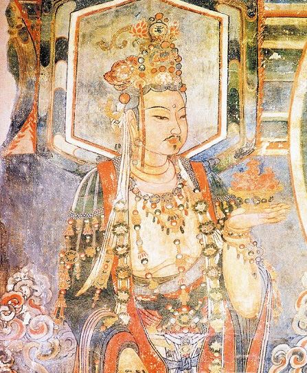
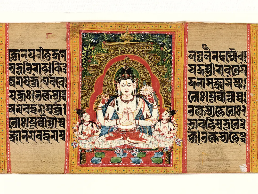
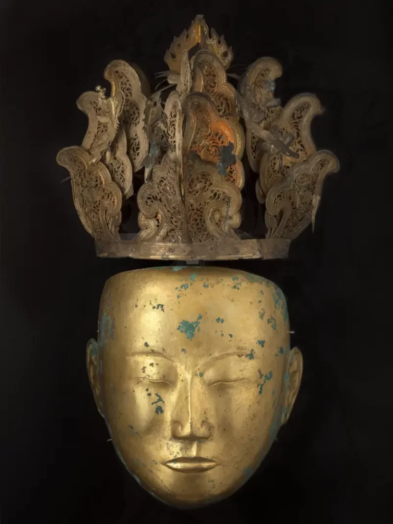
The sculptures of this era are said to have been naturalistic in style. Textile and ornaments represent roughly 70% of the sculpture surface so a refreshing course is definitely due. We need references !
Though enemies, there seem to have been common stylistic elements within the Liao and Jin dynasty. That is a good thing for us because the examples are few and far between (and the cc0 ones even more scarce).
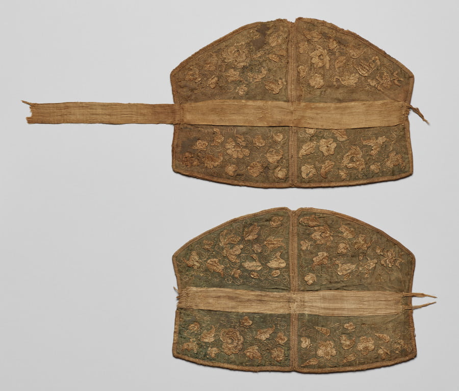
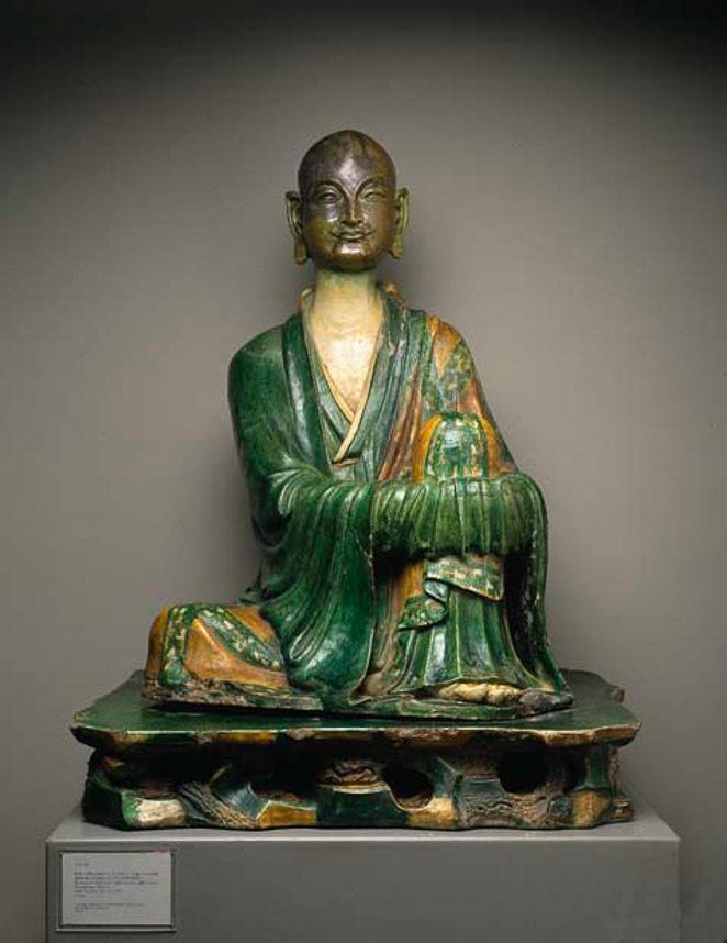
Now we have a -slightly- better understanding of the situation, let’s see what we can do with the 3D model.
Creating a “restored” digital double : a 3D reconstitution process
Disclaimer : this is an exercise, shown for documentation purposes only
The shape
Cleaning the mesh
We have a shape already. It was scanned and put online in 2017, as a 13MB something file size for the mesh and with available textures up to 8K. The mesh geometry is announced at 201 800 triangles and 100 900 vertices.
One thing can be said about scanned elements: their topologies change drastically from one technology and post-production algorithm to another.
I’m not going to enter into the “good topology” debate because I think this is utterly dependent on the goals to achieve.
So the first question to answer is what do we want to do ? We want to be able to try to texture the piece in a restorative (ish!) way and make the result available online.
In that endeavour, one could say that because the piece is already online, it might be assumed we can use the mesh as is.
After many attempts, I found out it wasn’t a good idea because the mesh and the elements to texture do not fit together.
Let me explain what I mean by that. The scanning method produced a triangulated surface for the piece as a whole. The mesh is denser where the reliefs on the piece are more complex. The texture is then projected on it. The result is that the elements we identified earlier are not exactly coinciding with the mesh. The frontiers are at best jagged, and the UV mapping is sometimes fractioned to the extreme. Any texturing done on that will not look good at a short distance.
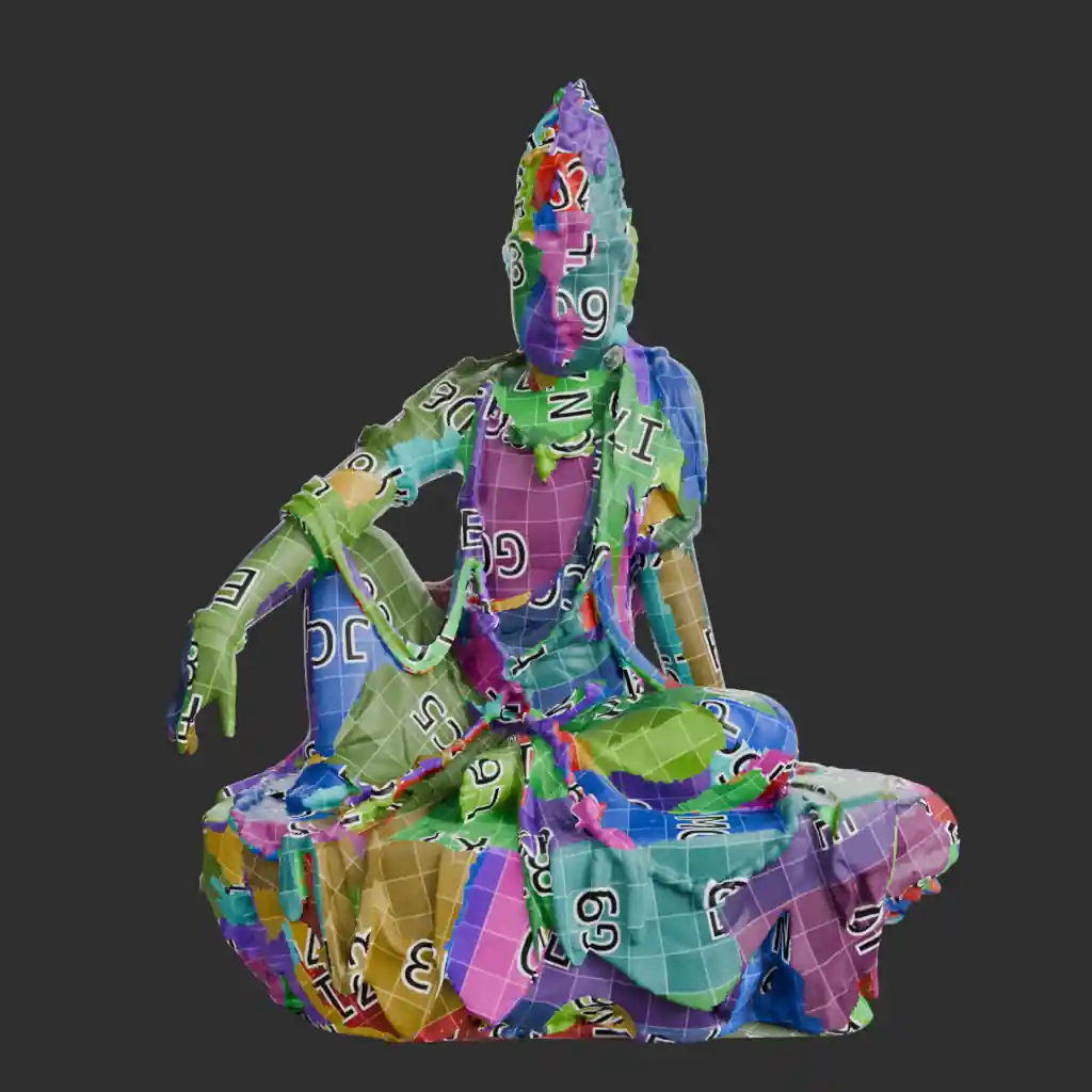
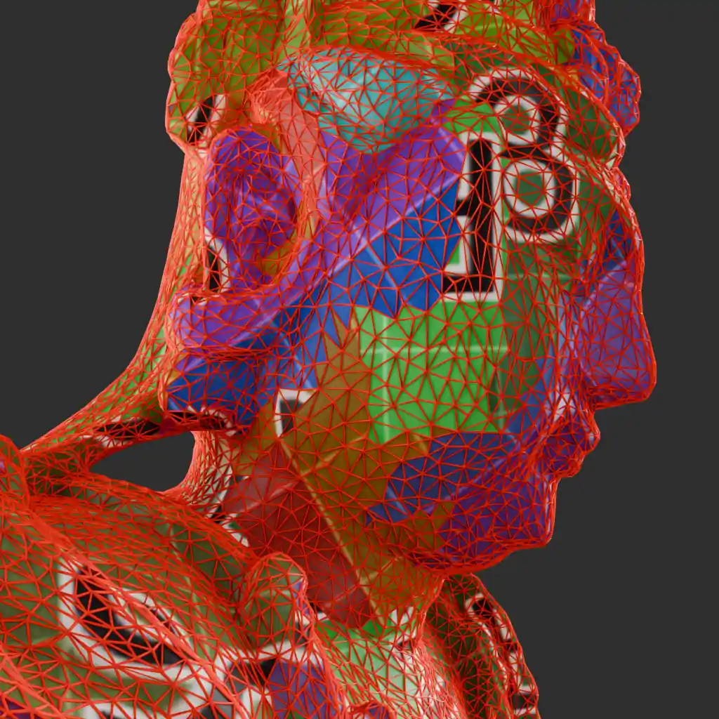
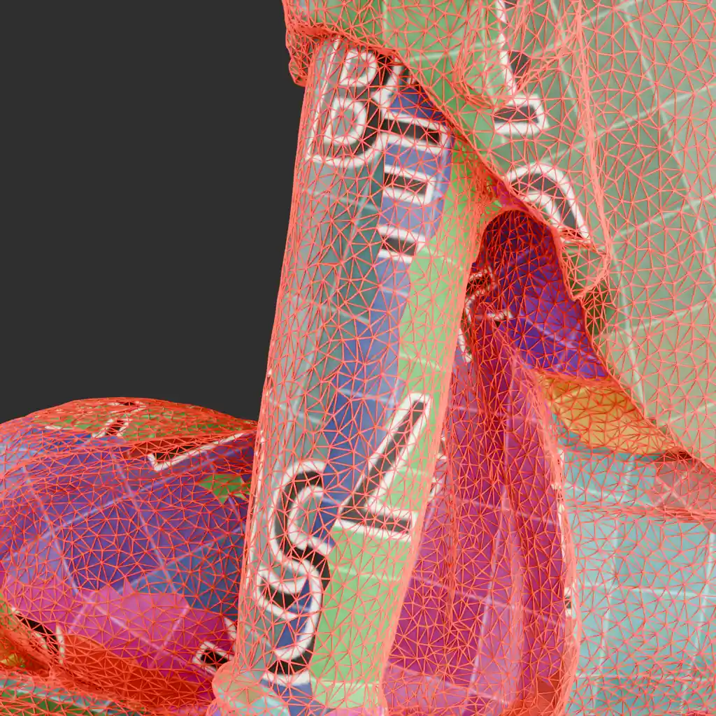
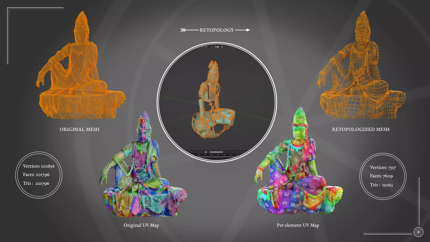
So, in order to do be able to texture the piece properly, we need to retopologize it to be able to work with the cleanest UVs possible. As this is a complex shape, I was faced with two dilemmas linked to one another.
Firstly, because of the work ahead, It would be useful to be able to isolate every element independently. But shall I split the retopology in as many elements corresponding to physical parts ? Or shall I retopologize it all and create vertex groups for each different parts? As this is an exercise, I tried both.
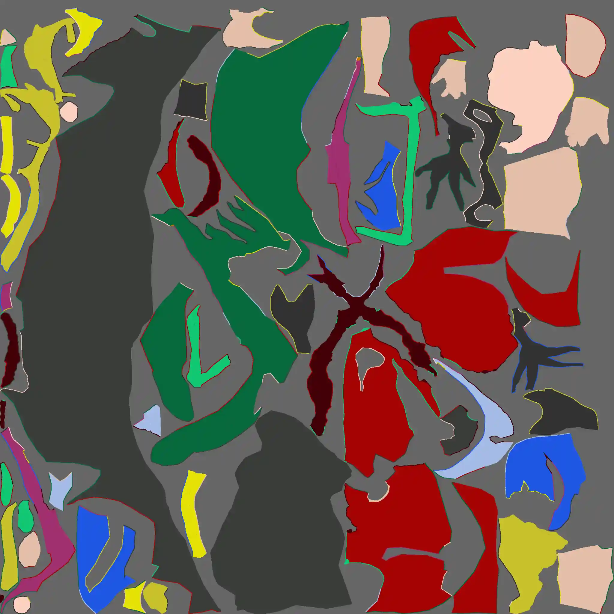
Then, I need to be very precise and follow the same logic in the naming convention I’m using. Because, as I experienced, this will become paramount both in the texture creation and the web-based rendering implementation.
My conclusion is thus: retopology is all fun and puzzles until the 4th day session in a row on the same piece redone at least twice to make up for bad judgements, then it becomes, well, not fun and bordering on life’s choices questioning internal monologues.
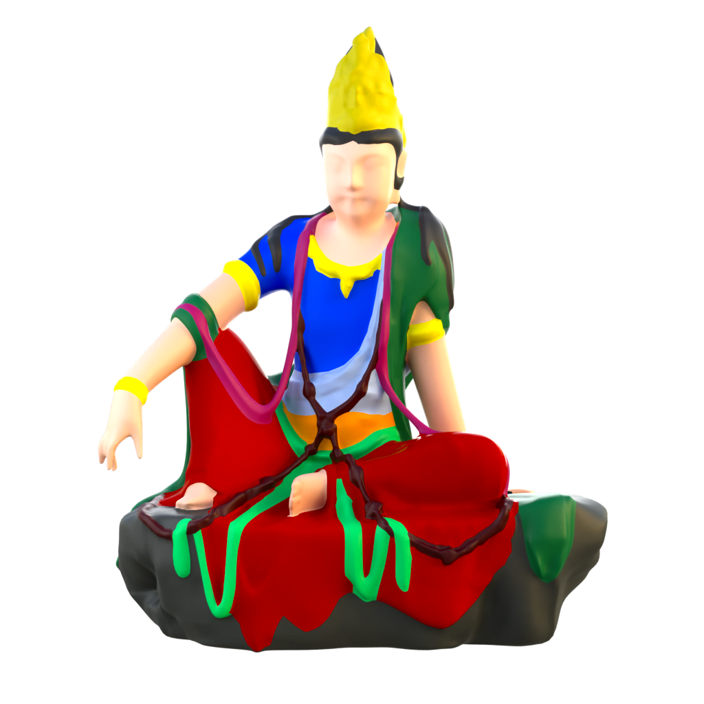
In the end, the most sensible way for this project, in this context and for this piece was to choose the vertex group method. Then I can have single-tiled ready-made maps more easily to import into painting apps and the three.js system. Also, that might save what is left of my sanity.
One step further
Upon closer inspection and using the references (and a good deal of introspection), I noticed the effect given by a unified mesh object was not completely genuine. The parts that were sculpted and added to the main structure need to stand out more.
We know from the different studies that these type of sculptures were made from jointed pieces of wood. Looking at the pictures on the museum website, we can notice that something like the crown is not a mass but a delicate latticework. The 3d scan version do not allow to precisely decipher if those are truly parts of the head or not. The same goes for the rosary and the Amitabah on his lotus throne and, in a lesser manner, the jewellery.
My initial thought was to work on the low polygon retopologized piece directly. I now don’t think that it will have enough details for acceptable results. Modeling these parts ex-nihilo could be a long and futile exercise: I think we will go the baking way to speed up the process. I had hoped to skip this step, but I’m afraid this project calls for it.
The idea is to do the texturing on a cleaned up very high definition version of the artefact and then proceed to baking it on a lower definition model. Hopefully, that way we can get the best of both world.
I have to promise my PC to give it ample breaks while manipulating that much data.
Texture the shape
Now that the groundwork is done, we can focus on the heart of the matter.
I initially thought about creating a PBR node based series of textures. I did. Then I decided to keep these only as a way to search a convincing palette and started all over again in a painting app. Just like the case of the lapis-lazuli goddess, I came to the conclusion that textures need to be somehow bespoke in order to give the piece an accurate and more convincing look. So far, I was not able to obtain such an effect without at least a last layer of hand painting.
A smilar process documented from scanning to colouring was used for the virtual restoration of the colours and textures of polychrome Bodhidharma statue from the Lingyan Temple, though I’m using a different set of tools (Substance Painter instead of Mudbox, for instance). This project is particularly interesting because both physical an digital restauration were done jointly and numerous analysis that interest us directly were made to document the process.
It’s a textile thing
As we’ve previously hinted at, fabric related parts represent a lot of the sculpture’s surface. In order to have an idea of what they could have looked like, I took it upon myself to create mock ups from reconstructed textiles from the fragments in the museums’ collection pertaining to the era we’re aiming for.
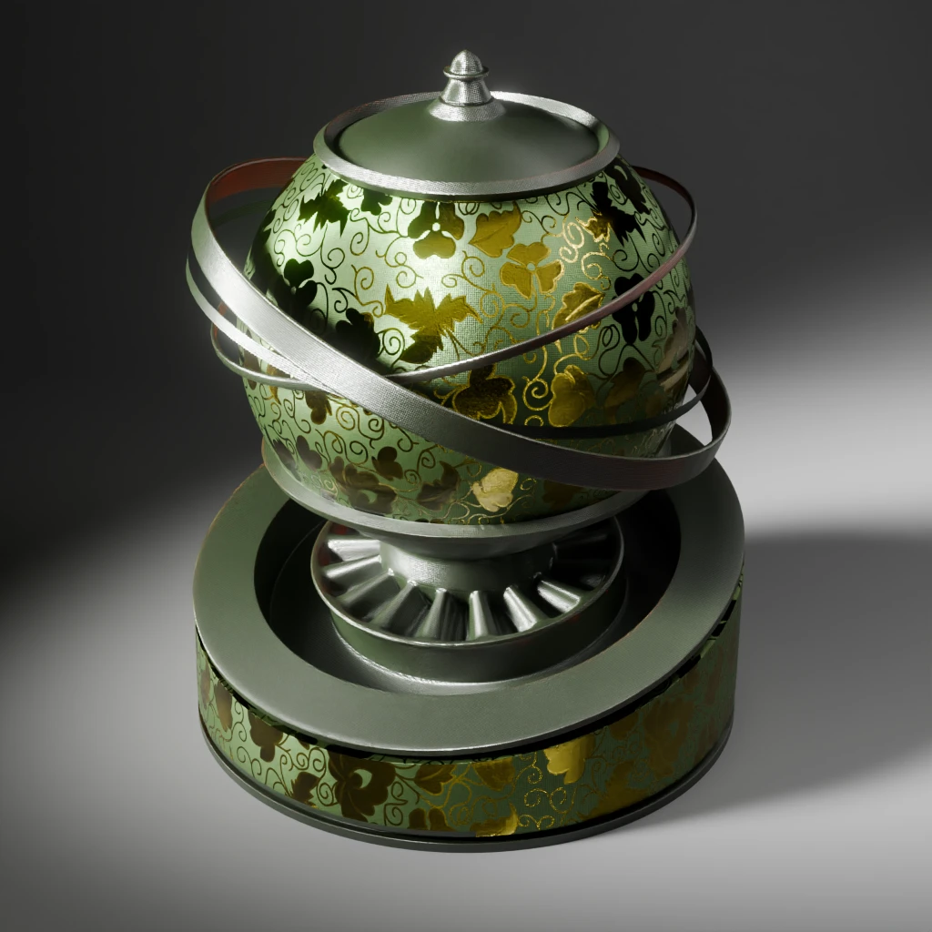
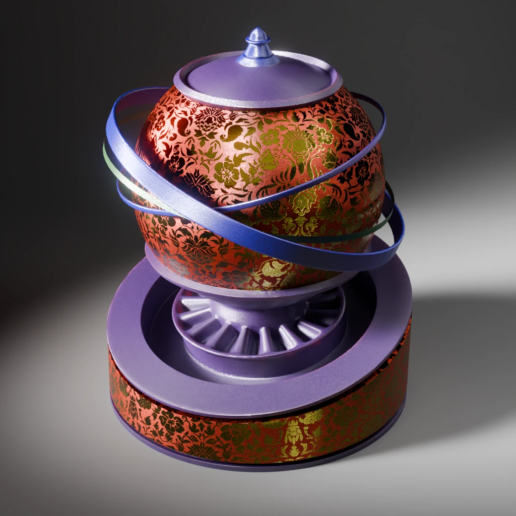
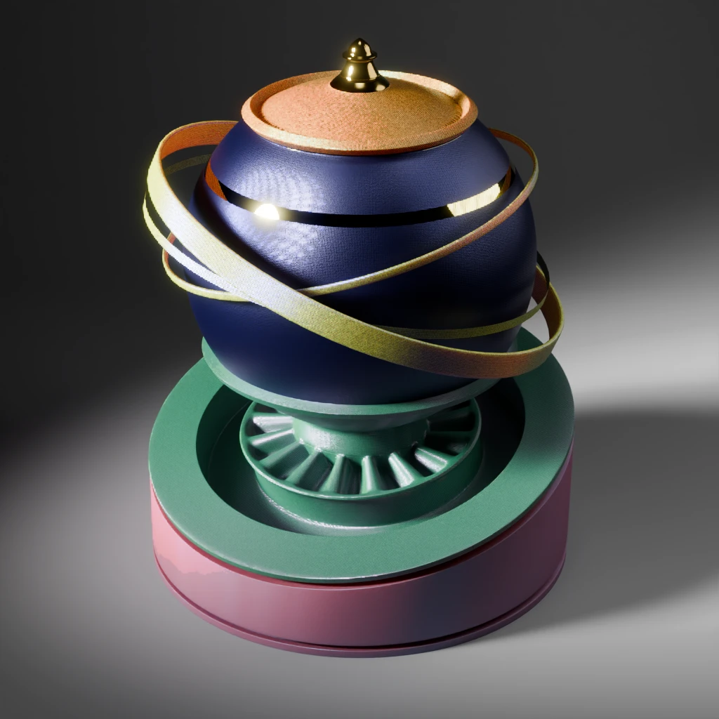
Using part of the motifs from the pair of boots from the Cleveland museum, with a little bit of polishing, a few wave pattern nodes and we have a bit of fun gilding elements ! Contrasting it with a sobre silk material, and we have, well, something. Who knows how accurate it is historically speaking ? We know from the references that there was indeed a gilded decor: I think it can be used as a discrete border on our model.
The sculpture has many different textiles to texture so the fun is only beginning ! I was able to test things out on my beloved complex shape. You can see theresults below.
Don’t be fooled by the apparent randomness of colours, remember we have a palette goal and iconogaphic references.
The many faces of a bodhisattva
Now, despite my best efforts and the amount of researches I did, I couldn’t find a definite answer to some of my design and colours questions. There is an important amount of guesswork and the collaboration with a scientific team is missing.
I know, I know, this is an exercise etc. Still.
Because this is digital and kept in a non-destructive workflow to the best of my abilities, we have now, after quite a lot of work, well, let’s say an array of coloured variants.

The big question now is, which one to choose ?
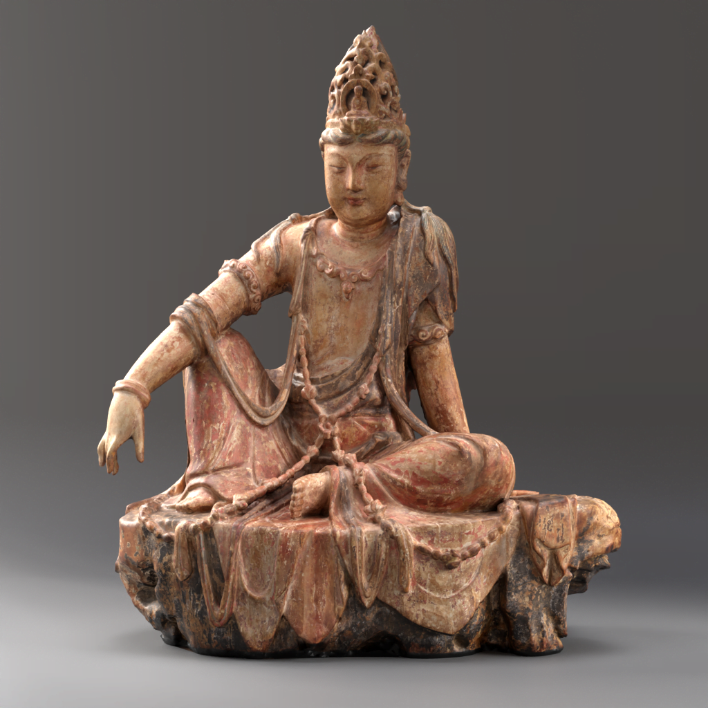
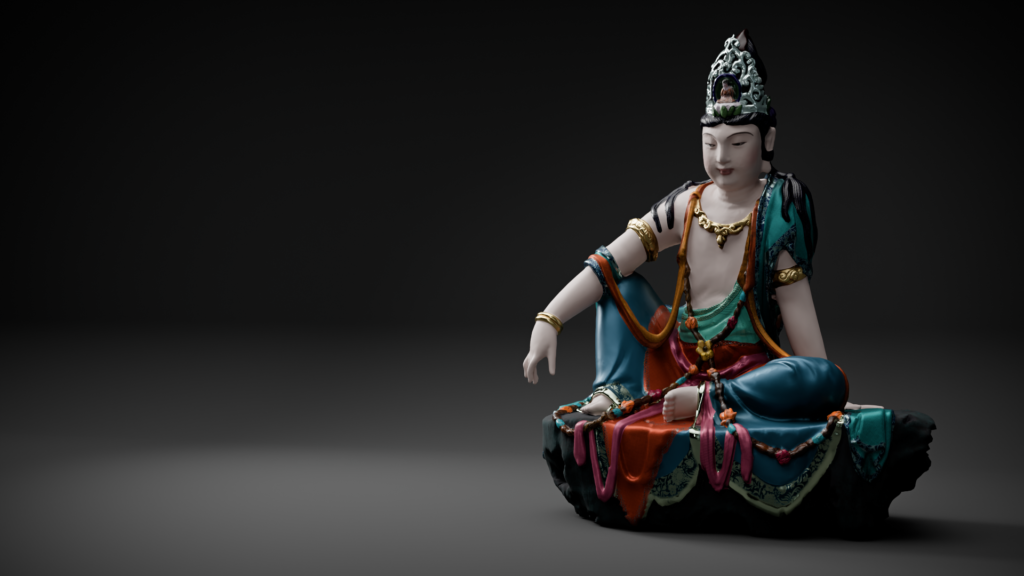
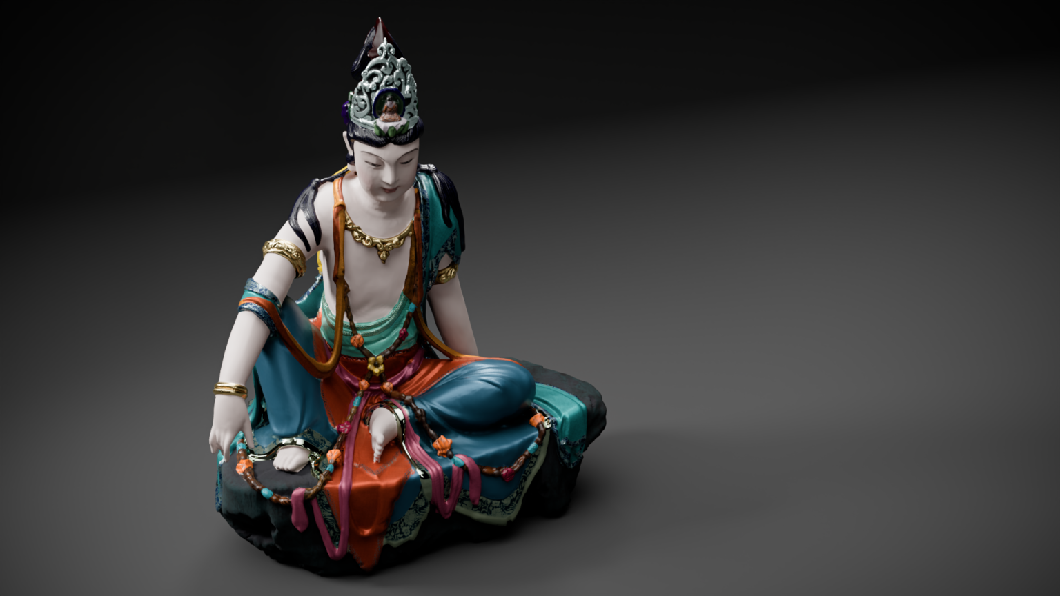
I will be frank. I’m still unsure I chose the right one. My biggest pet peeve is the dhoti’s colour. I know the piece looks more convincing with a warm tone. I’m also almost certain it’s because I’m more accustomed to this colour palette than a cool one. So, I’m arbitrarily selecting the opposite.
You’ll notice I did not overly repaint elements such as the Amitabha buddha: the actual texture lets us think he was coloured and the references (whatever era) show he is always represented as descriptively as the Avolokitesvara in whose hairdo he sits upon.
The crown and jewels are reshaped in Substance painter (normal map). It allows me to alter the surface of the model without touching the geometry of the base mesh.
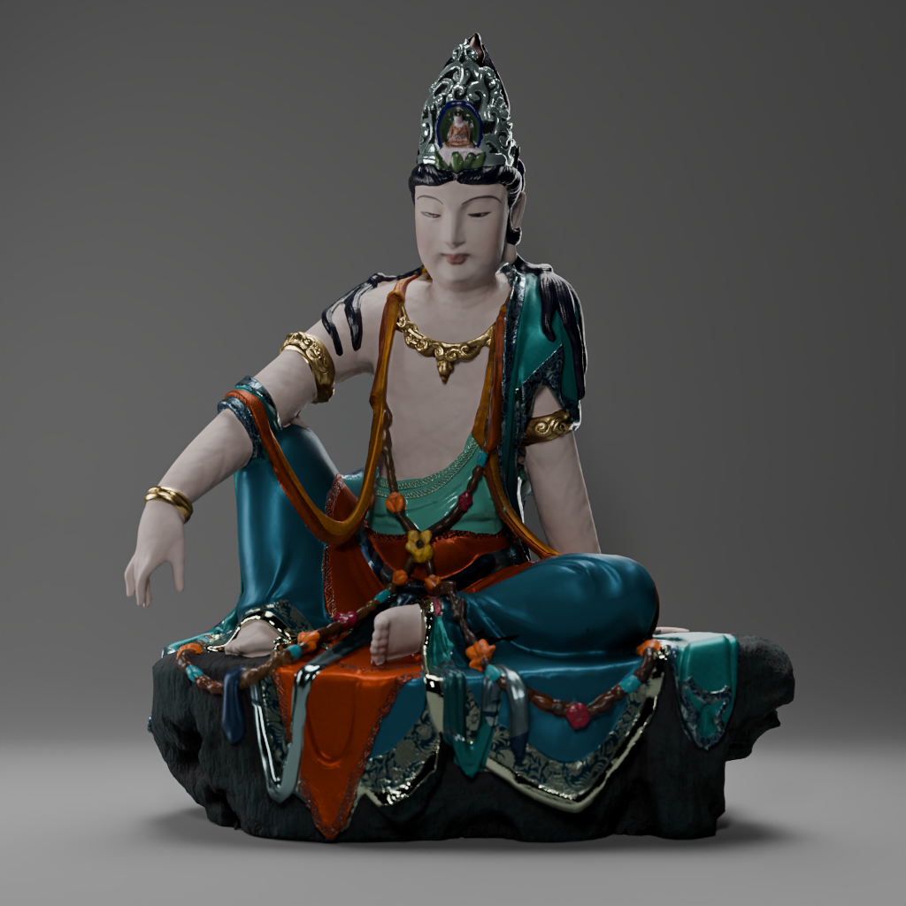
Shine a little light: stills renders using Cycles
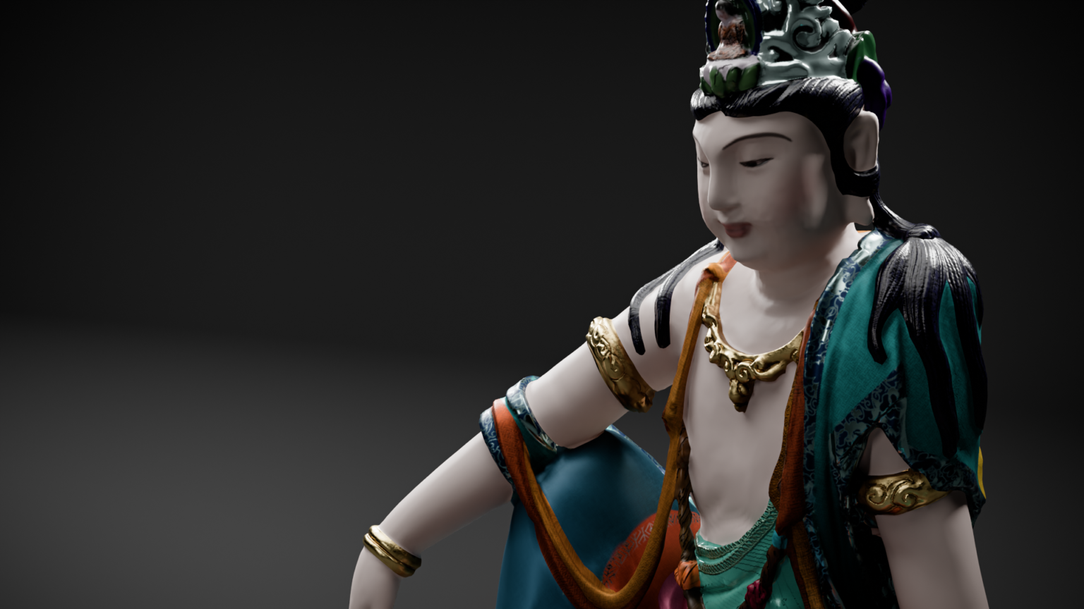
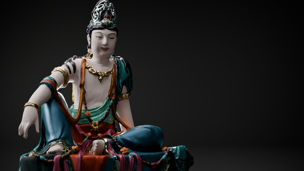
All hands on code: making the model available for the web
Process
Once everything is in place in an as orderly fashion as I can muster, it’s always easier to deal with the online version of the model.
I had a few scraps with baking the textures exactly how I wanted them. The metallic parts of the model were my biggest pet peeves.
Most of you may know about this “issue” and how to go around it, namely that baking metallic textures in blender will result in a black spot on the diffuse map. “Metal in 3D is a black diffuse material and a tinted glossy component”, say the experts.
I went back and forth with the idea (again!) of separating all the elements into separate meshes so that I can fine tune each texture in three.js for the online viewer. In the end, I choose not to do that for file size reasons. I wanted to limit texture size around 1K, which is a little short for a “hero” piece , but is already tough for certain mobile phones and networks. As a result, the details are not as neat and precise as I have wanted them to be, but it can be viewed with a “decent” loading time.
But that means, in this case, I have 14 different materials to bake into one single tile, combining metallic and non-metallic ones. Therefore, I would lose the colours of one or the others using the “diffuse” or “glossy” bake. The link above gives the answer to that Gordian knot: plug metalness map into the emission socket and bake ! That gives us a usable metalness map.
One quick tip I learned on the fly: I toyed with the IOR value of the new (blender 4.0.x) BSDF principled shader and didn’t put them back to the default value (1.45). As a result, the emission map was not taking into account all the parts I needed. It should have been obvious, but have I not left one of them as is and giving different results, I probably would still be looking for a solution. Once I found this out, I finally obtained an emission map that can be used as a metalness map.
As three.js allows for the usage of a .metalnessMap class, it’s a game of fine tweaking afterwards.
Code lines
Here are the most relevant lines of codes behind the materials of the model in the web viewer. Remember that I’m working with a JSON file to feed the model to the viewer, so the syntax is irrelevant here. Just gather the information you need from it !
"3Dmodel": "./assets/models/avalo_1/avalo_2.glb",
"meshes": [{
  "name": "avalokitesvara_low_armor_text",
  "textures": {
    "map": "./assets/models/avalo_1/textures/avalo_combined_2.webp",
    "normalMap": "./assets/models/avalo_1/textures/avalo_norm.webp",
    "roughnessMap": "./assets/models/avalo_1/textures/avalo_rough.webp",
    "metalnessMap": "assets/models/avalo_1/textures/avalo_metal.webp",
    "aoMap": "assets/models/avalo_1/textures/avalo_ao.webp"
  },
  "values": {
    "aoMapIntensity": 0.5,
    "normalScale": [0.21,0.21],
    "iridescence": 0.15,
    "clearCoat": 0.35,
    "roughness": 1,
    "metalness": 1,
    "envMapIntensity": 0.9,
    "needsUpdate": true
  },
  "modules": {
    "side": "FrontSide",
    "envMap": "hdrEquirect"
  }
}]
3D view
Disclaimer : technical limitation to material render in web app can let artifacts show, particularly in zoomed views.
See the full screen view (this will open a new tab in your browser).
Credits
Images
Unless otherwise mentioned, all images credits to LGS.
Guanyin of the Southern Sea, Liao (907-1125) or Jin dynasty (1115-1234), China, Nelson-Atkins museum of Art
Bodhisattva, Kin Dynasty (1115-1234) fresco in Ch’ung-fu Temple, Shuo-chou, Unknown artist, Public domain, via Wikimedia Commons
The Bodhisattva Avalokiteshvara in the Form of Shadakshari Lokeshvara: Folio from a manuscript of the Ashtasahasrika Prajnaparamita (Perfection of Wisdom), Mahavihara Master, early 12th century, Accession Number: 2001.445a, Metropolitan museum
Figure of a luohan, moulded earthenware with glaze, Yixian, Hebei province, China, 11th Century, Liao-Jin Dynasty, Royal Ontario museum
Pair of Headpieces, Liao dynasty, China, Cleveland Museum of Art via Wikimedia Commons
Pair of Boots, Liao dynasty, 907-1125, Cleveland Museum of Art
Textile fragment with boys in floral scrolls, Northern Song dynasty (960–1127), 11th–12th century, Metropolitan museum
Bibliography
John Larson and Rose Kerr, Guanyin, A Masterpiece Revealed, Victoria and Albert Museum, 1985.
Petra Rösch, Chinese Wood Sculptures of the 11th to 13th centuries: Images of Water-moon Guanyin in Northern Chinese Temples and Western Collections, Columbia University Press, 2007.
Tong, Y., Cai, Y., Nevin, A. et al. Digital technology virtual restoration of the colours and textures of polychrome Bodhidharma statue from the Lingyan Temple, Shandong, China. Herit Sci 11, 12 (2023).
Cybele Tom, Clara Granzotto, and Ken Sutherland, “Seeking Balance: Material and Meaning in a Polychrome Guanyin”, in Perspectives on In/stability, ed. Delinda Collier and Robyn Farrell (Art Institute of Chicago, 2022).