

Gaudernack’s peonies
The following texts and images are the results of a training exercise to go from the pictures or the description of an artefact to the creation of a 3D digital double, sometimes restored version of it. If you wish to know more about the process, explanations are in A journey into learning a (3D!) restoration process workflow article.
Today, we are trying our hands at a real case scenario. This time we can have access to the preparatory drawings and the final created piece ! The plot thickens when we learn that these elements are situated on either side of an ocean.
It is relatively easy for the place where the object is to have a copy of the drawings to present alongside to the public. The opposite isn’t true. I like the idea of allowing the public to see and manipulate on a screen the application of the designer’s idea they can see on paper. True, an exhibition is usually the place to do that. Yet, they are limiting: in time, in space and let’s face it, in regard to conservation’s requirements. Paper is notoriously light-damaged and letting the audience touch and manipulate a fragile piece is, well, shall we say unwise ?
Enters 3D !
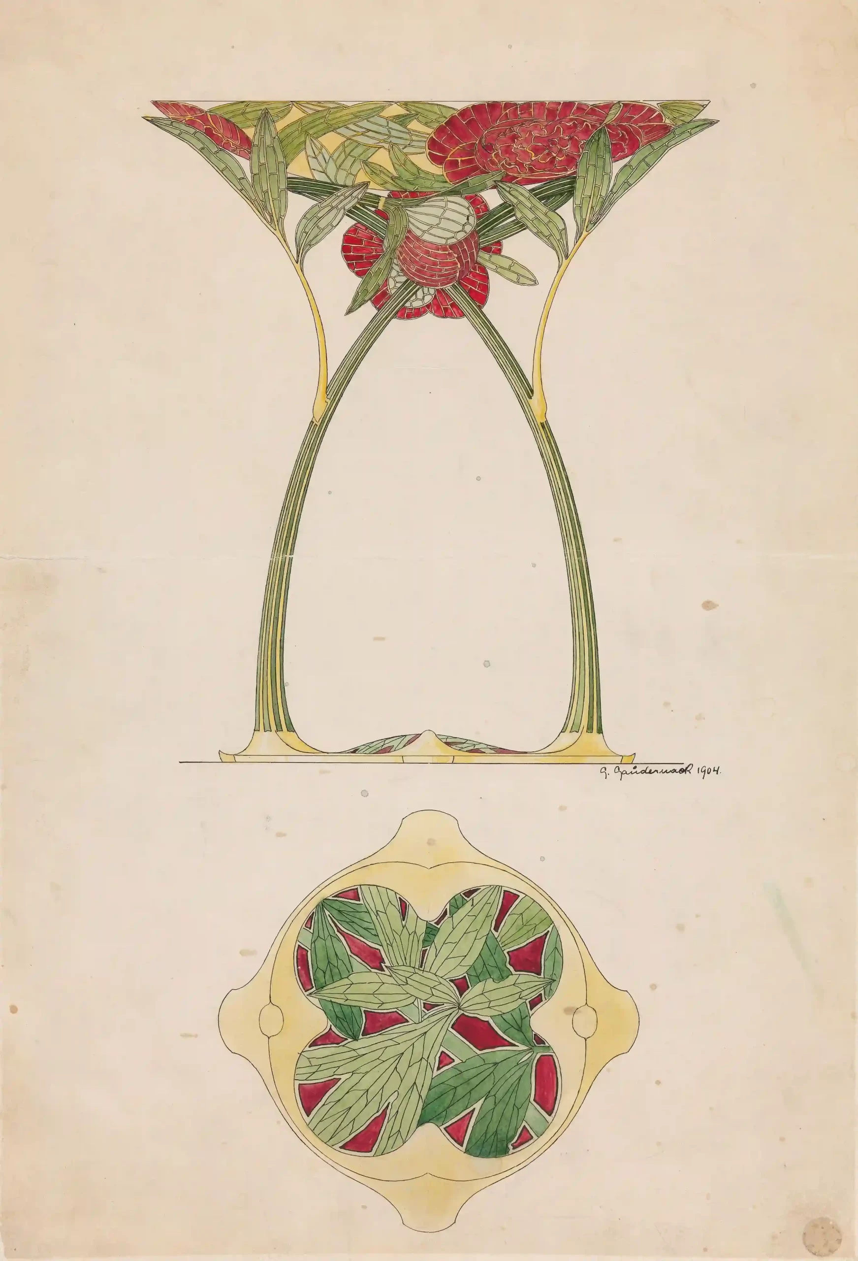
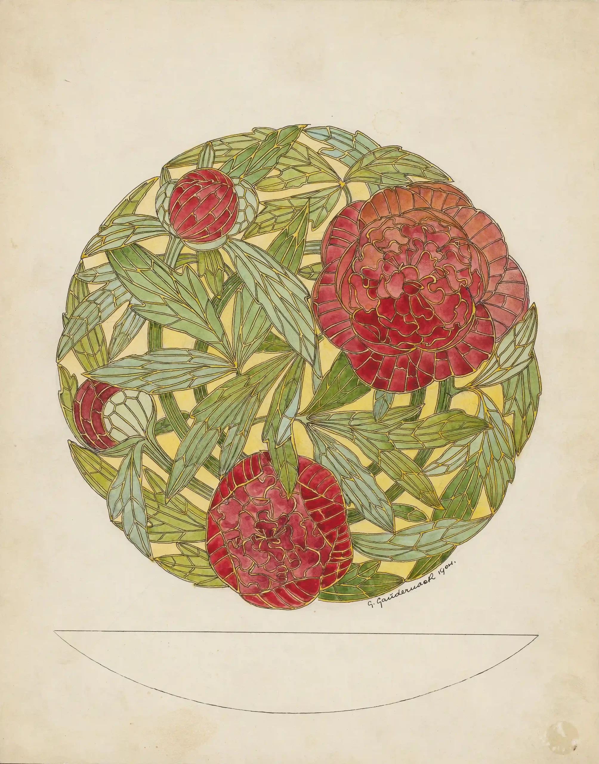
Title: Drawing for Peon vase
Datation: ca 1904
Provenance: Oslo, Norway
Dimensions: 44.1 x 30.9 cm
Source image: INV n°OK-18632A and OK-18632B, Nasjonalmuseet, Norway
Description and Historical context
We have two sources for this project. The preparatory drawings from designer Gustav Gaudernack are curated at the National museum of Norway in Oslo.
There is one created object from them, produced by the David-Andersen manufacture and curated at the Walters Art Museum in Baltimore. I could not find the total number of the Peony vases that were created according to Gaudernack’s drawings.
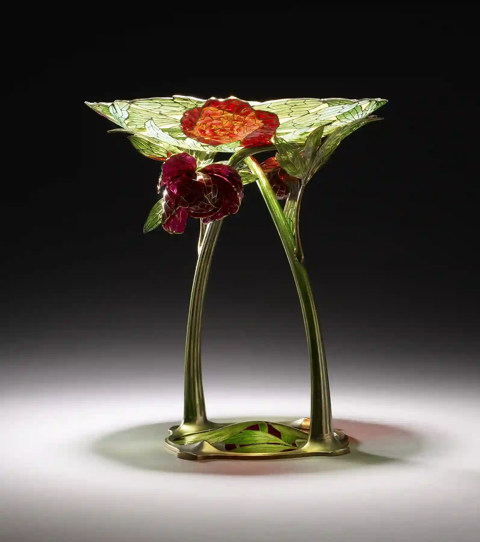
The shape is a poem in itself: two stems rise sinuously from the ornate foot and bend to support a bowl while continuing their path to end up, respectively in a blooming peony flower and a blossom on the other side of the artefact. The bowl transcends the idea of a peony bush in plique-à-jour form. Soft green and bright deep reds create the main palette, underlined by subtle yellows. The aspect of it all is enhanced by the gilded silver soft gold-like effect.
So, yes, we are definitely in art nouveau territory !
Technically, it is a very complex piece to make. The art nouveau whirlwind is there but using enamel techniques that do not respond well to sudden direction changes. The designer and the craft persons did a fantastic job at masking all these constraints in a cohesive, airy and flowing decor. This piece seems even more masterful in that regard, if a little over the top for my taste !
Gustav Gaudernack (1865-1914): from dragons to flowers
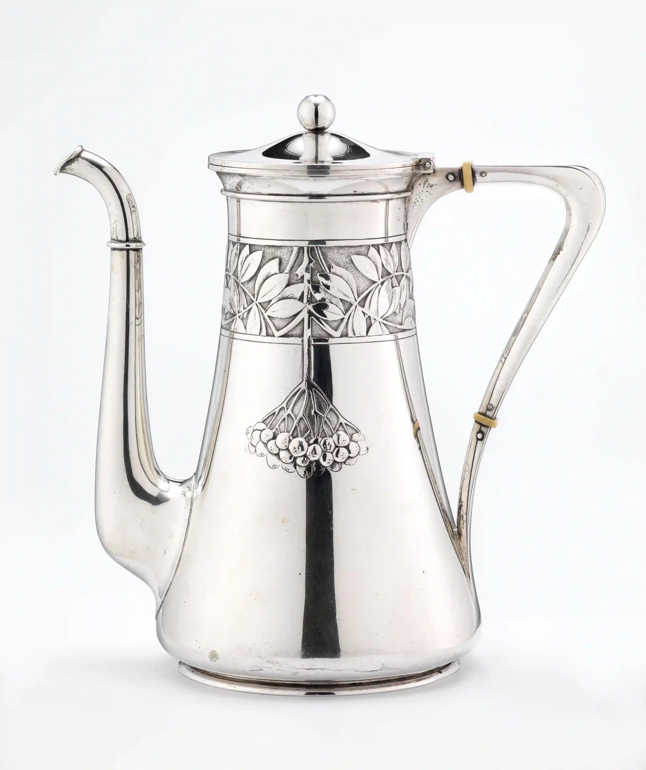
Gustav Gaudernack was an Austrian born Norwegian designer. He trained in Bohemia and Vienna before immigrating and then worked for the David-Andersen goldsmith company between 1892 and 1910, then eventually created his own firm.
He created and saw to the production of numerous objects for different companies. After a period marked by dragestil accents and historical pastiches, he then fully embraced the Art nouveau movement. He was also keen on developing techniques, particularly enamel related ones.
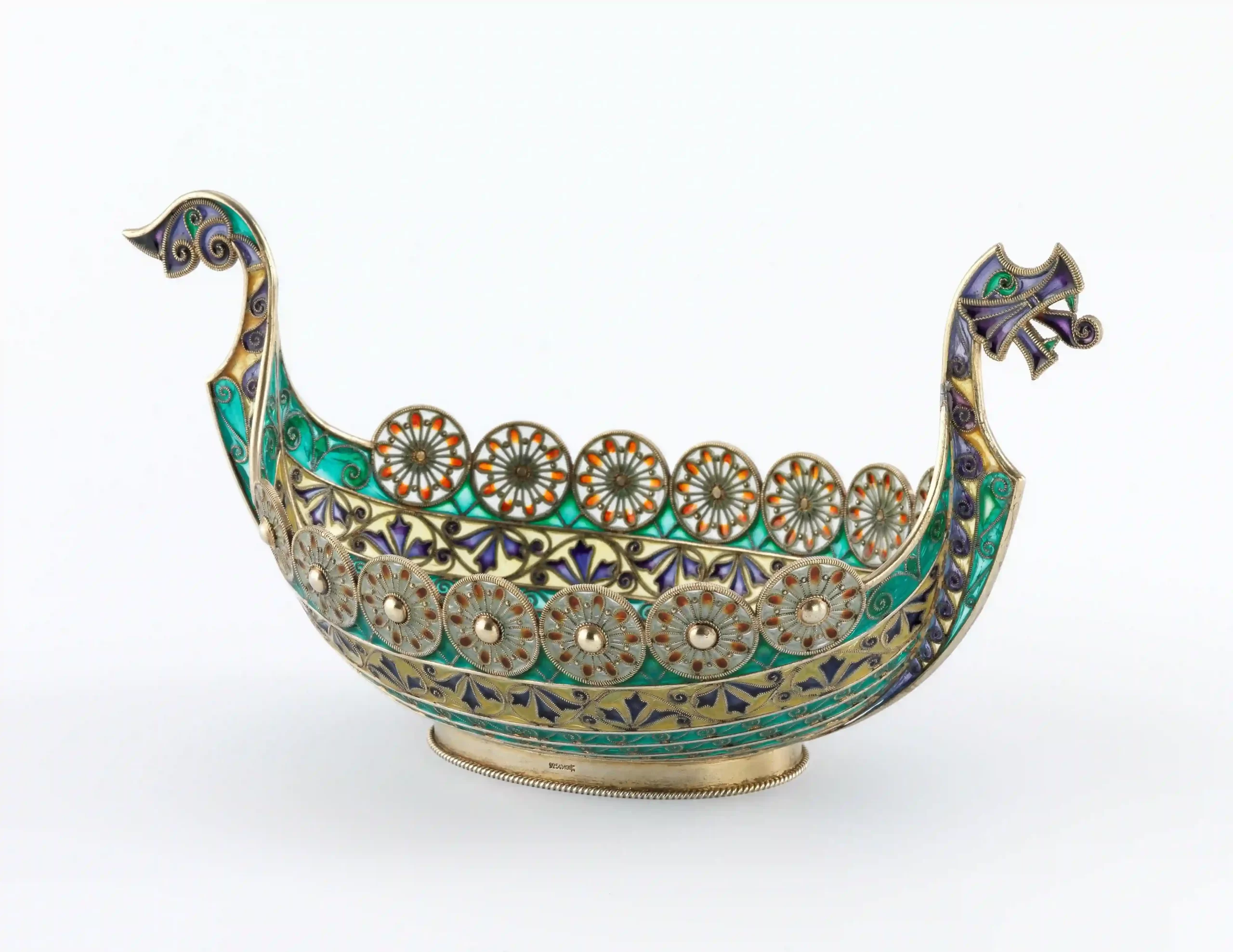
Enamels and Plique enamels
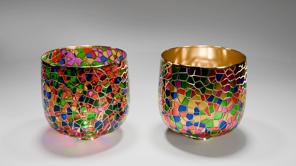
The Walter Art Museum describes the object as silver gilding, “plique-à-jour” and “cloisonné” enamels. These last two things are variations on the same thing. It’s a very old technique, known since the 3rd millennium BC in Mesopotamia making use of the fusible possibilities of grounded coloured glass. The outlines of a drawing are made of metal threads, creating small cells. Once filled with enamel powder the piece is fired. The enamel melts and fill the cell with a glass-like substance. The difference between the two techniques is in the backing material. “Regular” cloisonné is made on metal or ceramics or stone (or anything that can withstand the 800 °C kiln temperature!). “Plique” has ultimately no backing material (it is removed after firing), making it freestanding and translucent, sort of small vitrail. It also makes them fragile and brittle.
Technical conundrum: test and test again
Making lists
Now that we know a bit more about the model and its context, let’s try to think about how we can create a digital double of the piece. This is no a small feat, and planning ahead will help in the long run.
First, what is our goal ?
We aim to make a model that can be used in a 3D viewing environment (web browser or VR headset). That means we are ultimately aiming for as low a file size as we can that renders both the shape and the textures accurately.
There are different methods to achieve this goal. As with most of the projects on this blog so far, scanning the piece is not an option. But, would a scan of the object have helped ? Short answer: Not really.
In that particular case, I’m not sure scanning the object in order to create a UX experience would help. First, we have enough material to create the outline more or less accurately in a relatively short amount of time. Then the whole piece, and Gaudernack’s work, hangs in the translucency of the enamels. That means we need to be able to dissociate the enamel parts from the rest of the piece. For the textures alone and on mesh terms, that means we would need to retopologize the scanned model with so much precision that it would exponentially grow the time spent on the piece just to have a model to work upon. It is probably easier to start from scratch and build the model layer by layer. In all fairness, a scanned model would maybe help to find the exact outline faster, though.
As I embark on this project, I think the point that will hurt the most is the organization of it all. Is it better to separate parts and individualize materials in order to be able to code specific materials for them ? Or should I use a series of maps and alphas from a unified mesh to trick the renderer into doing what I want ?
Besides, let’s keep in mind I’m working on a technical budget: both size and computation costs must remain under control.
With all these points in mind, I think we need to make preliminary tests. A trial run if you prefer, so that we can create a method that is sure to work. Or that will not fail too much !
Finding a method
Thickness test
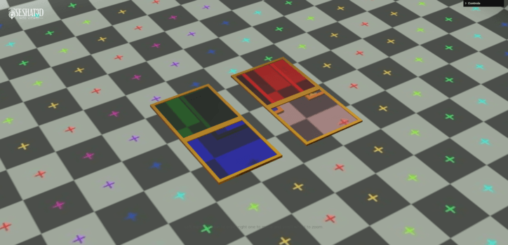
The first thing I wanted to acknowledge is to make sure the thickness of glass like pieces would not be a problem in three.js. I’ve encountered issues on that front before and if I could not pass this point then the project fails on the spot.
I started out with a simple shape, with and without thickness (i.e. double-sided geometry).
"parent": "frame001",
"name": "Plane_blue",
"textures": {},
"values": {
   "color": "blue",
   "dispersion": 5.0,
   "metalness": 0,
   "roughness": 0,
   "transmission": 1,
   "opacity": 1,
   "thickness": 2.27,
   "ior": 1.5,
   "specularIntensity": 1,
   "specularColor": "#ffffff",
   "needsUpdate": true
},
"modules": {
   "envMap": "hdrEquirect",
   "envMapIntensity": 1,
   "side": "DoubleSide"
}
I found three.js examples files useful, as well as this page about thickness and glass materials.
Turns out, I may not need double-sided pieces in order to have a convincing effect. That is good news because it means less geometry, therefore less heavy files !
Plique enamels in three.js
Then, let’s move on to trying with a more accurate element, namely one of the leaves from the decor. The idea now is to create a proof of concept of a material render that can look like a 19th century version of the “plique-à-jour” enamel technique. This will, of course, require some heavy refinements later.
A method to the madness
So here is the plan, based on our little tests.
First, good news, it can work! Definitely, maybe.
Then, the idea is to create the metallic structure first then create the enamel cells, making sure I respect the different materials’ separation. That way I can add cuts ‘on demand’ so I can stick to a quad topology. Granted, it will most likely be an ugly quad topology but a quad topology nonetheless.
Once everything is modelled, I think I can try to mix maps (PBR) and code to create convincing textures for the web viewer.
Hopefully, maybe.
It’s in the details !
Disclaimer : this is an exercise, shown for documentation purposes only.
Tips on how not to become mad:
- Make sure you have an adequate position and take breaks. I mean it doesn’t look like it, but it’s a heavy hard surface design modelling process. Your wrist and back will hurt. I diverted the Pomodoro method (a set timer assigned for a specific task) and have it warn me every 25 minutes to force me to stand up, move around for 5 minutes and drink water.
- Make bite sized sessions, no more than 4 hours per day and work on something else then.
- No, seriously, drinking water is important.
How to do it: 3D reconstitution process
Modelling the shape and which shape to model
The cup shape is complex.
I think the best way to model it is to first try to understand how the different parts work with one another. Let’s start with a first assessment of what we have to deal with.
can see 8 elements so far. Starting from the foot, then the 2 stems, each sprouting one side leaf and ending each on a floral element. On the top is the bowl.
I can already see the hardest parts to model will be the floral elements. They are not complex per se, but we do not have a clear view of all their sides. I vote to doing them last. That way I can familiarize myself with the style and workflow of the project before tackling the hardest part. Cherry on top, there are differences between the design and the created artefact. Let’s cross this bridge when we get there.
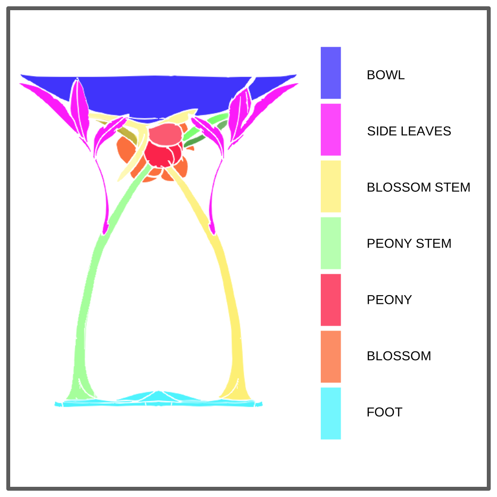
The easiest parts are the foot and the bowl. Let’s start with them.
The foot
The metallic rim was surprisingly the toughest part to pinpoint, mainly because we do not have a view of the underside. The different slopes have to be estimated and reconstructed by sight. The most effective method was to use a lattice to deform the mesh. It gives a more natural flow.
As we do possess the full outline of the decor from the drawings, this first part into detailing the mesh was relatively fast. One thing, though, I have no way to make absolutely sure the design and the piece share the exact same decor as we do not have a full view of it.
Fun fact, I did have to redo the metallic structure part because it seems this is one of the cloisonnée part and not plique du jour. Therefore it needs a metallic background. It a simple enough tweak but it also shows the importance of researching things thoroughly first !
The bowl
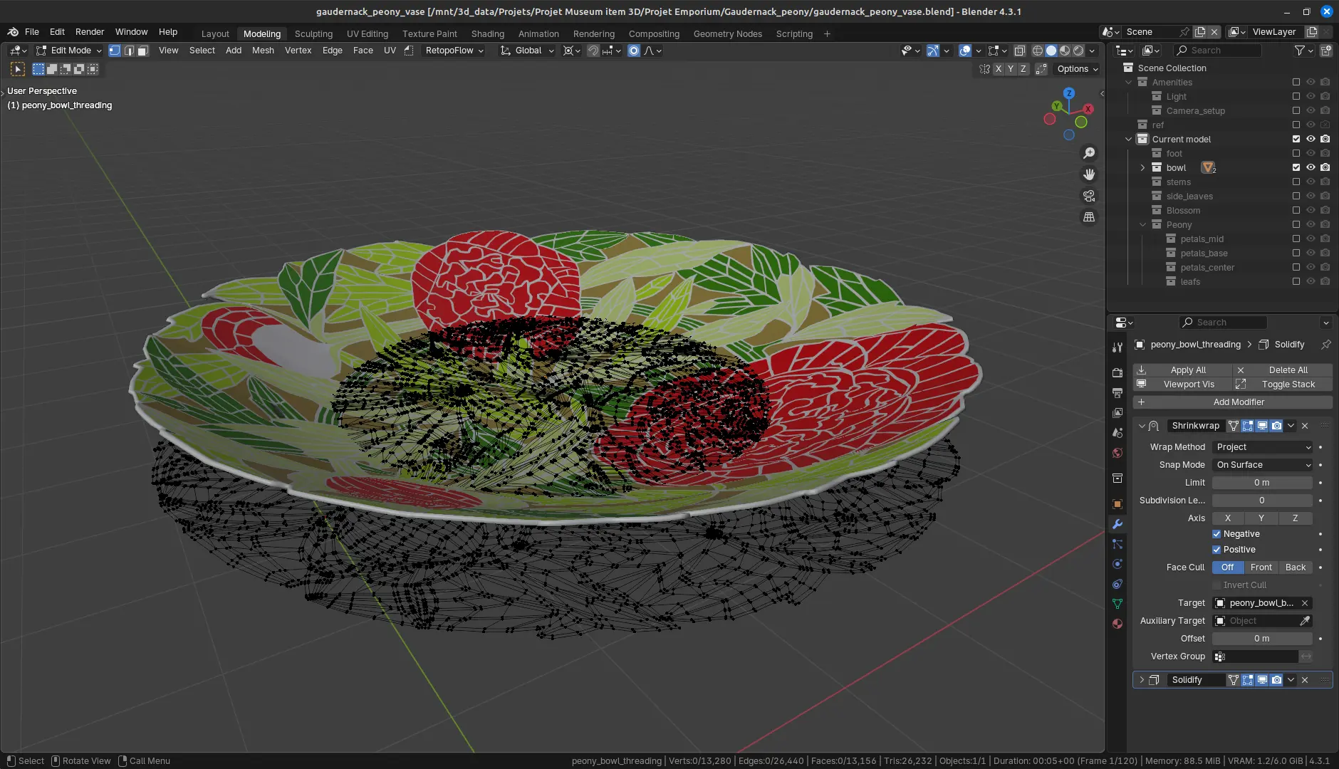
It’s a long but not overly complicated process as long as I try to keep everything at even numbers of vertices to respect a quad mesh rule. Spoiler alert: I did not succeed every time. I’m going for the “triangles are okay as long as they are strategically placed” (i.e. on flat surfaces or tiny unseen angles). The deformation is done using a shrink wrap modifier on a dummy bowl extracted from the drawings. This trick has drawback: the deformation of the flat created design modify the proportions of the elements. In this case, because it is a shallow bowl, it does not modify things too drastically. If I were to nitpick, I’d say it is more perceptible in the slightly bigger flowers. The overall proportions of the design are respected and, once again, the references do not allow a full comparison with the crafted artefact.
The stems
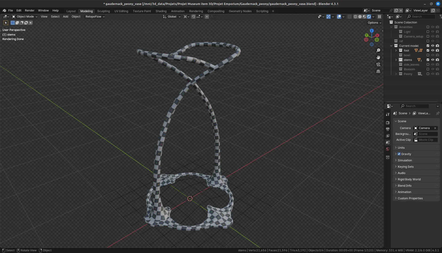
They are the literal link between the discreet foot and the overbearing bowl. Their lightness and sinuosity create the elegance of the piece.
The drawings do not show their full paths, so I am also referring to the object for guidance. For instance, the frontal view of the drawing do not show they are straight for most of their height and only start bending after the side leaves sprout. Starting from the drawings, I initially created helix like structures from the foot.
Just as well, they do not cover the whole circumference of the bowl as I initially thought. In order for the images and references to make sense, they have to change path somewhere around the inside of the side leaves. Just like hiding an ugly UV seam, it is quite cunning of the artisans to have put this abrupt bend there.
The sides leaves
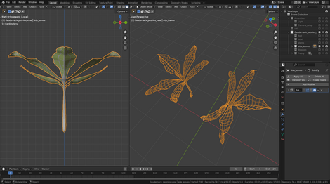
Now we are starting to delve into “extreme” deformation of shape territory. As the leaves seems mostly symmetrical, let’s focus on one and copy it then tweak for differences only at the very end of the process.
Because we have a side view, we only have to try to make the shape fit the sides. It is a little finicky, but the artefact can help us limit guess work: there’s ample photographic documentation of the leaves.
The dreaded inflorescence and the case of the missing sepals
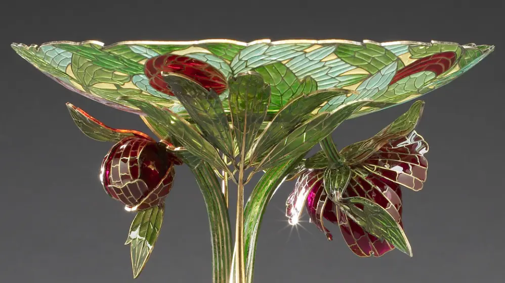
Because these are not overly visible on the references, I am using the object as a guide.
They do not conform fully to the botanical floral formula of the species and there are differences between the design and the object. So, we will have to go by eyes and whatever brains we could find !
I created them on separate files, taking my time and adjusting as I go. I initially though trying to draw them first would help. It didn’t. Surprisingly, what worked was vocalizing a description of what I was looking at in the references and immediately modelling it. It’s very weird, the cat was looking at me funny, but it worked.
The cells outlines on these two elements are complete reconstruction. I was not able to extract their exact geometry from the references. So, I did as best I could.
The blossoming bud
The object shows 3 bracts at the base, making the connection with the stem by a punt mark.
There are 2 petals forming the outer circle, positioned directly behind the 2 most out reaching bracts. The third bract reaches inside the shape toward the opposite side; it is not linked to a petal. Instead, it lets an opening show. I am not sure what is happening there: there seems to be a rounded mass of glass inside and I don’t see metallic cells.
Once the main masses are in place, I used lattices to shape the leaves and petals. This is a non-destructive workflow allowed me to modify the enamel cells to better fit the references.
However, the drawing situates there a white shape that is not on the object. I’m guessing this is a reference to the delicate silk-like sepals protecting peonies blossoming flowers. The bud orientation has moved a little from design to object, but this is clearly an important difference. That is intriguing. So, what do we choose to do ?
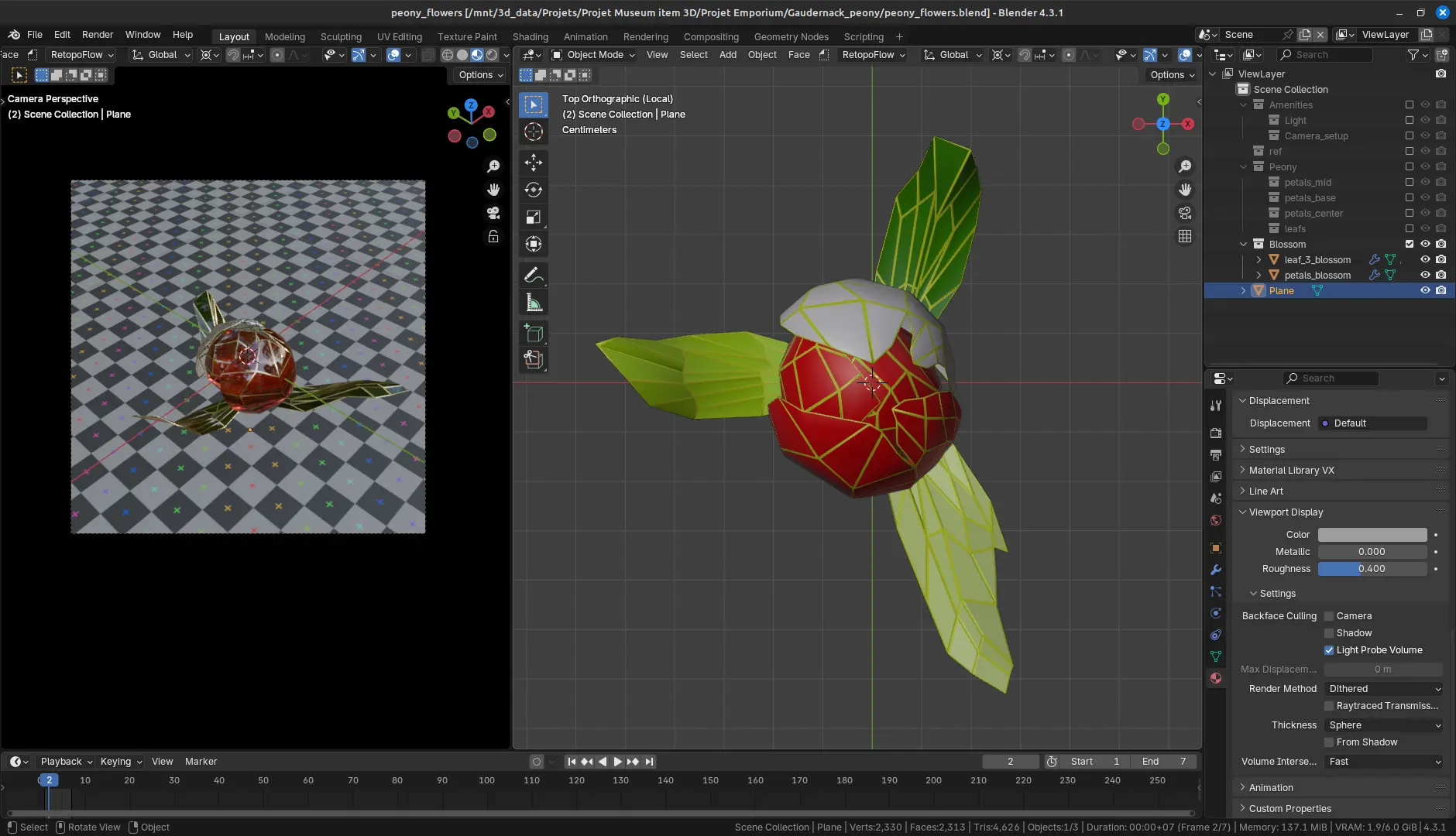
Well, as I have decided to follow the drawing from the start whenever a question arose, there is an obvious decision. So yes, on top of a complex shape, I’m going rogue ! That means adding a yellow-white sepal.
The flower.
As with the bud, the shape starts with 3 bracts. Almost immediately behind them are three petals covering the rounded centre of the flower: the petals are organized by circle of 3, tightening as they fold towards the centre. Again, we have a discrepancy between the object and the design. There is another missing sepal ! One could have been a mistake, two is either carelessness or a deliberate act to aggravate me. I see no other options ! This 3D model will get the sepals it was originally supposed to have ! This is now personal!
Also, maybe I should take a break.
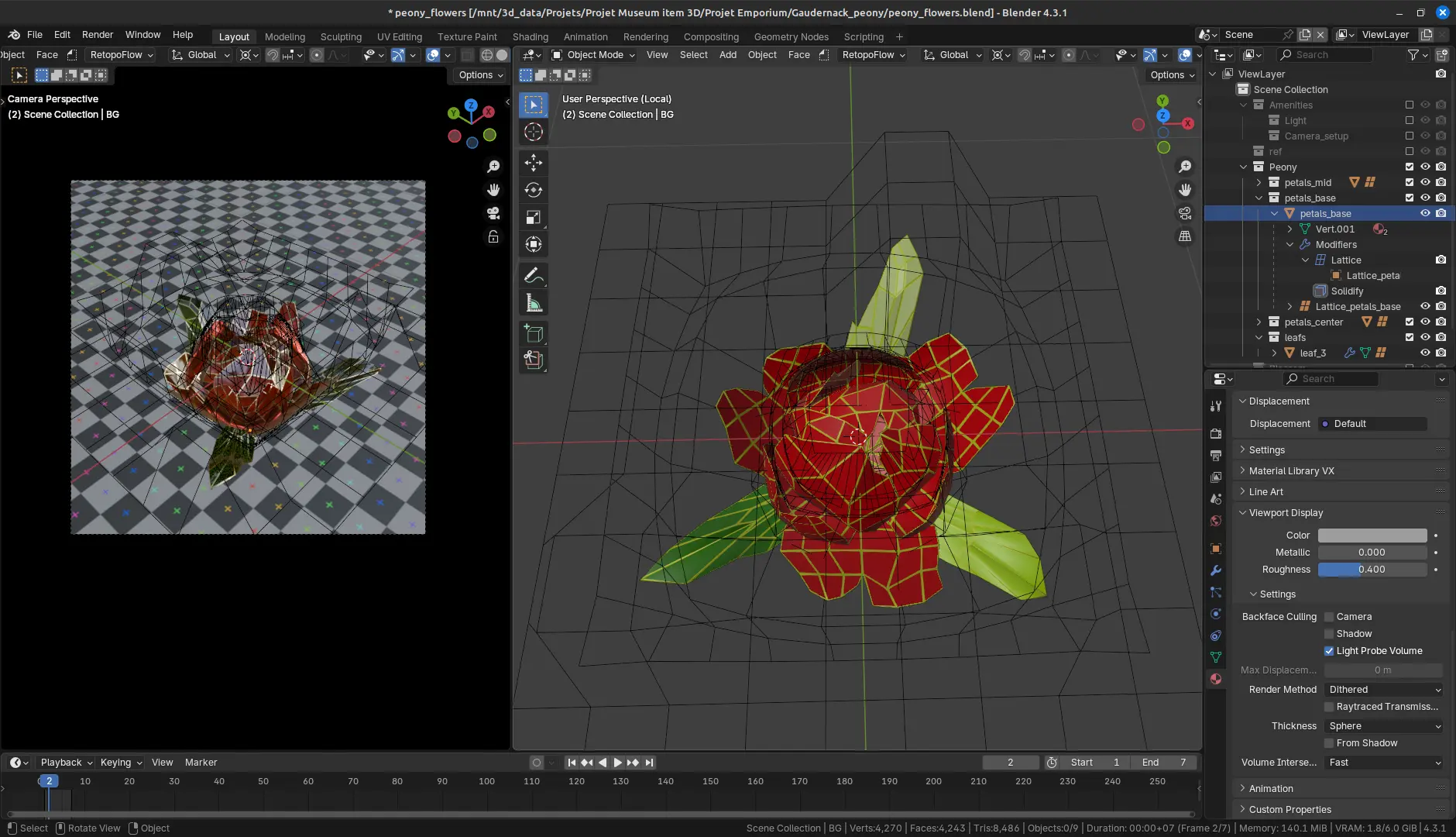
The difficulty comes less from the shapes themselves than their number and the effect they create together.
Again, I made heavy usage of lattices and the tweaking was endless.
Texture the shape
Silver gilding or “Vermeil”
Silver vermeil is gilded metal silver. In the late 19th and 20th centuries, the gold or gold-alloy layer is most likely electro-deposited via electroplating. I am not exactly sure how the object was produced in that context, but it piques my interest. If any of you, dear reader, knows more on the subject, please do come forward !
The result is a somehow dull, lightly gold coloured material. Using Blender new metal shader, we can have an interesting result.
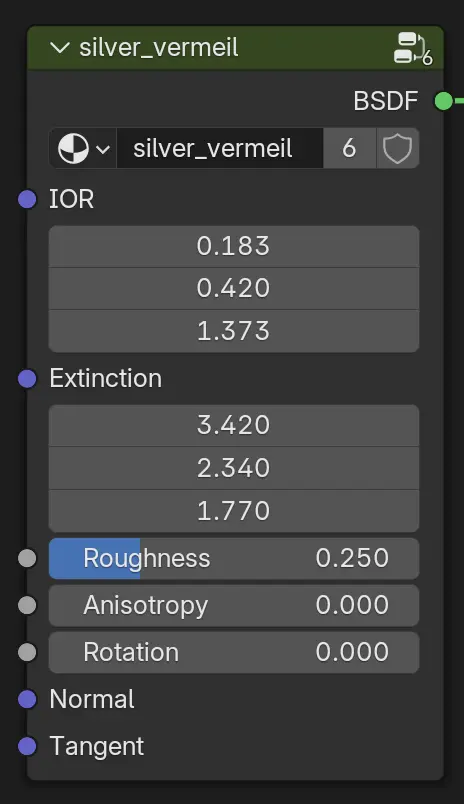
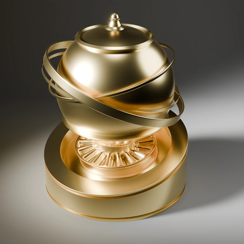
We also need to make sure it can translate well in a web browser context. WebGL renders based can’t be as nice as the Cycle path tracing render engine yet. I found values that make for a decent effect for the silver-vermeil we’re looking for though. Simple, yet effective.
Here are the most relevant lines of codes behind the materials of the model in the web viewer. Remember that I’m working with a JSON file to feed the model to the viewer, so the syntax is irrelevant here. Just gather the information you need from it !
"color": "#CEB792",
"metalness": 1,
"roughness": 0.35
Enamel
Intrinsically, enamel is glass, coloured glass in this case. It has a translucent quality though it is not fully homogeneous. On the artefact, the different colours seem to have different translucencies.
Just like before, we need to be able to showcase it as best as possible in a web browser. You know the drill !
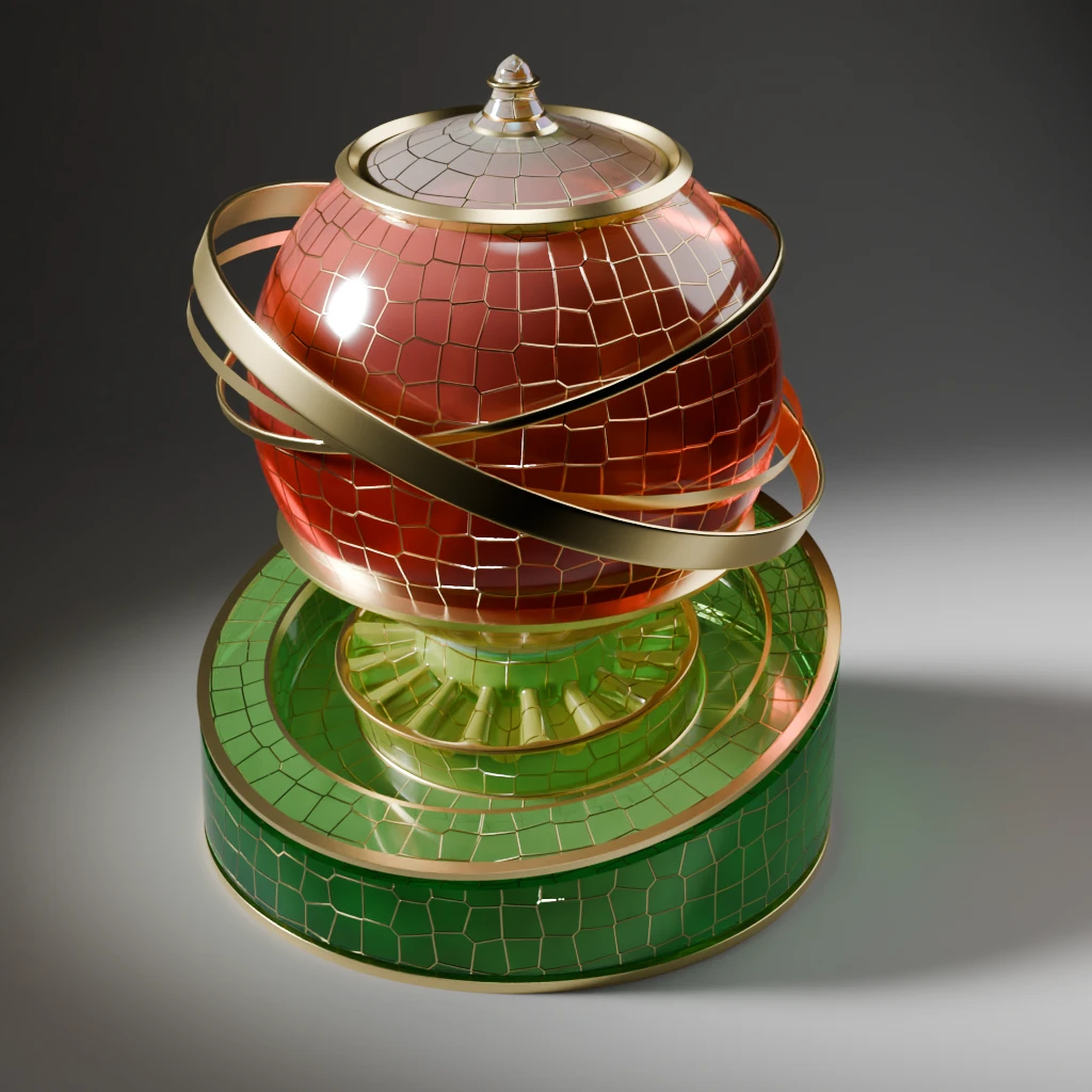
"textures": {
  "map": "./assets/models/material_balloon_gaudernack_peonies/textures/gaudernack_peonies_material_balloon_test_diff.webp",
  "aoMap": "./assets/models/material_balloon_gaudernack_peonies/textures/gaudernack_peonies_material_balloon_test_ao.webp",
  "transmissionMap": "./assets/models/material_balloon_gaudernack_peonies/textures/gaudernack_peonies_material_balloon_test_trans.webp",
  "roughnessMap": "./assets/models/material_balloon_gaudernack_peonies/textures/gaudernack_peonies_material_balloon_test_rough.webp",
  "normalMap": "./assets/models/material_balloon_gaudernack_peonies/textures/gaudernack_peonies_material_balloon_test_norm.webp",
  "metalnessMap": "./assets/models/material_balloon_gaudernack_peonies/textures/gaudernack_peonies_material_balloon_test_metal.webp"
},
"values": {
  "aoMapIntensity": 0.81,
  "metalness": 1,
  "transmission": 1,
  "normalScale": [0.82,0.82],
  "thickness": 0.2,
  "roughness": 1,
  "opacity": 1,
  "iridescence": 0.15,
  "ior": 1.65,
  "reflectivity": 0.3,
  "specularIntensity": 1,
  "needsUpdate": true
},
"modules": {
  "side": "DoubleSide",
  "envMapIntensity": 0.8,
  "envMap": "hdrEquirect"
}
This is a base. But the artist also added a shading variation per cells to give depth to the materials. The glass artist that created the object has respected that. The only way for us to have the same result is to draw them by hand. We could theoretically use a white and black version of the drawings to create maps and masks to accommodate for that.
A simple side by side test comparison to make sure it’s worth it:
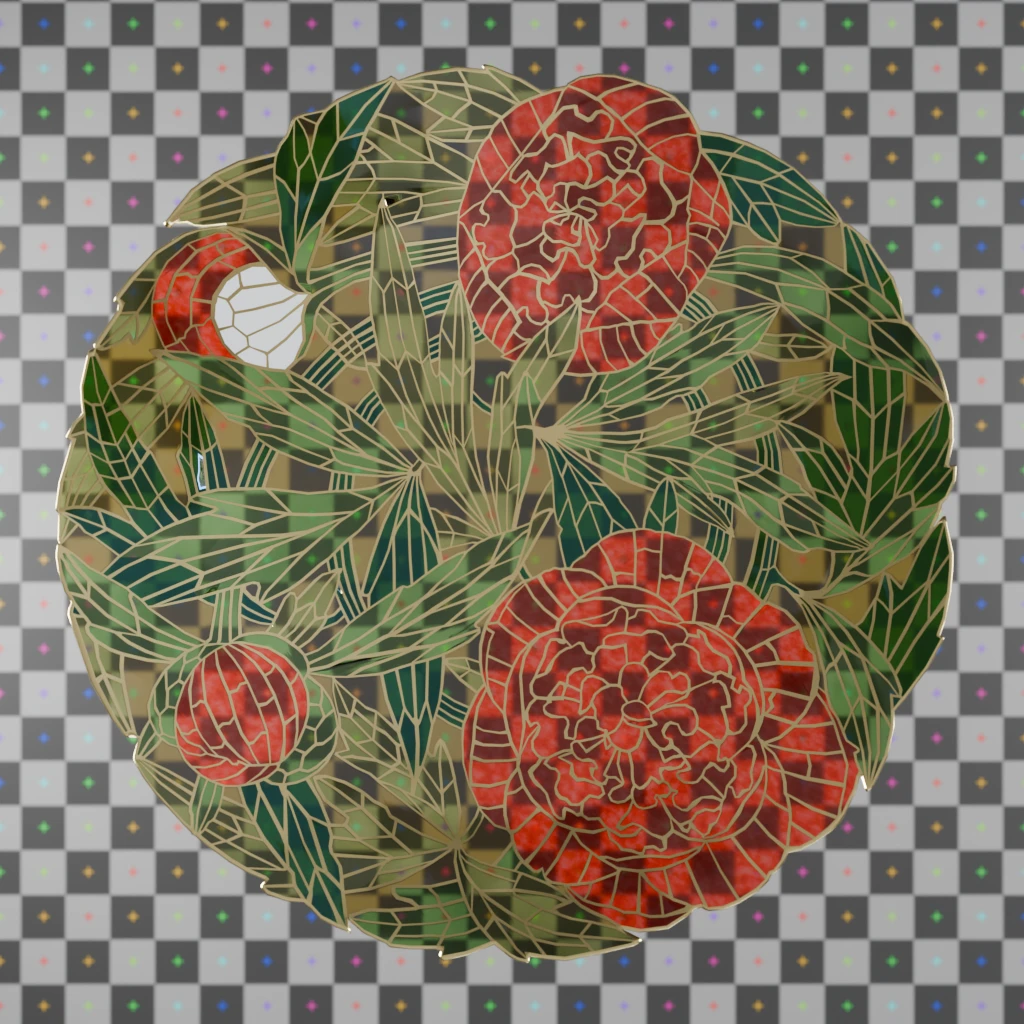
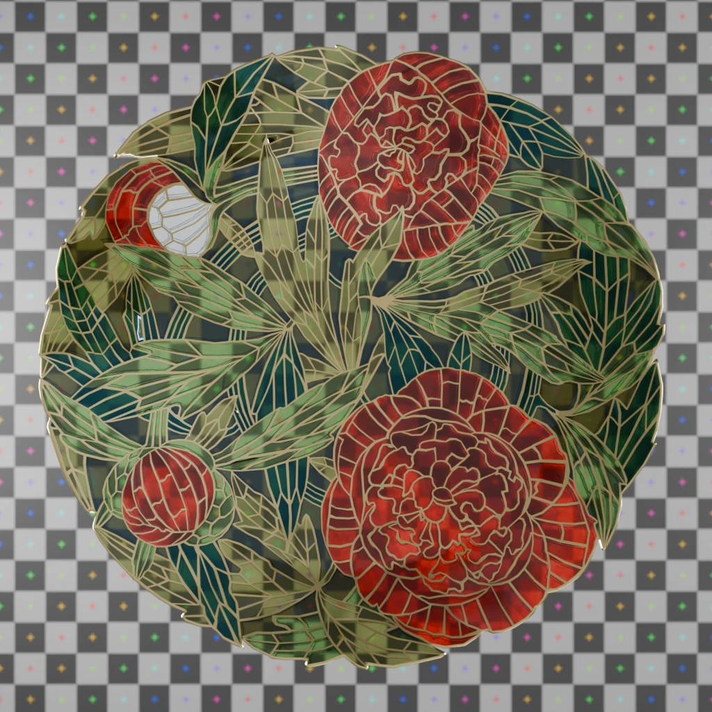
Okay. Off to my digital brushes I go ! I will be using the Ucupaint blender addon. It integrates cleanly to my already in place node setups.
Shine a little light: stills renders using Blender’s Cycles
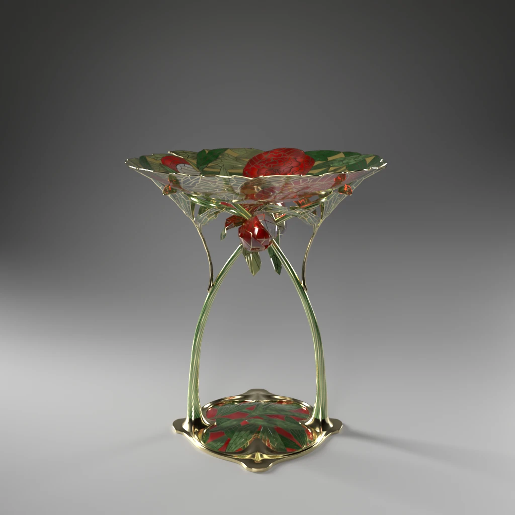
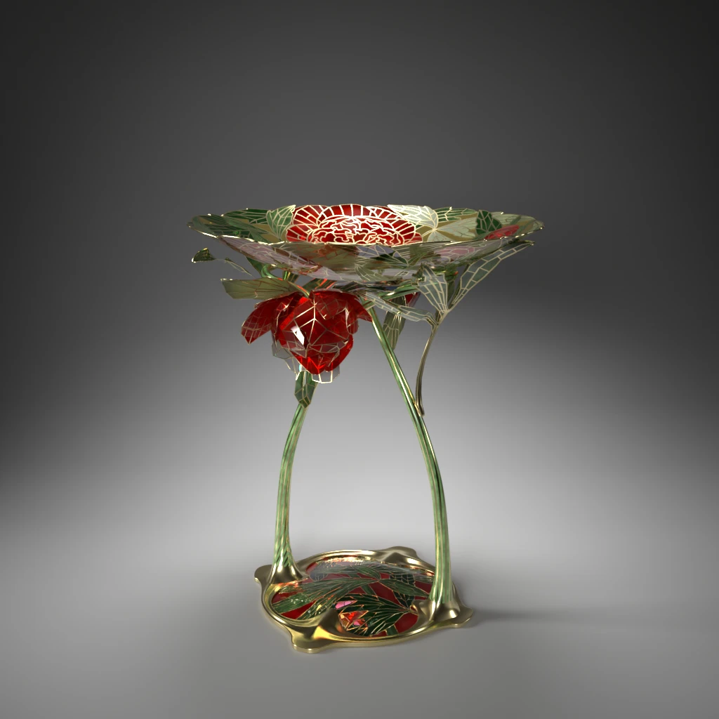
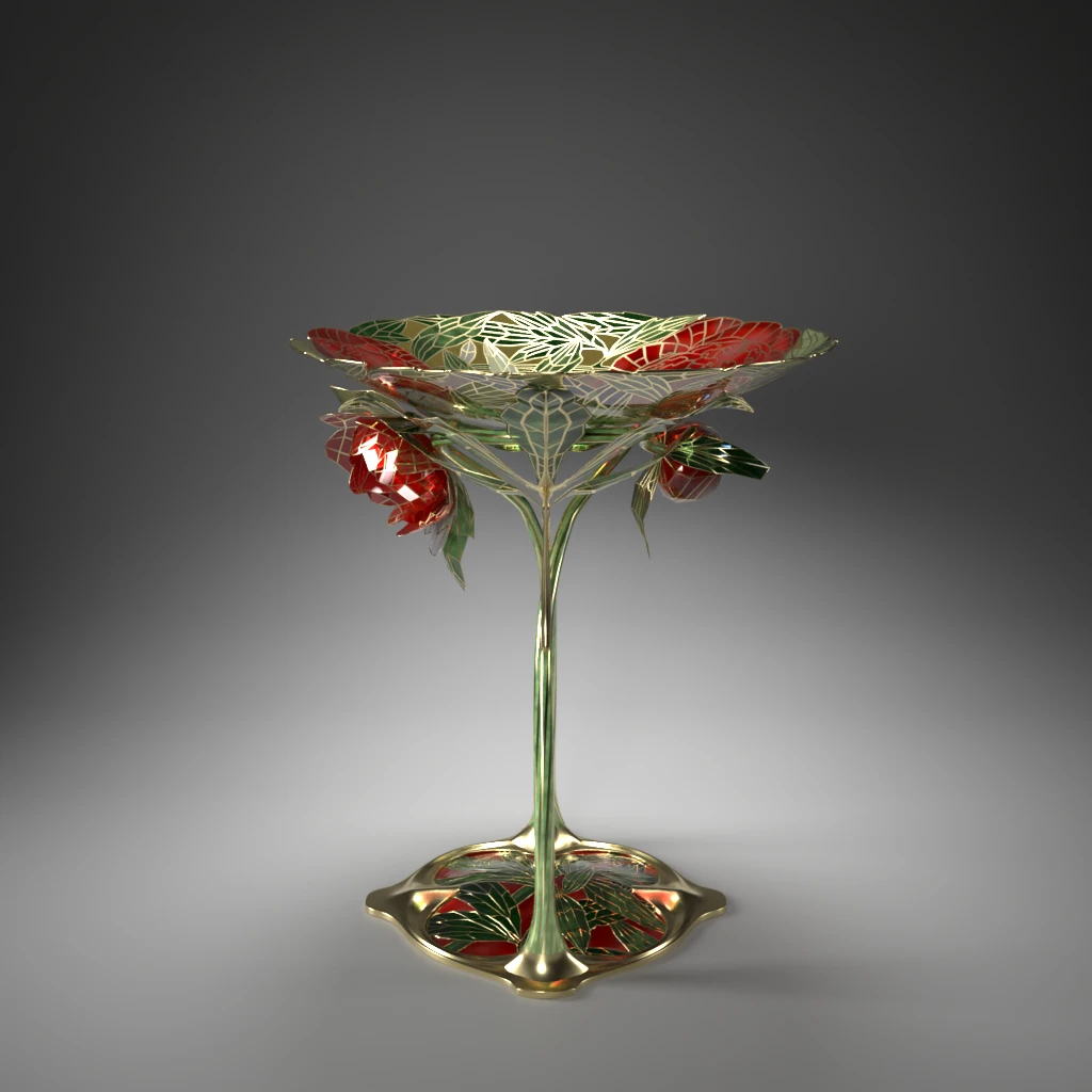
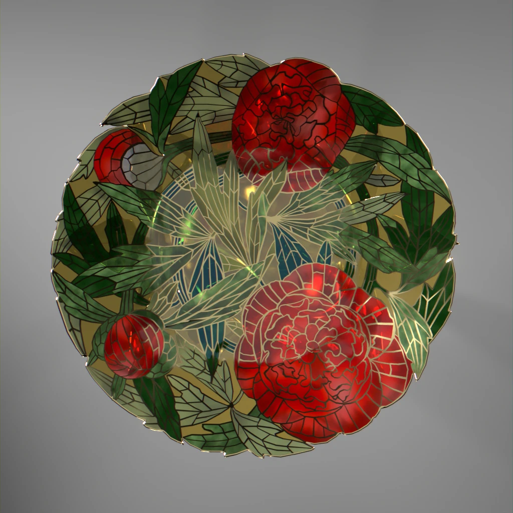
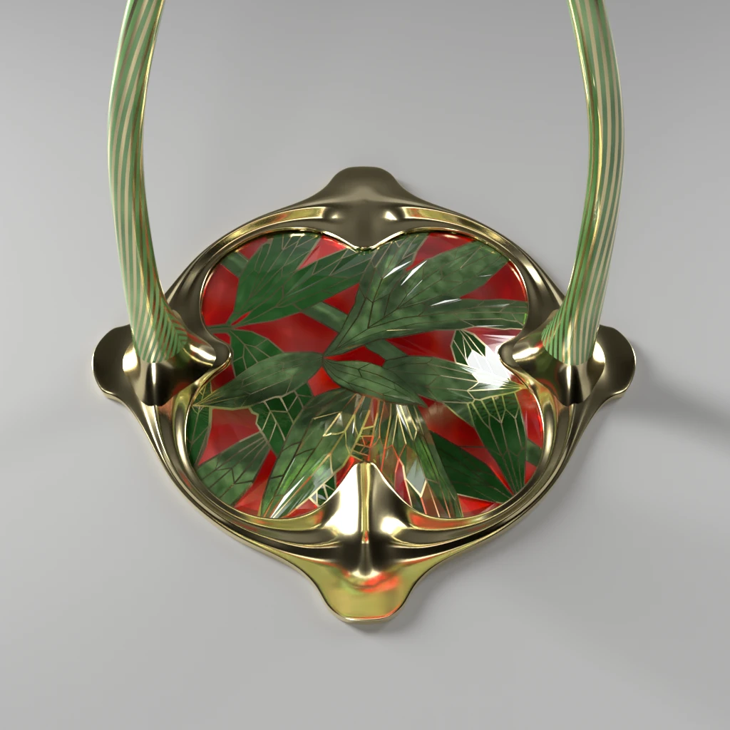
3D view
Disclaimer : technical limitation to material render in web app can let artifacts show, particularly in zoomed views.
This link will get you to the full view (this will open a new tab in your browser).
Contact
If any of you, dear reader, want to further the conversation, you can do so on Mastodon or Pixelfed.
Credit
Unless otherwise mentioned, all images credit to LGS.
Iconography
“Drawing for Peonvase”, ca 1904, Oslo, Norway, INV n°OK-18632A and OK-18632B, Nasjonalmuseet, Norway
“Art Nouveau Dish with Stem”, Guadernack (designer) and David Andersen (manufacturer), 1904-1905, silver gilding, plique-à-jour and cloisonné enamel, The Walters art Museum, accession number 44.991
Viking boat shaped dish with a dragon head and a tail, made with “plique-à-jour” enamels, 1895, Gaudernack for David-Andsersen, INV n°OK-1992-0109, Nasjonalmuseet, Norway
Coffee pot, Amelanchier series, silver, 1903?, Gustav Gaudernack, Nasjonalmuseet, Norway