

A Chinese puzzle
The following texts and images are the results of a training exercise to go from the pictures or the description of an artifact to the creation of a 3D digital double, sometimes restored version of it. If you wish to know more about the process, every explanations are in A journey into learning a (3D!) restoration process workflow article.
Yes, this is another plate. What can I say ? As a potter, I like everything ceramics. Besides, this particular example is interesting as a training exercise about broken pieces and the puzzle that faces conservators. The digital double reconstitution process can help make decisions about a physical restoration. This way, pieces can be manipulated as much as required without the risk of breaking fragile elements.
The 3D piece this work is base upon is preserved at the Musée du Louvre in Paris.
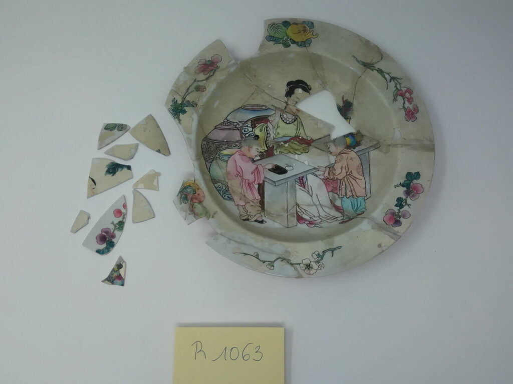
Title: Plate “Ne doit pas repartir rue Berryer”
Datation: ca 1730 ACE
Provenance: China ? In the style of Jingdezhen ?
Dimensions: 21 cm diameter, 2.8 cm high
Media: porcelain, enamel
Description and Historical context
This piece is intriguing.
Not only because of its current condition, but also because of the title the institution that shelters it chose.
“Ne doit pas repartir rue Berryer” roughly translates to “Must not return to Berryer street”.
Rose Valland’s work
I don’t know the circumstances of the registration of this piece. But here’s what I know about collection cataloguing within institutions as huge as the Louvre: they are, indeed, huge.
That means a specific collection can easily go up to ten thousand artefacts. Sadly, not all the pieces will have something distinctive that allows for a bespoke title. Whenever the registrar encounters something, anything really, that can identify the piece easily, it goes. My guess is there probably was a label or something on the object that says to not transfer the piece to said street.
There is also the very nature of this demand. The lists of artefacts that circulate within an institution come, most of the time, without context or said context have been lost. Inscribing the information in the administrative records ensures it cannot be ignored by anyone manipulating the objects afterwards.
But what exactly is in the infamous Berryer street ?
It’s another object from the Louvre database that holds part of the answer. This copper tray notes mentions that the street is where the “service de protection des oeuvres d’art” was. Situated in the Hôtel Salomon de Rothschild, near the Arc de triomphe. This administrative antenna of the Culture ministry (technically “Fine Arts” as the modern ministry was not yet born) was created after the war to deal with Nazis spoliations. The director of this office, Rose Valland is a renown French war heroin that painstakingly kept records of the plundering of works of art during the war and then was able to help track them down. Giver her biography a reading, it’s really worth your while !
Now, why would the registrar specifies that our plate was not to be transferred there ?
I withheld an information from you. The Louvre database mentions the plate was a donation from Adèle de Rothschild in 1922.
Yes, as in the widow of Salomon de Rothschild, the person that had the Berryer street hotel built.
My guess is this piece was probably somewhere in the building’s storages, as it was bequeathed by the baroness to the French government fine arts administration and used by the Louvre. After the second world war, with repatriations goings-on, the newly created service needed space and a lot of it. The plate could have been identified already and therefore can stay in the object department at the Louvre.
Mystery solved ? Maybe. One of you, dear reader, might know more about the subject.
Please let yourself be known !
Jingdenzhen and the western trade.
Now, let’s try to understand the artefact itself.
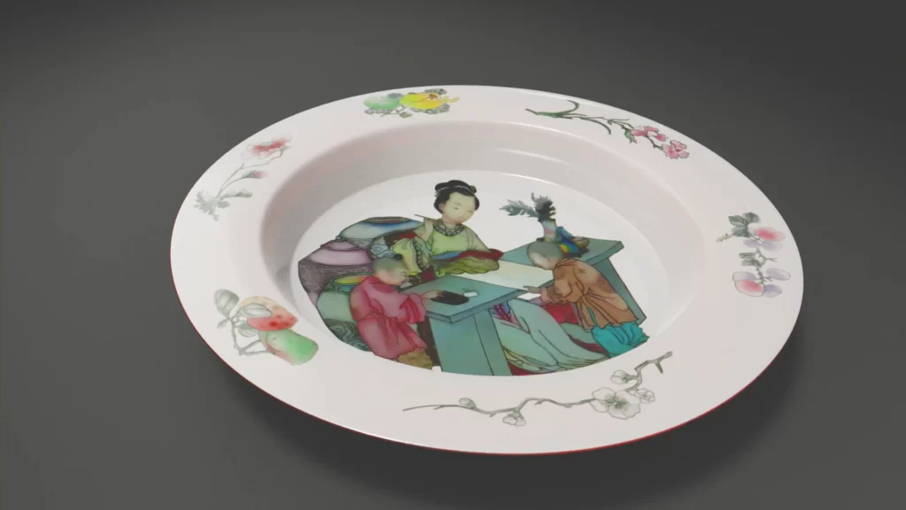
The well shows a woman doing calligraphy at a desk surrounded by two boys, one holding the paper and one grinding the ink. The rim shows a variety of vegetal motifs: branches bearing fruits and flowers. The base and foot are ruby red, while the well underside stays white.
The museum cartel mentions Jingdenzhen as a potential production centre, though it remains cautious.
This site in the Jiangxi province, in eastern China, became a major porcelain producing site in the 10th century ACE. It became an official imperial kilns site in the 14th century and remains such, with ups and downs, up until the Quin dynasty (1636-1916).
Jingdenzhen is known for both Chinese and export markets productions, though the development of the ceramic industry in Europe during the 18th century dampens the latter.
It still is a production site nowadays, and I gather you have seen and probably eaten from one of the pieces produced there !
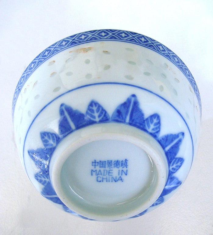
The “pink” family
The date given for the plate is around 1730, which could make it a Qing dynasty production, provided it is from Jingdenzhen.
Let’s start with the easiest marker, the “ruby back” base and foot, to help us find similar references in the fantastic garden that is Chinese ceramic production.
This is a common trait of the “famille rose” (pink family) series. These ceramics are made “in the style of foreign colours” (“yangcai” or “fencai”) i.e. colours introduced from Europe chemistry industry around 1720s. This includes but is not limited to pink hues. They were used in Jingdenzhen almost immediately. In addition to the already known styles and historic pieces, that period produces mainly two different styles of ceramics. Sober, mostly asymmetric and elegant pieces that are destined for the palace and the Chinese market. As well as heavily decorated pieces, inspired by western art, destined both for local trade and for export.
Technically, these productions are porcelains most of the time coated with a “glass-white” colour and then over-glazed with polychrome enamels. It’s a multiple firing process.
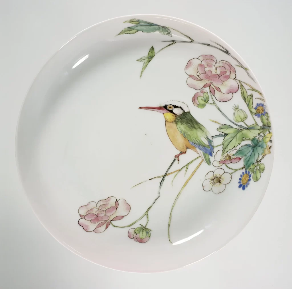
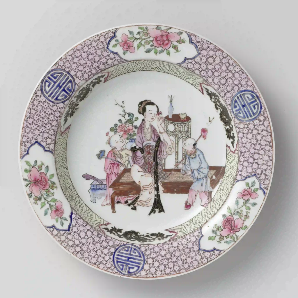
Our piece decor is similar to the following piece, dated from the same Yongzheng era: the 6 vegetal elements on the enlarged rim and the colourful scene that slightly overlap the lip and the same ruby back on the underside.
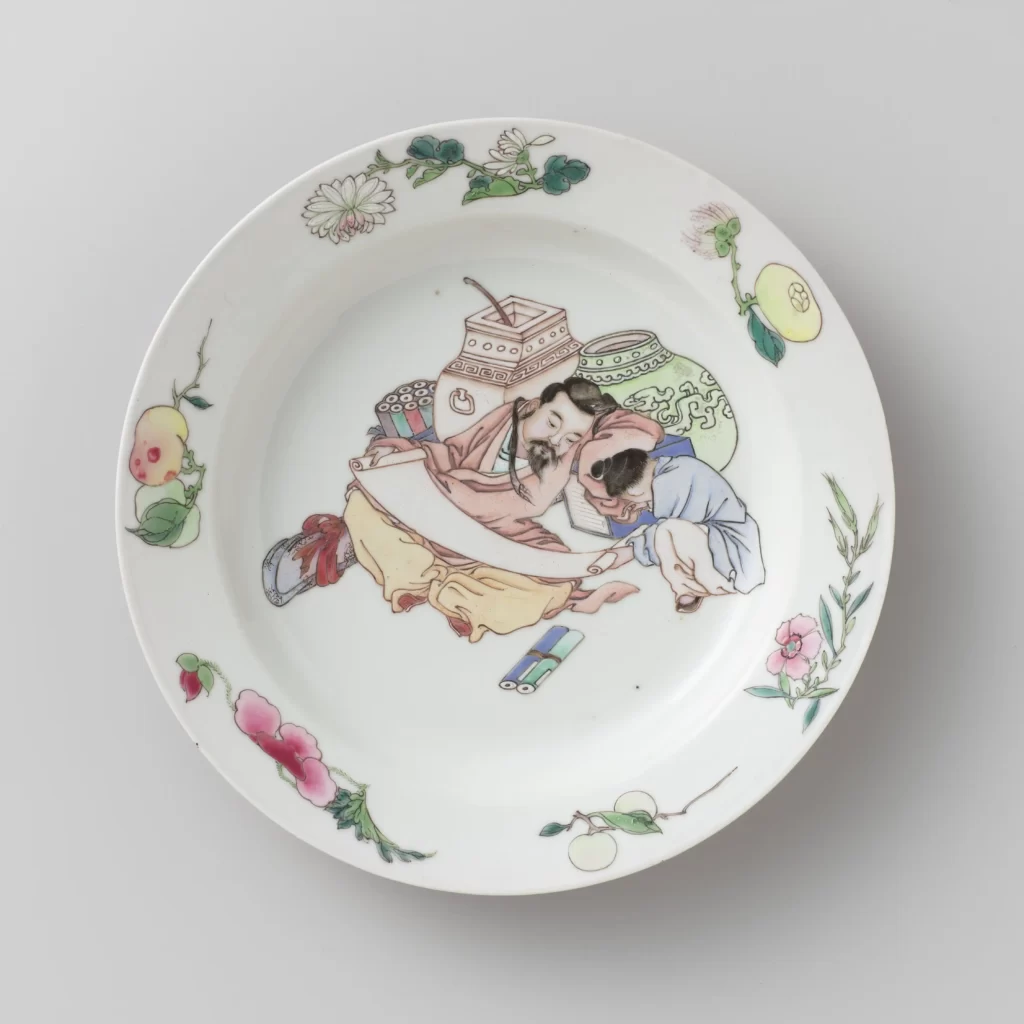
As just a ceramic geek, I wouldn’t know where to put this last example and ours in the dichotomy that literature gives the Yongzheng era characteristic ceramic production.
But I think we now have enough information and references to move on.
Visible condition report
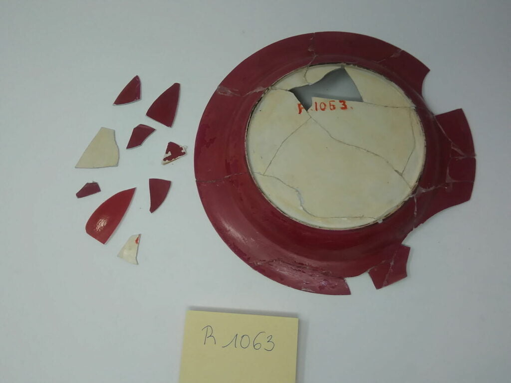
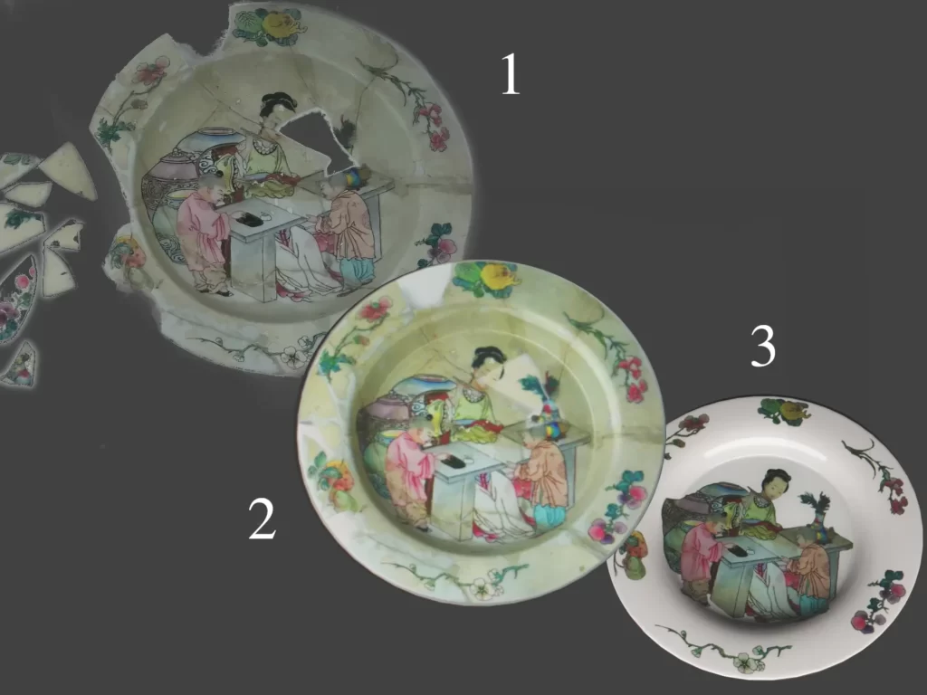
The plate is broken in shards and has obviously been previously restored. There are 14 pieces already glued back together and 9 free pieces.
The plate presents a yellowing and greyish surface with numerous scales all over.
The original base of bone white porcelain seems to surface now and again. I’m assuming the polychrome glaze layer is becoming loose. Part of this layer has been cleaned though and shows the perfect white it once was.
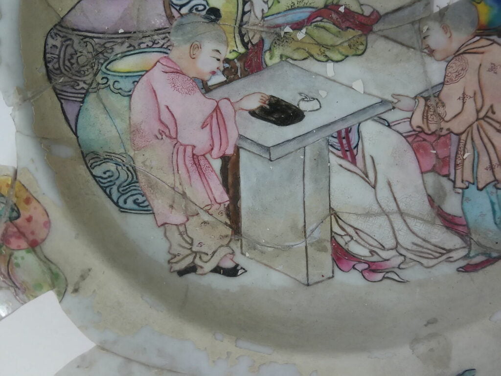
The decor, both the well’s scene and the 6 plants on the rim, is colourful and delicate. It doesn’t seem very lacunary outside of breakage lines and a few small occurrences on the lady’s hair behind the right ear or the top of the right shoe of the ink grinder assistant.
The underside shows the same layer separation. The red layer is mostly dulled, with the occasional darker and shinier small parts.
I’m not completely sure of what is happening there without actually handling the object. But that’s part of the game, here !
I’d say something along the lines of a restoration varnish gone wrong, but because of the layer separation, that also could have been a surface preparation or a firing issue. Among other reasons, enamel separation can be a sign of too greasy or dirty a piece before the enamel was applied or a kiln failure.
The same issue is apparent in the reference pieces mentioned above: it seems to be a common occurrence within the “famille rose” pieces.
Creating a 3D model of the piece
Disclaimer : this is an exercise, shown for documentation purposes only
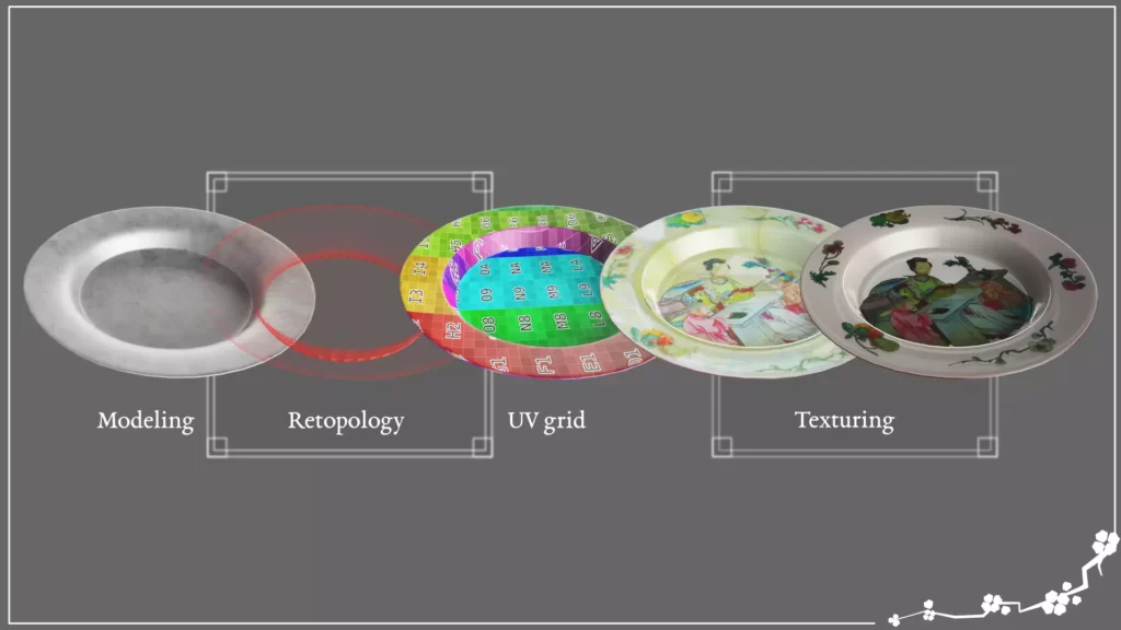
What to do : digital restoration choices
Fill in the gaps
As this is a multi-pieces artefact, let’s go ahead and create a map, so we know what piece we’re talking about.
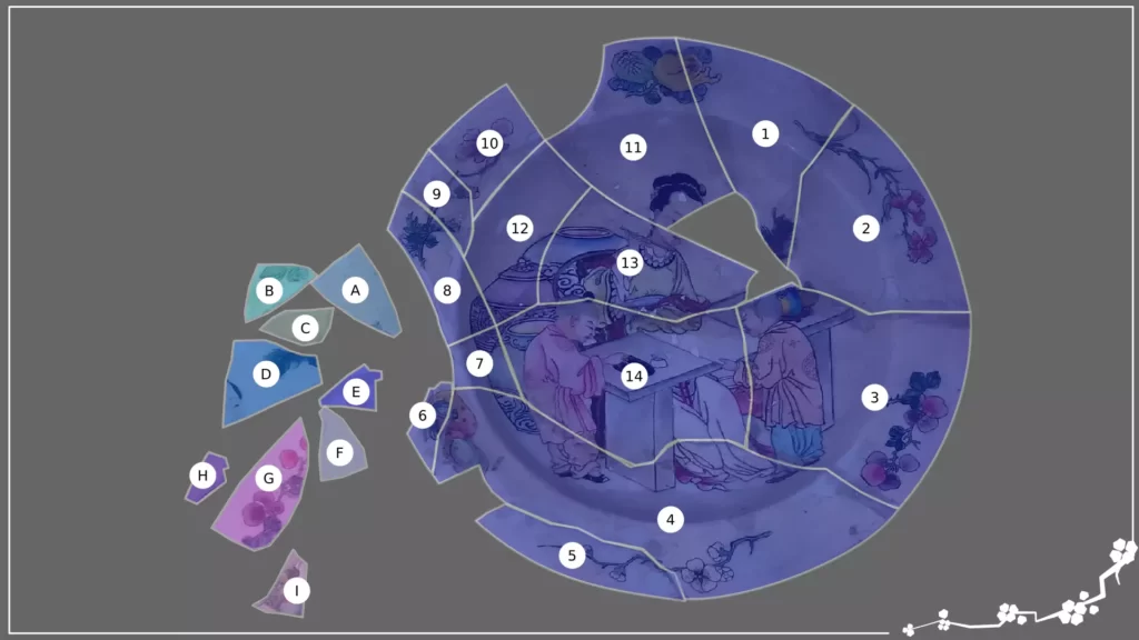
First thing first, let’s try to fill the missing parts with the free pieces that seems to fit along the pieces already glued. Just like with any regular puzzle, it’s always easier to start with the motifs.
The well scene is the quickest: the lady’s head (D) and the vase (I) pieces fit nicely. On the rim, the motif on the top left is finished with the piece showing a bit of green (A).
The fruits (?) of the bottom left motif is completed by the piece with two leaves on it (B).
From what is left, only one piece remains with motifs on (G). The motif though akin to the bottom right flowers doesn’t seem to fit in anywhere. I’m choosing not to use it.
The other pieces are motif-less. The plate’s shell empty spaces could certainly accommodate them, but there will still be gaps. As we do not have all the elements, it is impossible to be sure I’ll be putting them where they belong. Therefore, using the reference I found as guidelines, I’m making the choice to not use any of them. These pieces fit in gaps that will ultimately be a white band around the rim. We are not loosing any information about the artefact by leaving them aside.
You’ll notice the pumpkin motif is the only one still incomplete: the green fruit is missing a part.
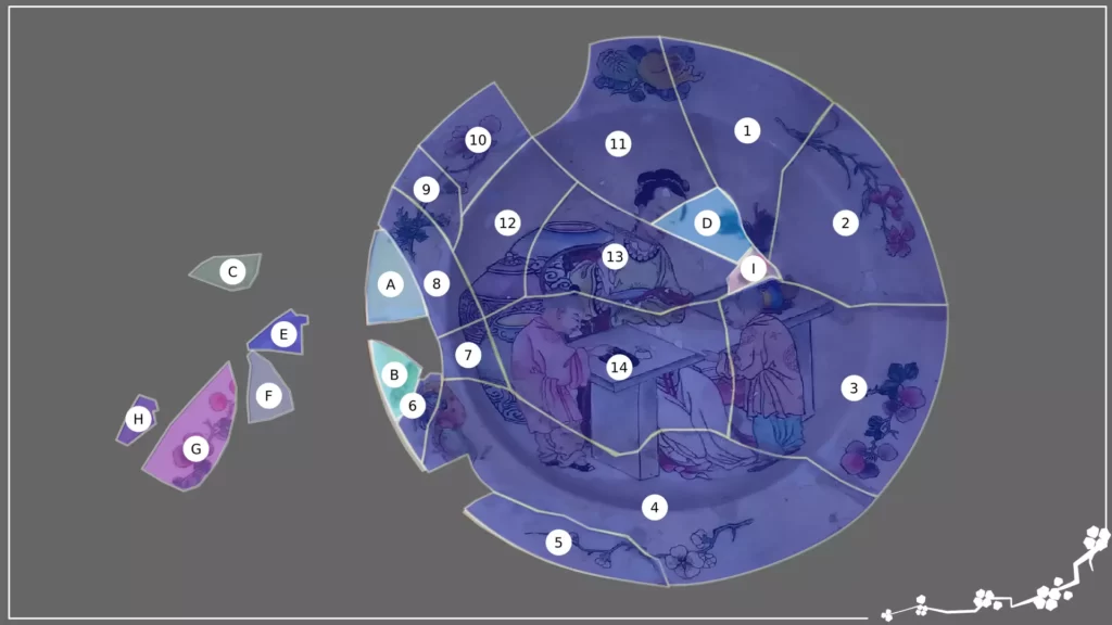
Here’s a quick round-up of where we are so far, in without colour retouching:
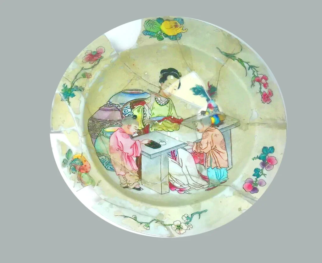
Cracks, flowers, and fruits
The restoration seams are visible. The cracks are making the piece hard to read. So, they will have to be dealt with (and that will be way easier in digital form than battling a 2-parts very uncooperative resin !).
The cracks also have damaged parts of the motifs, making them undecipherable on occasions. The good thing about that is we do have references about them. We will be able to make educated guesses should the need arise, as in the completion of the green and orange fruits’ decor.
How to do it: a 3D reconstitution process
Model the shape
Now, let’s start the groundwork.
We require a 3D shape to put all the intricate decors on.
We do not have a side reference to know the plate’s profile, however we have dimensions to help us project a credible shape.
On the underside reference image, we can see the rim and lip are roughly a third of the diameter, with a somehow steep lip creating the well quickly on a rounded basin-like motion.
Here’s my interpretation of it:
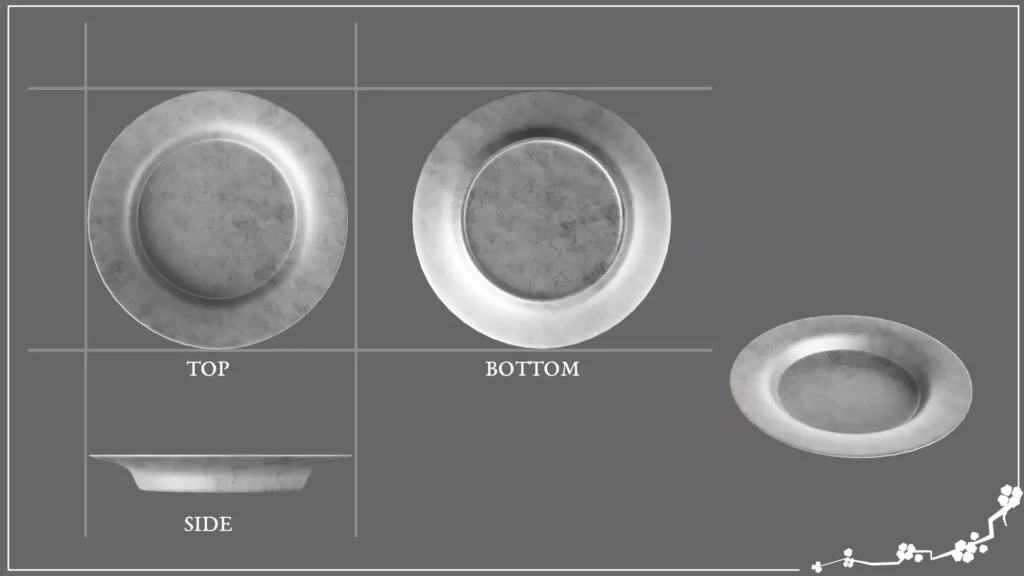
Texture the shape
Note: Maps are basically information encoded into images giving the computer information about the material, so it can render as you want it to.
This piece is different from the cuerda seca example. It doesn’t really have reliefs and high points. Don’t get me wrong, it has some. The glazers’ brushes left a minuscule path whose height can only be felt by the tip of the fingers or seen with a directed oblique harsh light. But these are extreme cases and, for the sake of this exercise, I’m choosing to ignore them.
Good news, then: we are only aiming to create a diffuse (colour) map.
Because the digital media allows us to have options, I’m going to create two versions of the digital double. One will be a comprehensive restoration. The other one will be a complete re-creation of the piece, accounting for the information the references give us.
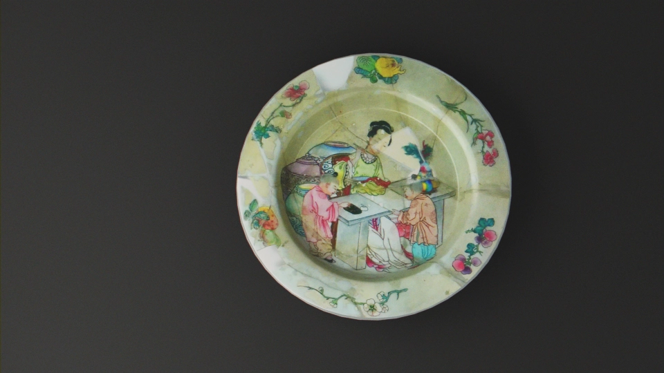
Comprehensive restoration : let the piece tell its story
The idea here is to go to for readability. As long as the shape and motifs are easily seen, the job is done.
I will not be filling the missing decor parts by re-creating them. I will just be using slightly darker block colour in these areas to amend for the losses, and simple dulled white blocks for the large gaps on the rim. In painting restoration, it’s called a neutral inpainting. In this particular case, it’s a personal preference. It normally is debated with the curation team and/or the client on a piece by piece basis.
How to reintegrate and fill the gaps let on by time and alterations is a social group and philosophical marker. Because the conservation work is first and foremost a scientific process, this very very last part of the work is never linked to the physical condition the artifact is in. This has been dealt with earlier on.
Each culture has its own way on dealing with this issue. Some will emphasize the repairs, some will prone the “less is more” approach, and others will make it completely disappear.
On a personal note, I don’t think any one of them is better than the others. Of course, having been classically trained in a European environment, I’m more accustomed to a certain way of doing things. But I now fully acknowledge that it is only that: a custom. One that is, like all trends, temporary.
I can use a doctored image extracted from the original references, combining standing and free pieces, as a diffuse map. Filling the gaps with white is easy enough. Once it’s done, a little UV editing and it is skinning the shape satisfactorily.
Here are the results.
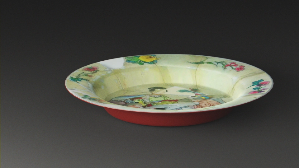
Fully re-created version : testing hypothesis
For this variation of the texture, the idea here is to render a hypothetical view of the plate, making the broken and restored traces completely disappear.
This a purely theoretical view, again more philosophical than anything: the infamous “as it was” version. Though we have clear references, there is no way to be absolutely certain of how the artefact was. This is why it is, to me, a complete nonsense to try to emulate this on physical pieces. It’s only propagating an idea of something set in the mind of a specific period. We know this has historically been proven wrong over and over again, like with the pristine white marbles of Greek antiquity. Thankfully, the 3D media allows us to try things out without endangering the integrity of the preserved pieces. In this paradigm, it is a gigantic and potentially limitless sandbox !
After pondering the question, I came once again to the realization that the easiest way to deal with the matter was to follow the process of the initial creator of the piece.
I should probably say “creators” because in highly productive centres like Jingdenzhen, there always are task specific specializations. We’ve already taken care of the thrower or molder part: the bare shape is done.
Walking on eggshells.
We now need to take care of the glazer part and create a first layer of pure glossy white.
A simple PBR material should do the trick with the added slight translucency porcelain pieces can give out. This eggshell effect is a characteristic of “famille rose” pieces.
Chinese porcelain is a hard paste material and I always thought it gives out a hard glare, an almost aggressive reflection, particularly when it’s white. It is close to glass in that regard. It’s also why it’s easy to recognize. Look for the piece that kind of look like it wants to bite you.
But, maybe, that’s just me?
Here’s the noodle soup for the material I tried to create.
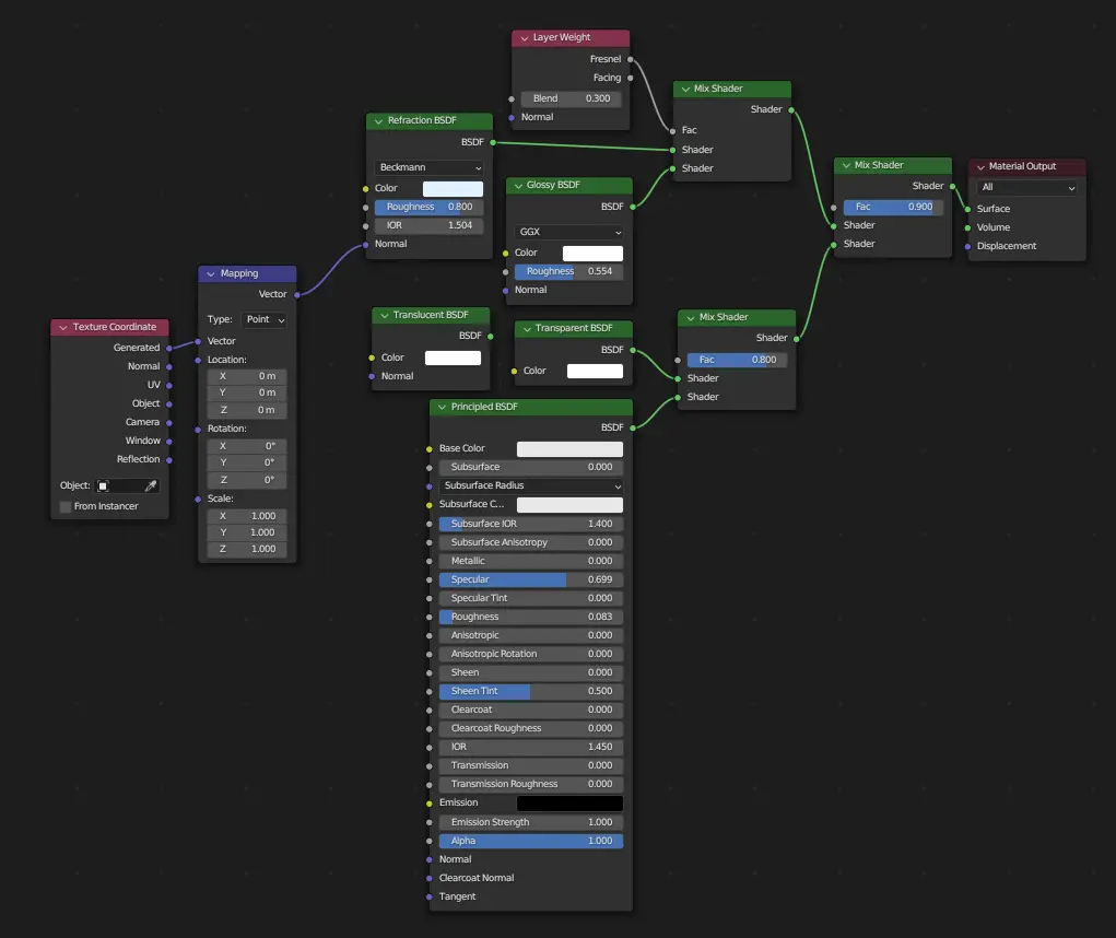
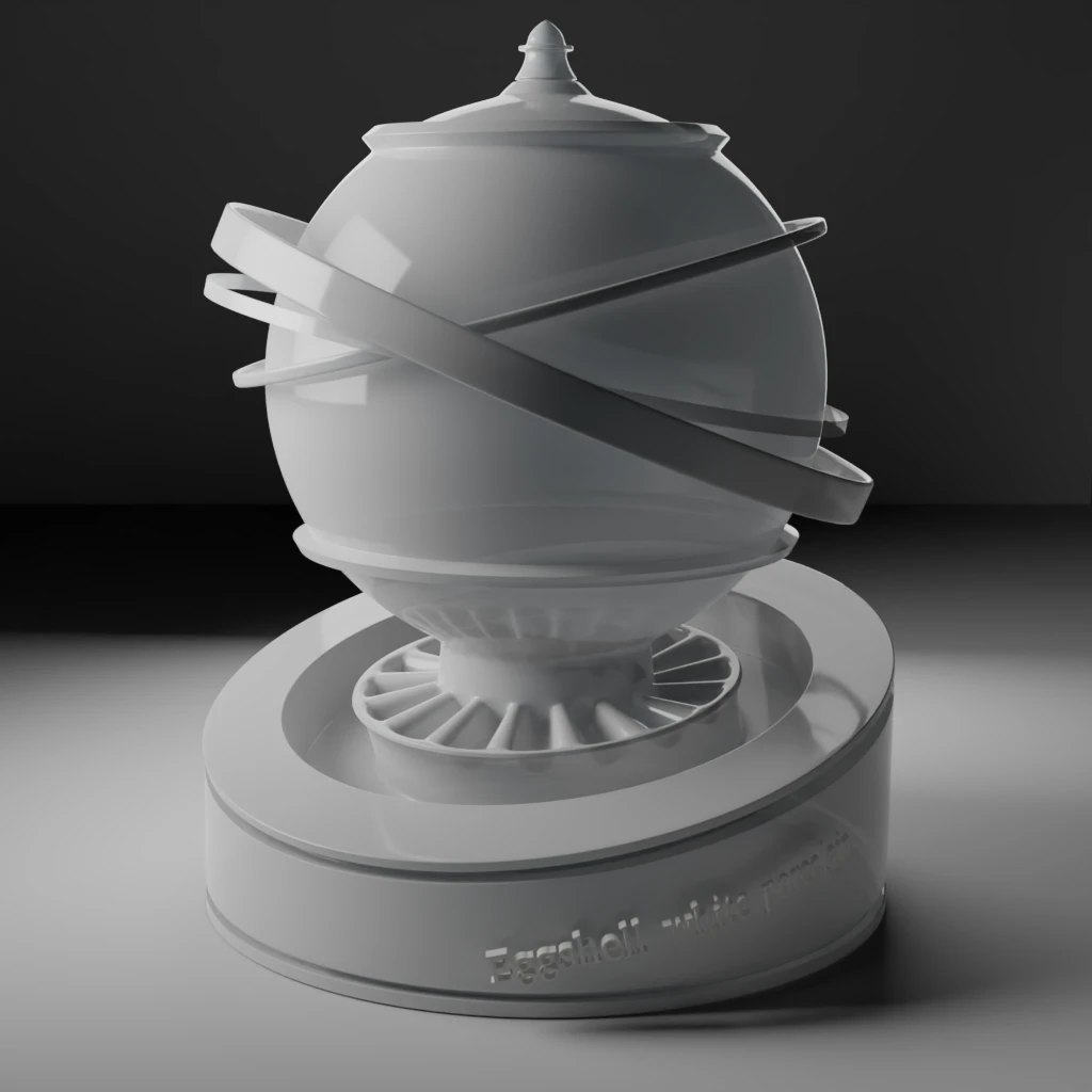
You’ll notice I did not use the “translucent” node, though the material description explicitly mentions this propriety. I was not able to make it work for what I was aiming for. According to the Blender documentation, the node uses a Lambertian diffuse property. In a nutshell, from what I could understand and in this particular case, this will not do. What I want to do is to be able to see the shadows of what is behind the object, including the object parts themselves. As the effect given by the node is using the normals from the same geometry, that last part won’t work, hence me using a “transparent node” instead and modulating it. It is not worth using two sets of normals: the effect can be rendered much faster this way.
But I might be completely wrong in this method. If any of you, dear reader, knows how to make this work, do not hesitate to let yourself be known!
See ? See ? It looks aggressive !
But then again, I’m a faience person.
Let’s now tackle the colours elements, starting with the red-ruby glaze of the underside.
As this is a variation on the same material as the white one, we only need a nice tint to it and some slight modifications in the values.
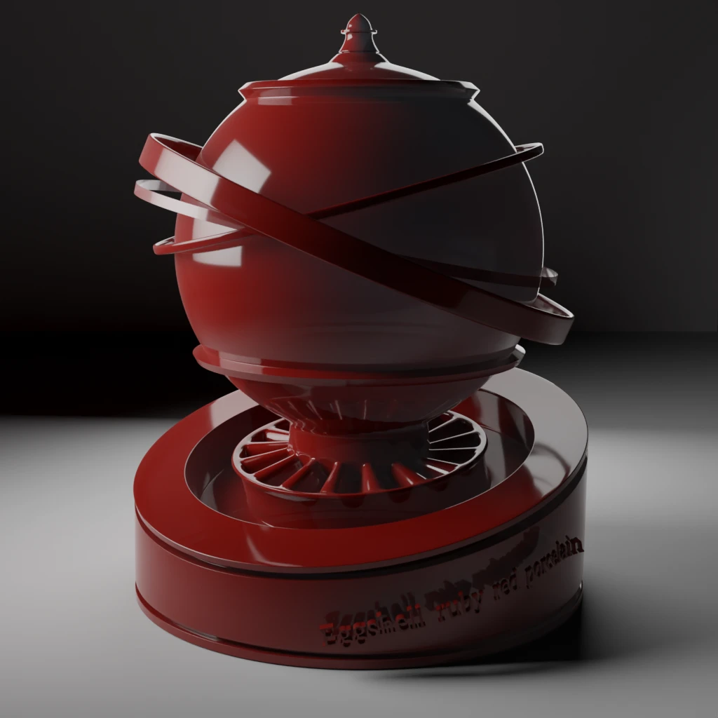
All dem pertty flowers
I’m not certain in what order the decor was painted. I would instinctively go from centre to sides, if only to prevent smudges. But I also know the colours’ application might be done one at a time everywhere on the piece, with a drying time in between.
So in order to gradually build skills towards my goal one step at a time, let’s start with the rim and the flowers motifs to “warm up” before tackling the centre scene.
There are six of them. Because I’m not sure that I can properly identify all of them, let’s make a map and give them reference, so we know which one we’re talking about. My idea is to isolate each element to be able to work on them. Once this is done, I can reintegrate them on a single image.
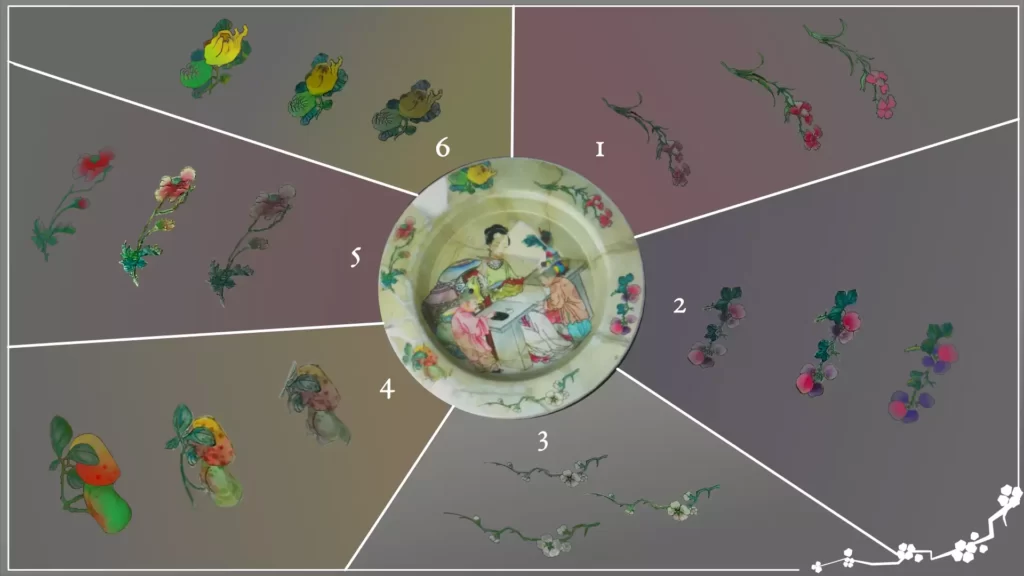
The first thing to do is to get rid of the cracks and holes in the existing parts. Then, it’s a case of cleaning, completion and colour adjustments.
This last part is more clearly visible on the 4th motif. This is also one of the few elements for which our reference gives a clear example. It is present on the rim of the “Plate with a man and a boy examining a scroll” from the Rijksmuseum.
The motif is not entirely identical: the stem goes toward the orange fruit, when ours is the other way around.
I discovered at that point that simply photo-manipulating the references was not going to give me the results I was hoping for. Therefore, I had to redraw most of the motifs from scratch. It is less fine thant the piece probably is but the end result is better with a more accurate render of the tenuous tranparencies of the colours on a white reflective background. I tried to emulate the effect of the reference piece.
The well’s scene is another matter. Particularly the part of the objects on the desk: it is not easy to decipher elements in the cracks and holes. Because the piece’s reference images do not have enough resolution, some parts of the shards bearing the motifs are not clearly visible.
Because of the context of this exercise, I allowed myself a little leeway and reconstructed what I think is there. But it’s only my hypothesis. The feather kept on the multicolour vase had me puzzled for a while and I’m really not sure of what the other element is. I was not able to find the exact same scene or decor in the references, but versions of it are present on other pieces. Same goes for the little orange piece near it and what I think is a white and blue vase on the background.
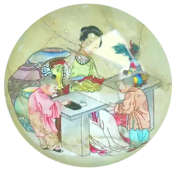
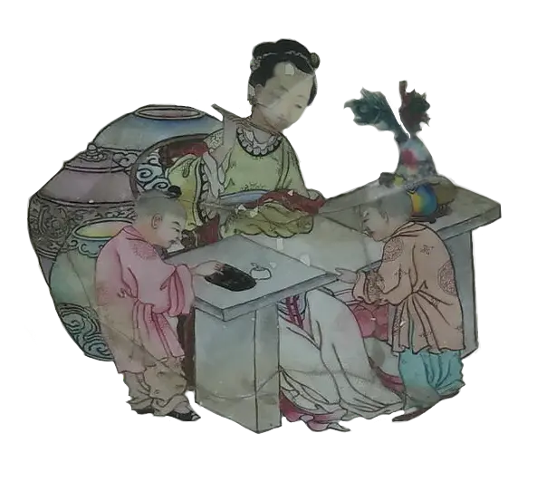
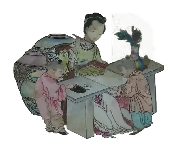
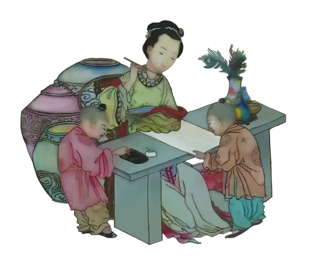
Now it’s a case of combining it all together to obtain this version of the piece:
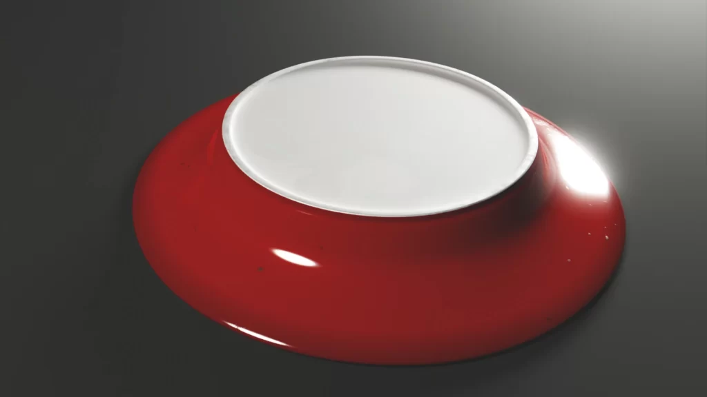
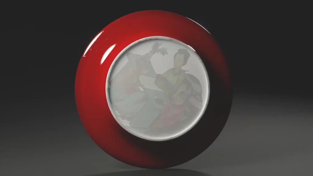
Interactive rendering
All hands on code: making the model web available using Three.js
All hands on code: making the model web available using Three.js
Process : this is were I saw red !
My initial plan to use the PBR node setup from Blender to Three.js didn’t work as planned. It did work and everything was fine but the ruby-red part. It was too bright, too dull and overall not very interesting.
I pondered about the most efficient method to use. In this case, it turns out the fastest way was to recreate the maps on Substance Painter. I know. I could have started with that ! But, repeat after me, “this is an ex-er-cise”. So, I’m choosing to see it as having learned two ways to do something. Or something along those lines.
It was actually not that long to redo because, as we’ve seen, I prepared the files separately. So it was basically a case of import and tweak.
Of course, I ran into a UV issue that I sorted out by moving the seam line away from the rim decor. I may or may not have practised primal crying in a cushion at some point before resorting to that. Another .glb model and texture export later, off I was to a quick bake for all the textures in Blender to use on single images combo maps.
…
…
Yeah, I thought we were almost done, too.
Aaaaaand then comes the eggshell effect I completely forgot about in my previous test.
No matter how much I tweaked the maps and whatever sorcery I did with the code, It didn’t work.
Another cushion, another quick primal crying session.
The solution in this case was to diverge from my usual workflow. I usually export the .glb model without texture and mix it all via code afterwards. In my opinion, this allows for more control while being fast because I only have to deal with one material.
On this occasion, I needed to control the materials one by one to modulate the transparencies. The plate is composed of 4 of them: the well scene, the rim decor, the ruby-red glaze and the porcelain white eggshell bottom.
In order for this last one to work, I had to export the .glb model from Blender with placeholders as textures. I then could access them (meaning the UV part of the model they encompass) and give them a specific material.
I don’t like this method much because it makes for a very very redundant code, most of the materials being extracted from the combo maps. But within the limits of my dear 3DWeb Viewer, that is something I will have to live with for now !
Code lines, for the appreciative connoisseur
Here are the most relevant lines of codes behind the materials of the model in the web viewer. Remember that I’m working with a JSON file to feed the model to the viewer, so the syntax is irrelevant here. Just gather the information you need from it !
{
// Ruby-red enamel
"textures" : {
   "map":"./assets/models/assiette_Berryer/textures/assiette_berryer_diff.png"
   "normalMap":"./assets/models/assiette_Berryer/textures/assiette_berryer_norm.webp",
   "roughnessMap":"./assets/models/assiette_Berryer/textures/assiette_berryer_rou.webp",
   "clearCoatMap":"./assets/models/assiette_Berryer/textures/assiette_berryer_glo.webp"
},

"values" : {
   "normalScale": [0.05, 0.05],
   "metalness": 0.08,
   "ior":1.504,
   "envMapIntensity": 1,
   "needsUpdate" : true
},
"modules" : {
   "envMap": "hdrEquirect"
}},
{
// Well scene

"textures" : {
   "map":"./assets/models/assiette_Berryer/textures/assiette_berryer_diff.png",
   "normalMap":"./assets/models/assiette_Berryer/textures/assiette_berryer_norm.webp",
   "roughnessMap":"./assets/models/assiette_Berryer/textures/assiette_berryer_rou.webp",
   "clearCoatMap":"./assets/models/assiette_Berryer/textures/assiette_berryer_glo.webp"
},

"values" : {
   "normalScale": [0.05, 0.05],
   "metalness": 0.08,
   "ior":1.504,
   "envMapIntensity": 1,
   "needsUpdate" : true
},
"modules" : {
   "side": "DoubleSide", // to accomodate for the eggshell effect
   "envMap": "hdrEquirect"
}},
{

// Egg-shell effect for the bottom part

"textures" : {
   "alphaMap":"./assets/models/assiette_Berryer/textures/assiette_berryer_tra.webp"},
"values" : {
   "normalScale": [0.05, 0.05],
   "metalness": 0.08,
   "ior":1.504,
   "roughness": 0.1,
   "transmission": 0.55,
   "opacity": 0.8,
   "envMapIntensity": 1,
   "needsUpdate" : true
},
"modules" : {
   "envMap": "hdrEquirect"
}},
{
// Rim decor

"textures" : {
   "map":"./assets/models/assiette_Berryer/textures/assiette_berryer_diff.png",
   "normalMap":"./assets/models/assiette_Berryer/textures/assiette_berryer_norm.webp",
   "roughnessMap":"./assets/models/assiette_Berryer/textures/assiette_berryer_rou.webp",
   "clearCoatMap":"./assets/models/assiette_Berryer/textures/assiette_berryer_glo.webp"
},
"values" : {
   "normalScale": [0.05, 0.05],
   "metalness": 0.08,
   "ior":1.504,
   "envMapIntensity": 1,
   "needsUpdate" : true
}

"modules" : {
   "envMap": "hdrEquirect"
}}Contextualization
Now, just for fun, how about we go the extra mile and emulate a digital restoration studio for our digital restored artefact ?
Because it’s digital, and I’m the one modelling, I can finally have all I wanted in a studio without being limited by space and budget !
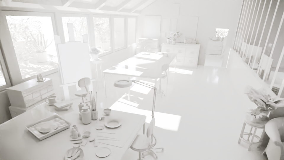
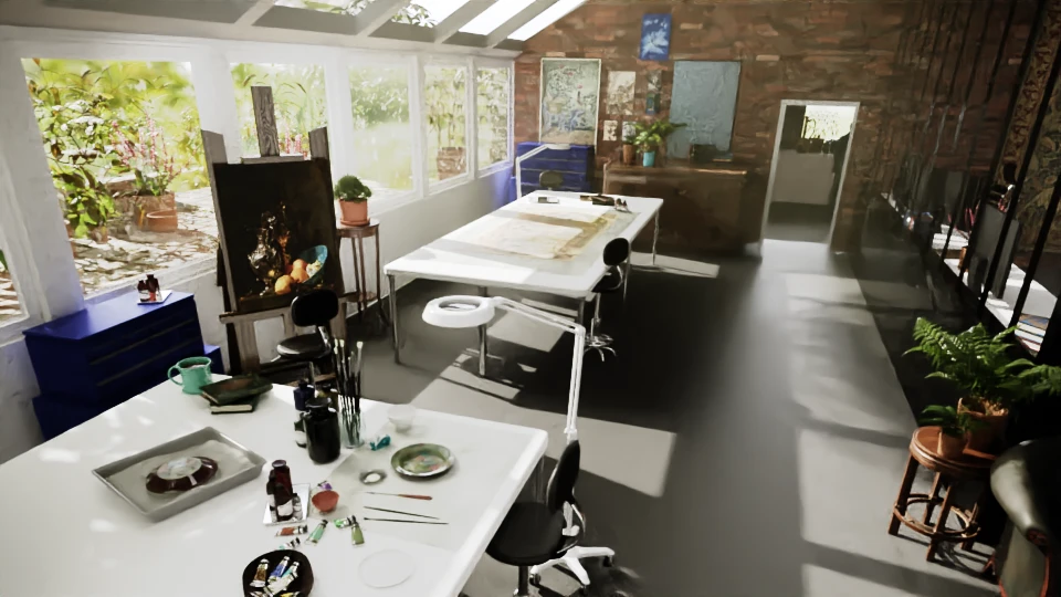
Now, that’s a nice place.
And yes, I am aware that painting, paper and ceramics are seldom restored in the same areas (different tools, different dusts).
But it’s my digital studio and I do whatever I want.
Case and point, the coffee mug on the same table as an artefact ! The heresy !
Cabinet de curiosités
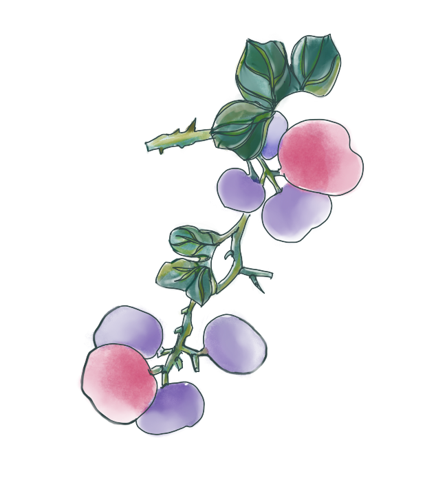
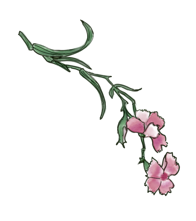
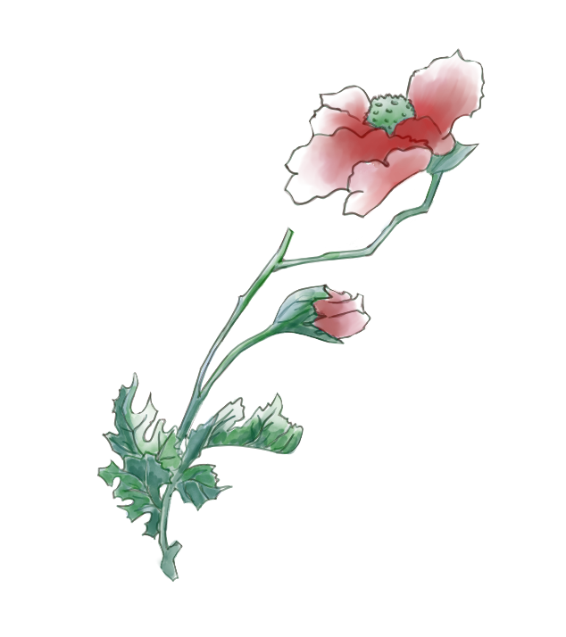
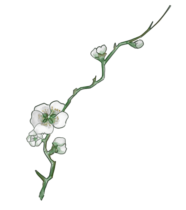
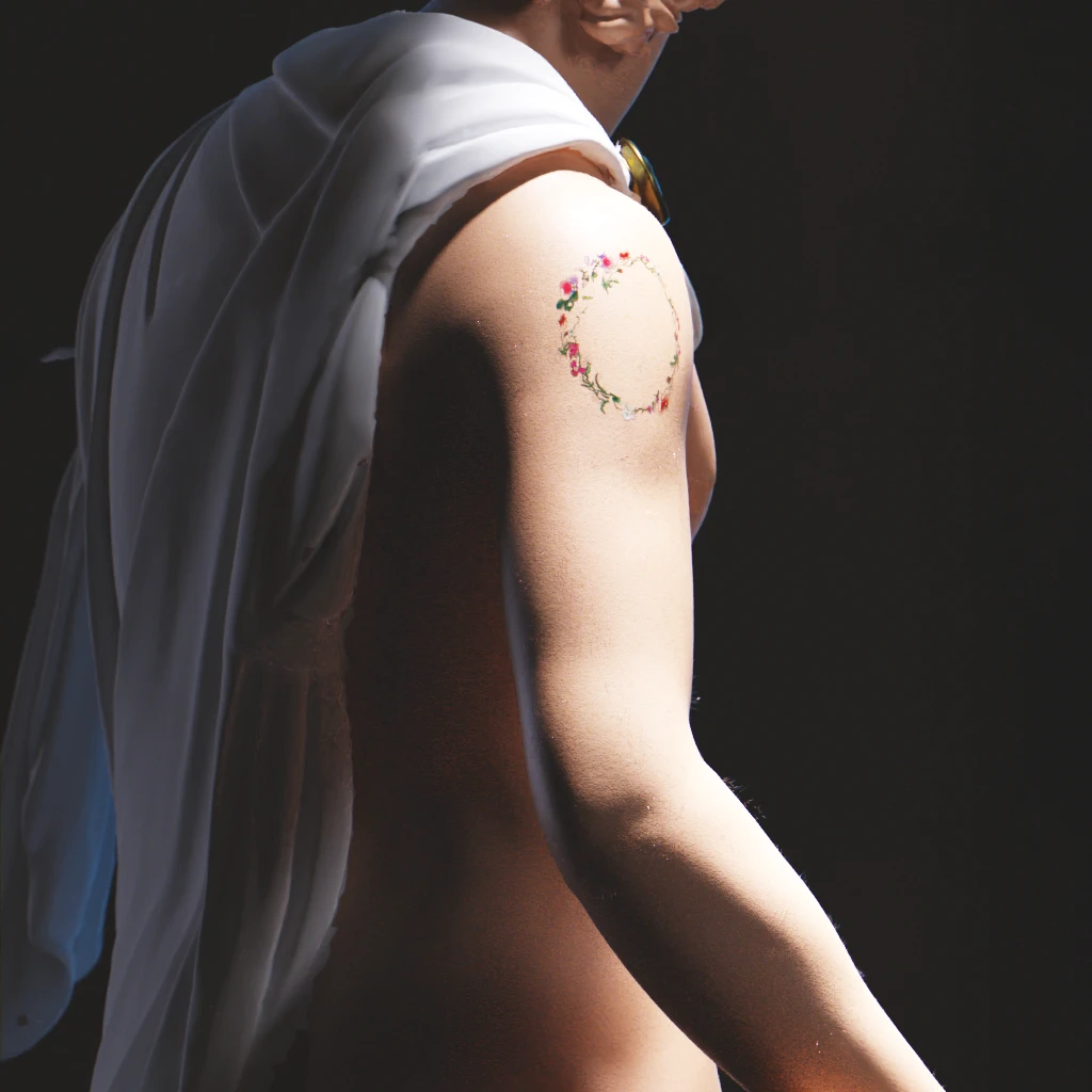
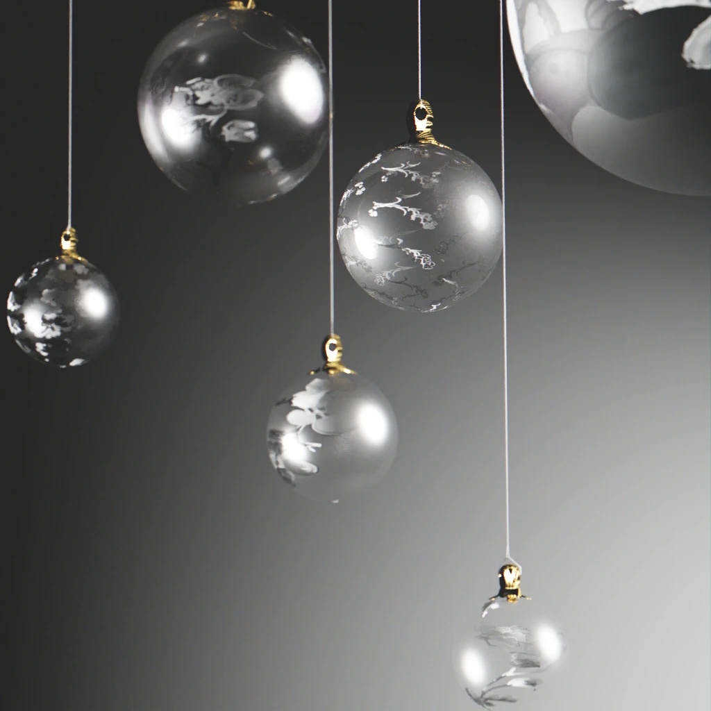
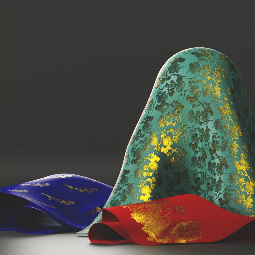
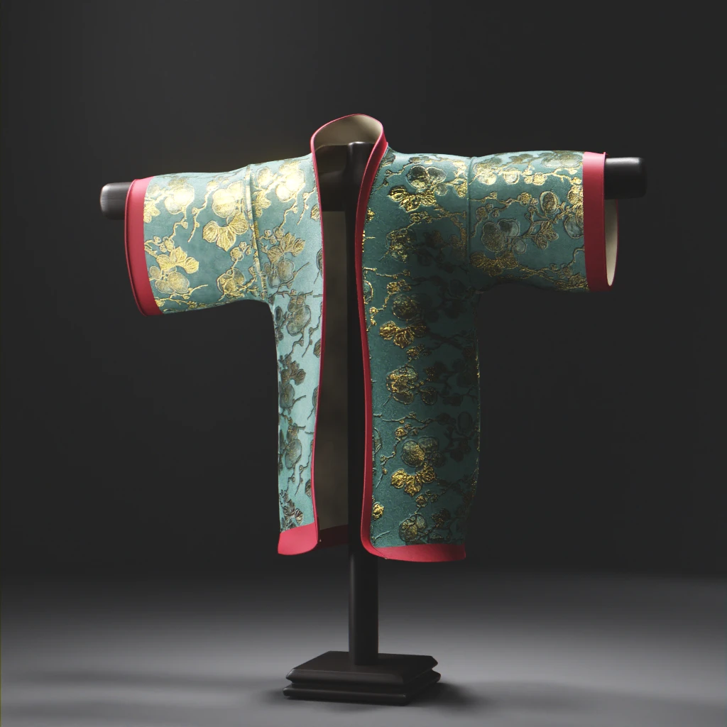
Because I had to redraw the motifs to use them, I now have digital fruits and flowers semi transparent images stored on my hard drive. How would you like to have a go at them ?
Remember that it needs a solid coloured background to be used as coloured pieces because they are mainly transparent ! The .png versions you can download have stronger colours.
Your turn to play !
Credits
Restoration studio rendering:
- Vintage wooden drawer, James Ray Cock via Polyhaven
- Still life on the easel, # Still Life with a Silver Jug and a Porcelain Bowl, Willem Kalf, 1655 – 1660, Rijksmuseum
- Morris wallpapers and sketches, V and A collections
Cabinet de curiosités:
- Male model: Yes, yes. You recognized him, from the SMK – National Gallery of Denmark ;-). Texturing based upon this skin material modified to suit my needs. Dash of hair provided by the new Blender geo nodes system.